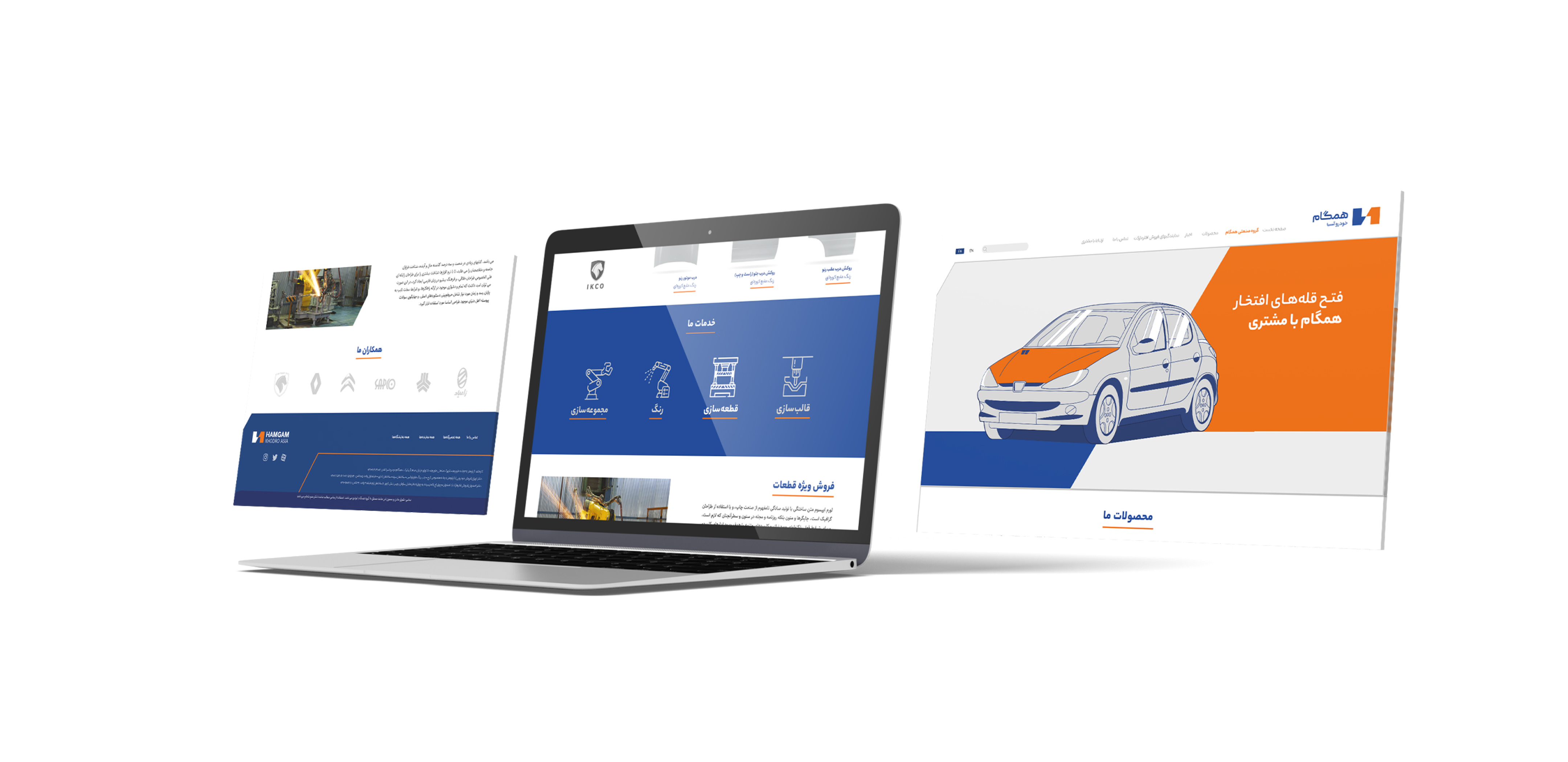
Designing the Identity and Brand Strategy of Hamgam Khodro Asia
Brand Challenge
Hamgam Khodro Asia is one of the manufacturers of car bodies and its products are of very acceptable quality to the extent that the same products are also sold in the market in Iran Khodro and Saipa packaging. The main problem was the lack of proper recognition and association of store owners and cleaners with the acceptable quality of this brand. The quality of this brand’s products was no different from the products of Iran Khodro and Saipa, but the audience had a hard time believing this due to the lack of sufficient information.
Experience gained
Market research was conducted at five levels. 1. Brand managers 2. Brand representatives 3. Store owners 4. Cleaners 4. Ordinary consumers. The brand image and expected benefits were extracted from the perspectives of all groups, and a comprehensive communication plan was designed to convey the identity and perceived quality of the brand for all levels. Changing the brand’s visual identity and creating a structure and introduction plan in brand communications will increase brand recognition and association.
Brand Visual Identity
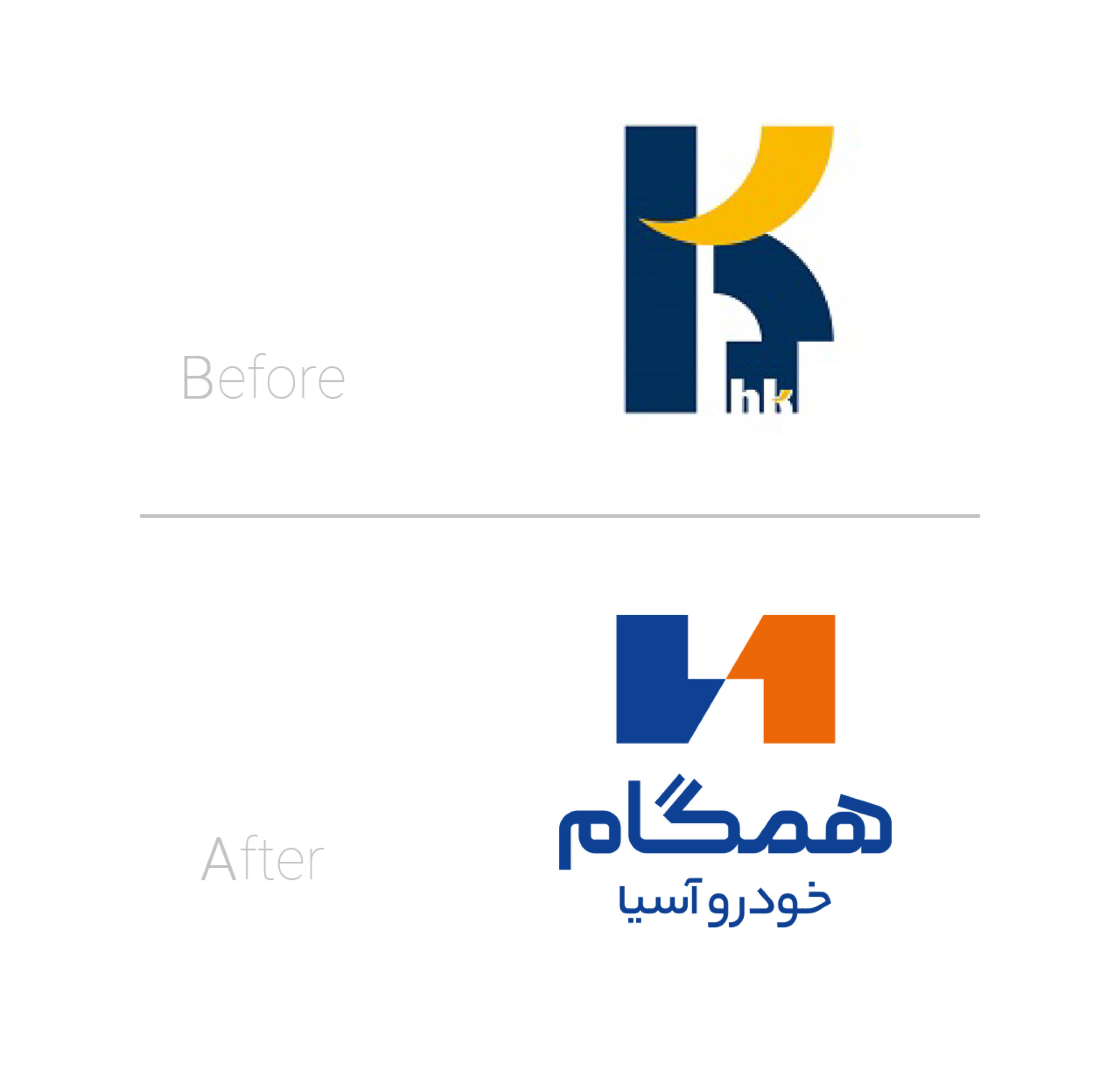
The redesign of the Hamgam Khodro Asia logo was done with a view to the new architecture of the brand. The new logo needed to both show the uniqueness of the Hamgam brand in the automotive industry and be usable for sub-brands. For this reason, the letters H and K (the initials of Hamgam Khodro) were changed to a single letter H so that the Hamgam Industrial Group and its sub-brands; Hamgam Khodro, Hamgam Taban and Hamgam Ghaleb could also use it by simply changing the color of a part of the logo.
This logo consists of the letter H, which stands for the word Hamgam (Hamgam), and the number 1, which was referred to in the brand’s strategy as being a pioneer and market leader. By changing the color of 1, the sub-brands of the industrial group can create their own visual identity while benefiting from the advantages of the parent brand.
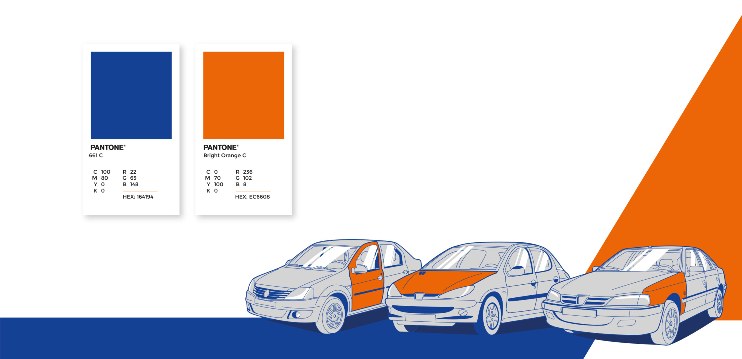
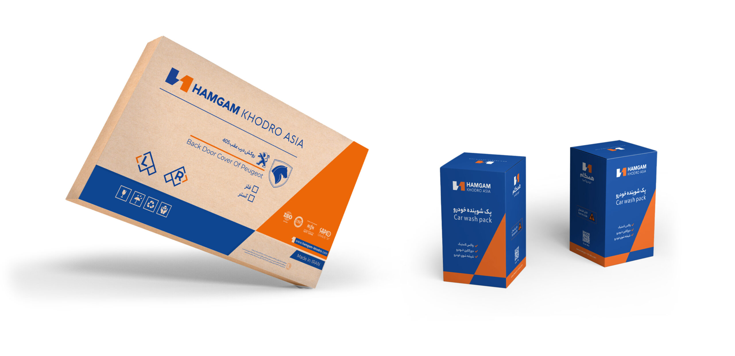
The angle in the logo was set at 30 degrees and was developed in all items of the brand’s visual identity. From the shape on the boxes to the color angle of the icons, an effort has been made to preserve and use this form to create visual integrity for the brand, evoking order and movement.