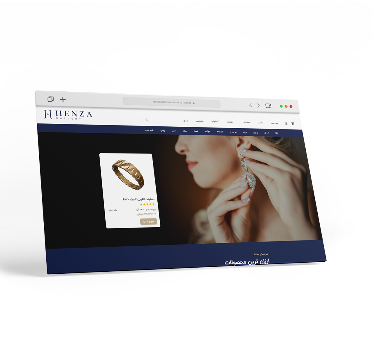
A long-standing bank in the gold and jewelry market, with years of experience in B2B sales to goldsmiths, was looking to create a new brand for B2C customers.
Challenge
This new brand faced challenges in entering the gold market and had to answer questions such as:
How can products be designed with appropriate and low weight and weight, yet eye-catching?
What identity should it have in the gold market, despite strong and old competitors, for a young and young audience, in order to stand out?
Solution
Creating an identity to showcase the discovery of new experiences and presenting designs to enter the daily lives of customers, such as bracelets with designs inspired by flying and airplanes for women working in agencies and airlines.
Experience
By defining the problem statement and selecting a branding model, brand research was conducted using several methods, including holding a focus group among buyers in a diverse range of age groups from teenagers to middle-aged people and in-depth interviews with gold sellers.
Thus, by analyzing the results of the research, the identity and strategy of this brand was born with the brand name “Henza”, emphasizing the promise of the experience of using gold for consumers who have not previously experienced gold as a means related to everyday life and indicating the identity of its owner.
Henza’s visual identity
The visual identity of the Henza brand was designed and implemented based on the brand’s strategy, which emphasized elements such as discovery, attractiveness, and trust. The uniqueness of Henza products is one of the key values of this brand. Also, the fact that the brand should look completely modern was one of the key points of the design brief for the brand’s visual identity.
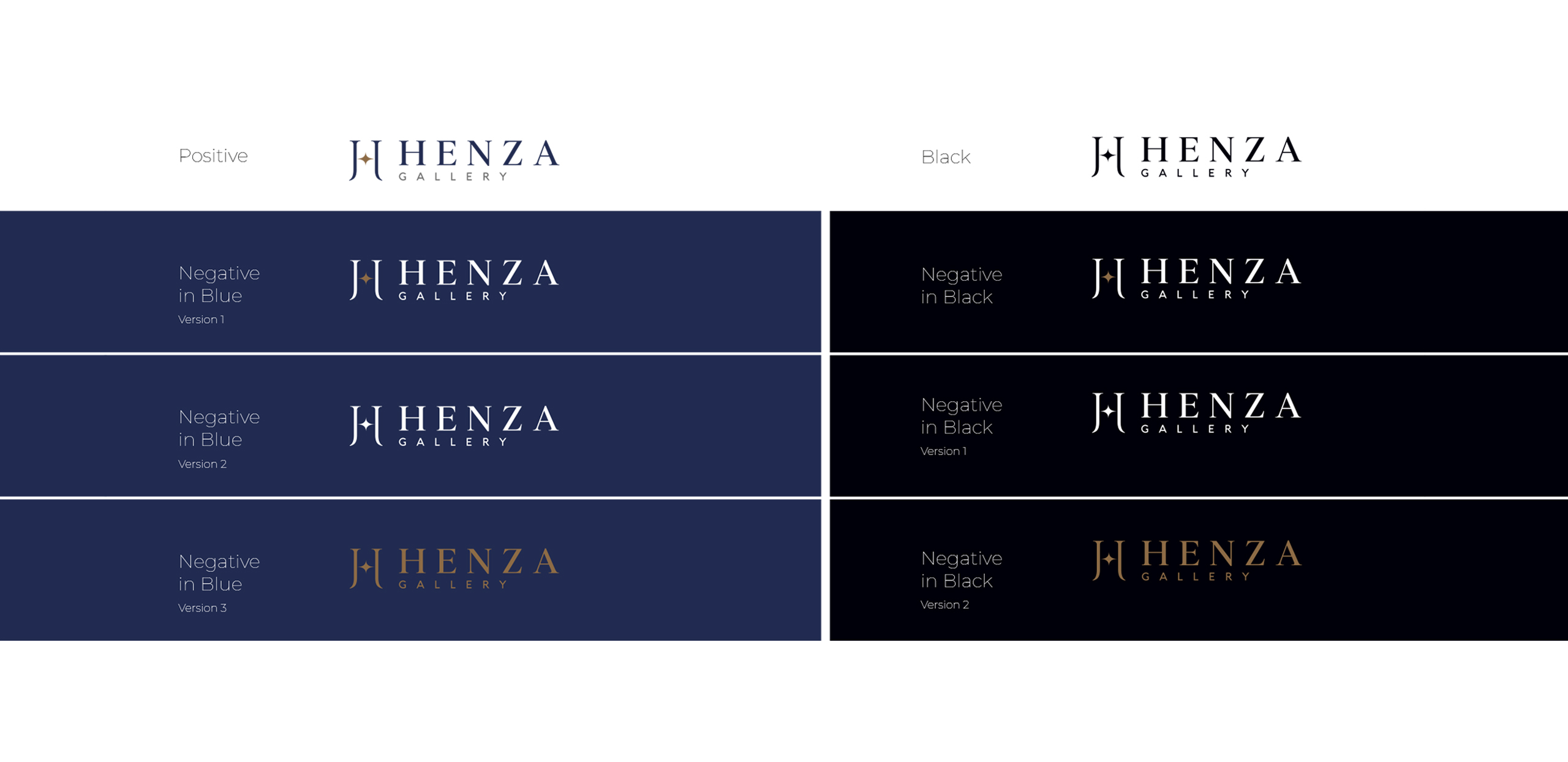
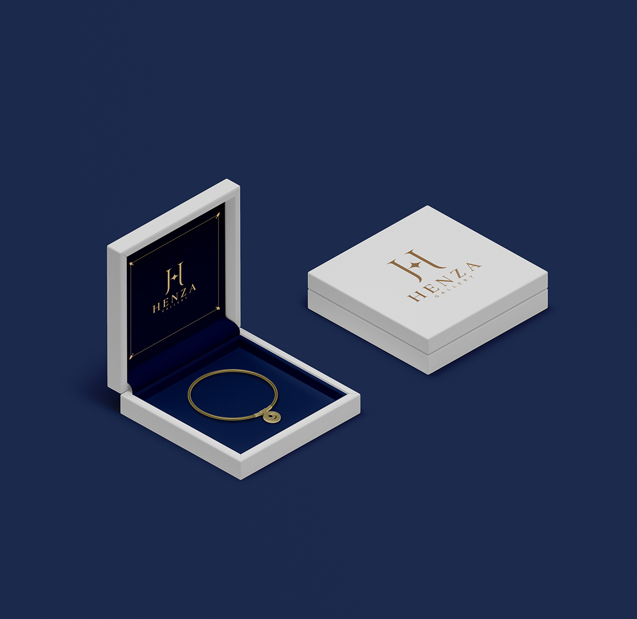
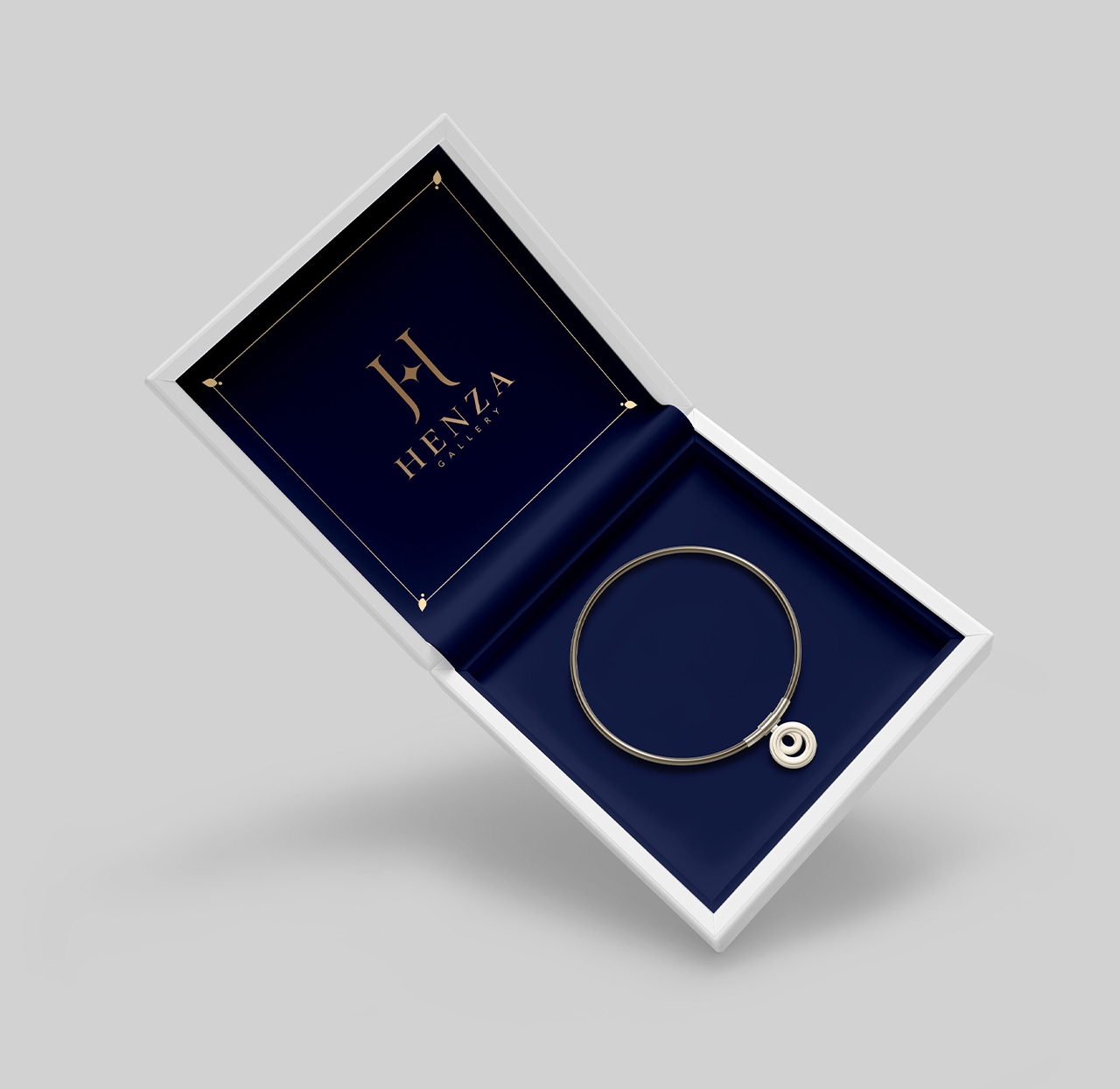
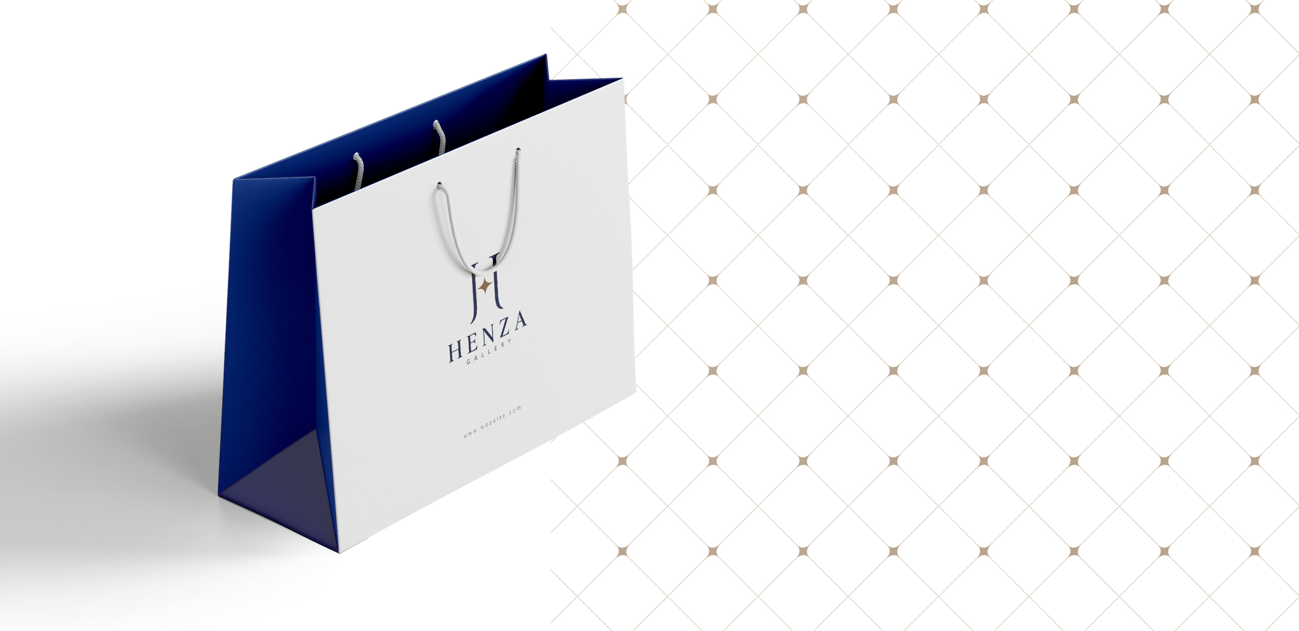
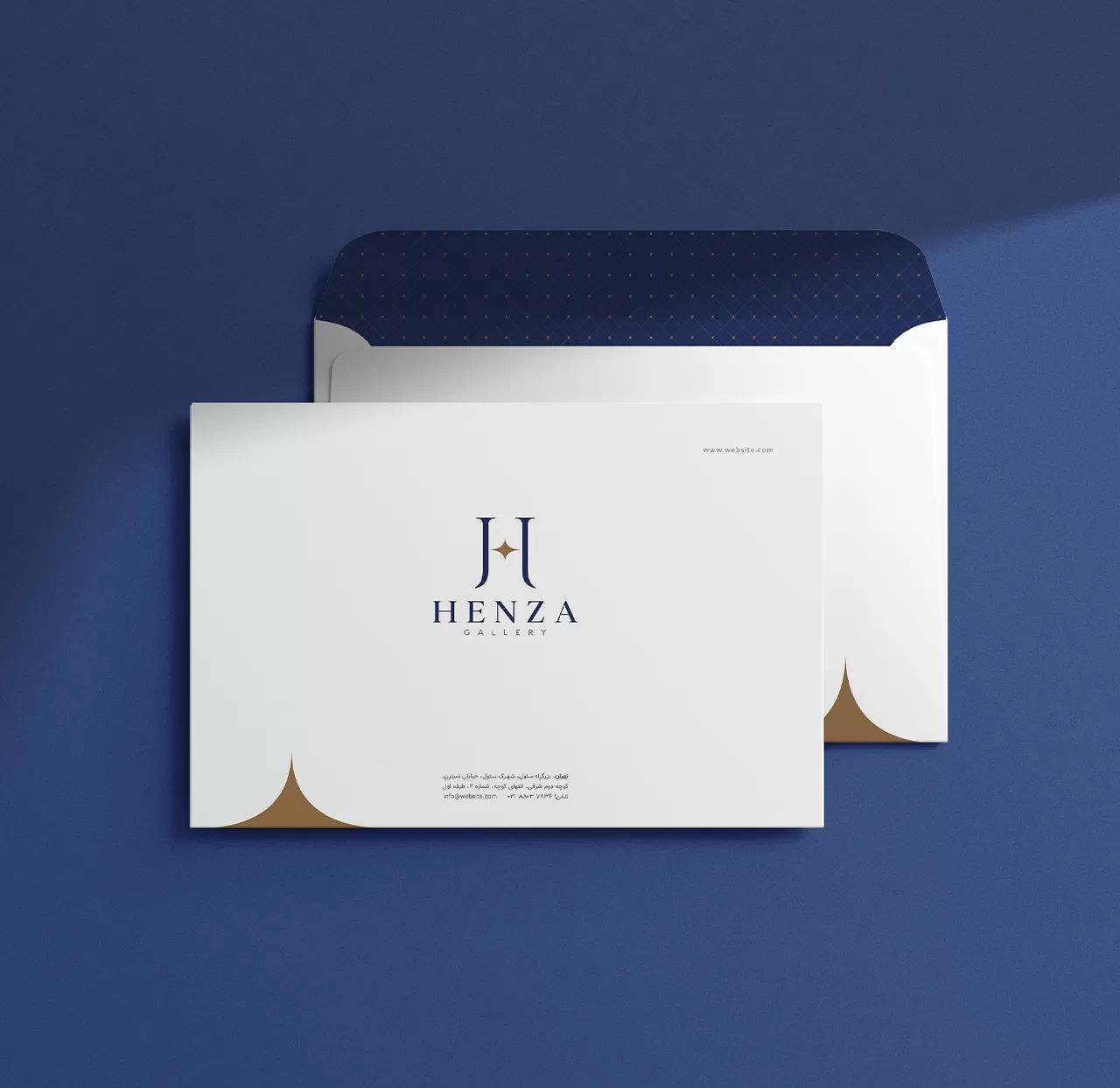
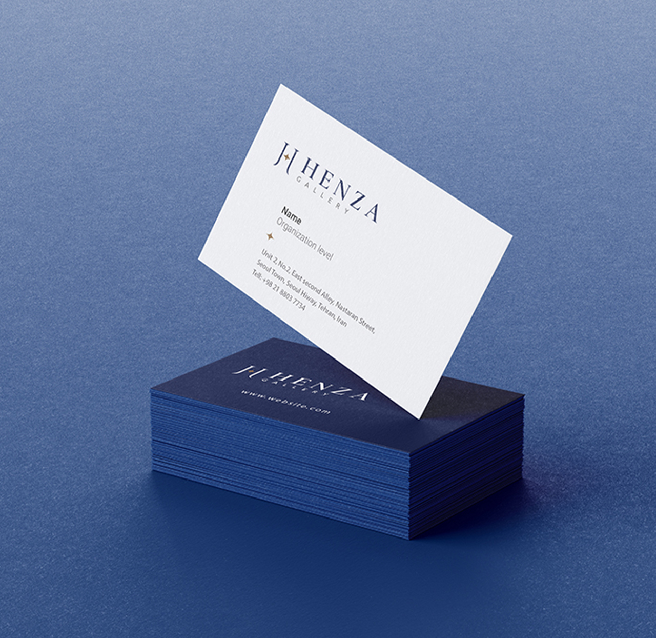
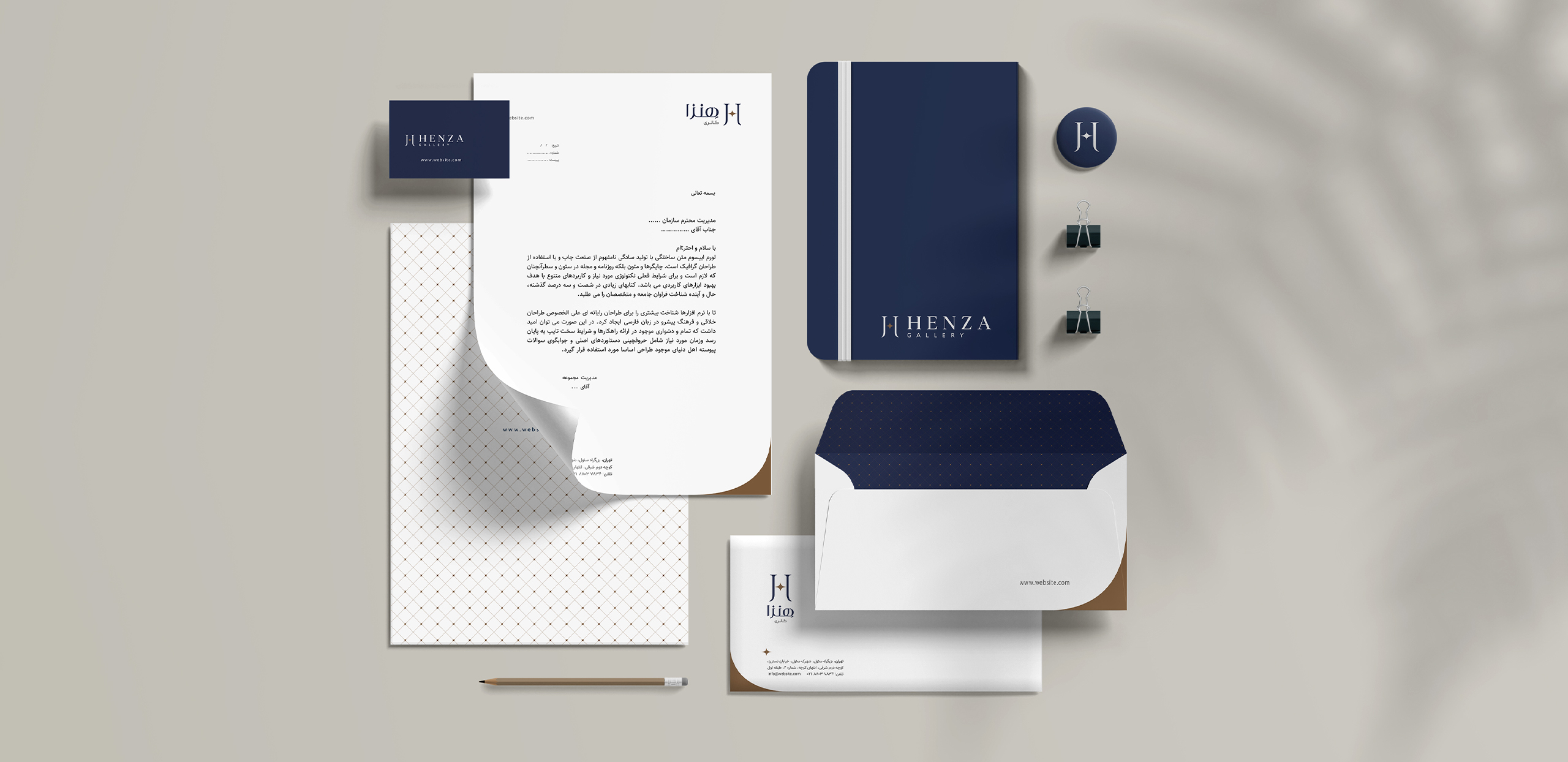
In this regard, by combining the letter H from the brand name and the star to evoke the uniqueness of the products, various designs were proposed, and in the end, a more attractive and coherent form was selected and implemented. Navy blue was used to evoke charm and a sense of trust, and gold was used to evoke brilliance and discovery in the visual identity. In order to implement various brand touch points, a pattern with appropriate brand associations was also designed, which was used in items such as envelopes, packaging wrappers, ribbons, etc.