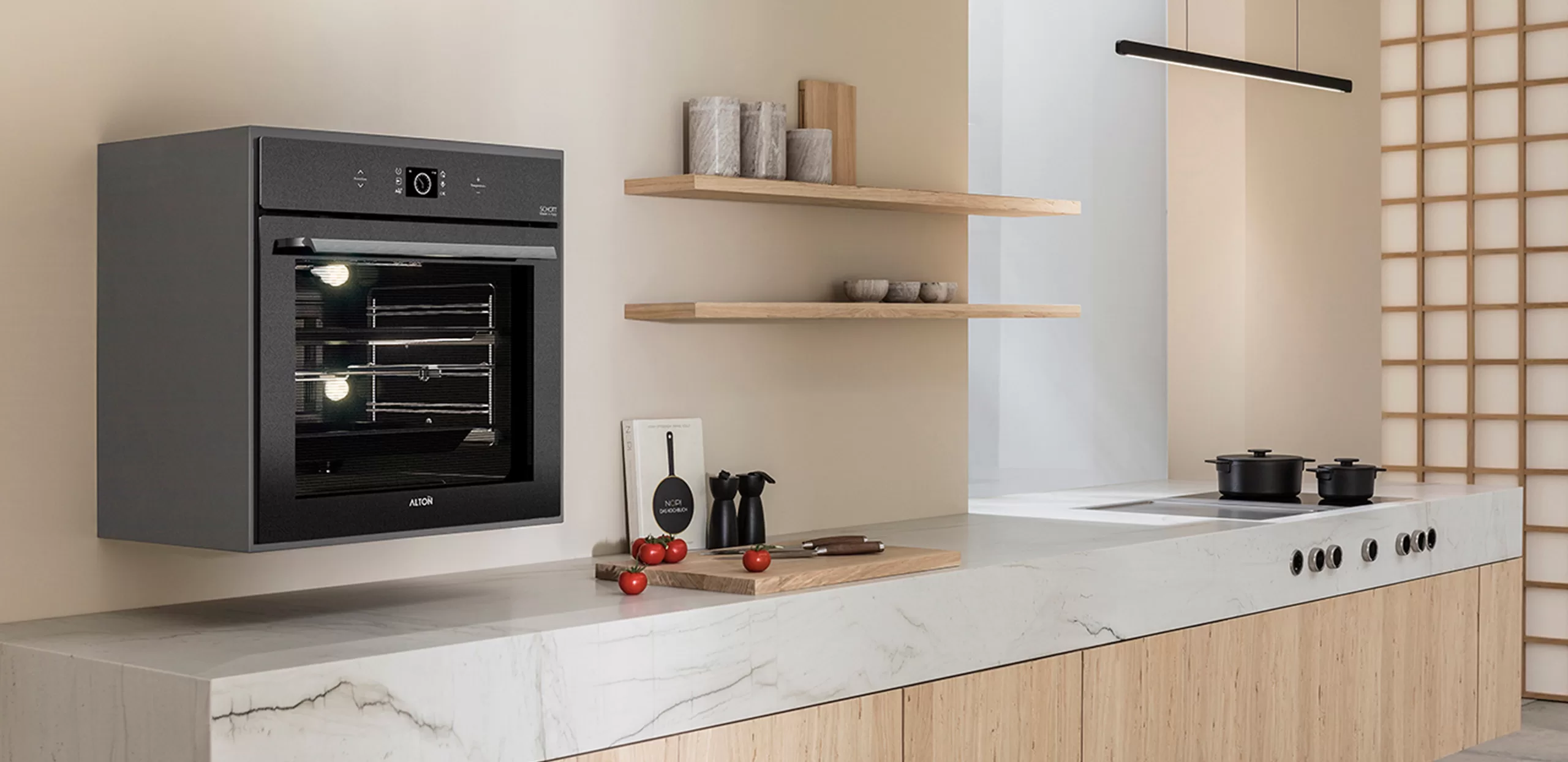
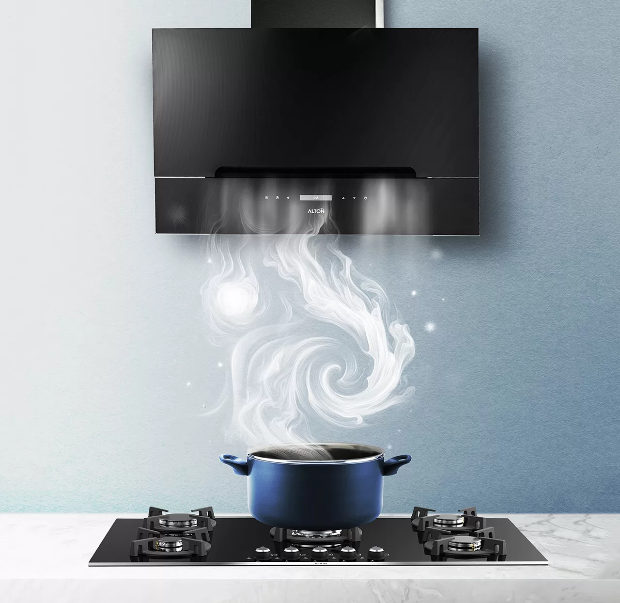
Alton is a manufacturer of home appliances and kitchen equipment. Alton’s products are of high quality, with one of its strengths being the regular and professional after-sales service it provides to its customers. However, this established perception, despite significant budget allocation to television and radio advertising, was merely a brand slogan: “The first word in the kitchen.” This association, because it did not convey a clear benefit in the minds of the main target audiences (customers, dealers, and service technicians), lacked the necessary effectiveness in sales and communication and only increased brand name awareness.
Experience Gained
Market research was conducted at seven levels: 1. Brand Managers
Sales Representatives
Store Owners
Customers (Alton customers, customers of other brands)
Cabinet Makers
Service Technicians
After-Sales Service Representatives of the brand
Through this extensive research, the expected benefits were extracted from the perspective of all groups, and a comprehensive communication plan was designed to convey the brand’s perceived identity and quality to all levels. If the plan is executed, each group will develop an appropriate association with Alton, and the flow of purchasing and cooperation will gain more strength. During the development of Alton’s brand strategy, one of the main audience’s needs regarding the importance of art and beauty was considered. The kitchen is, in fact, considered the territory of the lady of the house, and in Alton’s strategy, we tried to address how Alton can help a woman to both enjoy cooking and express a part of her identity through the beautiful design of the kitchen and its equipment. Alton is the brand that is intertwined with art, and in its communications, it will emphasize that its products are not just for cooking, but rather, with the help of art, they offer a window to a better atmosphere.
Brand Visual Solutions
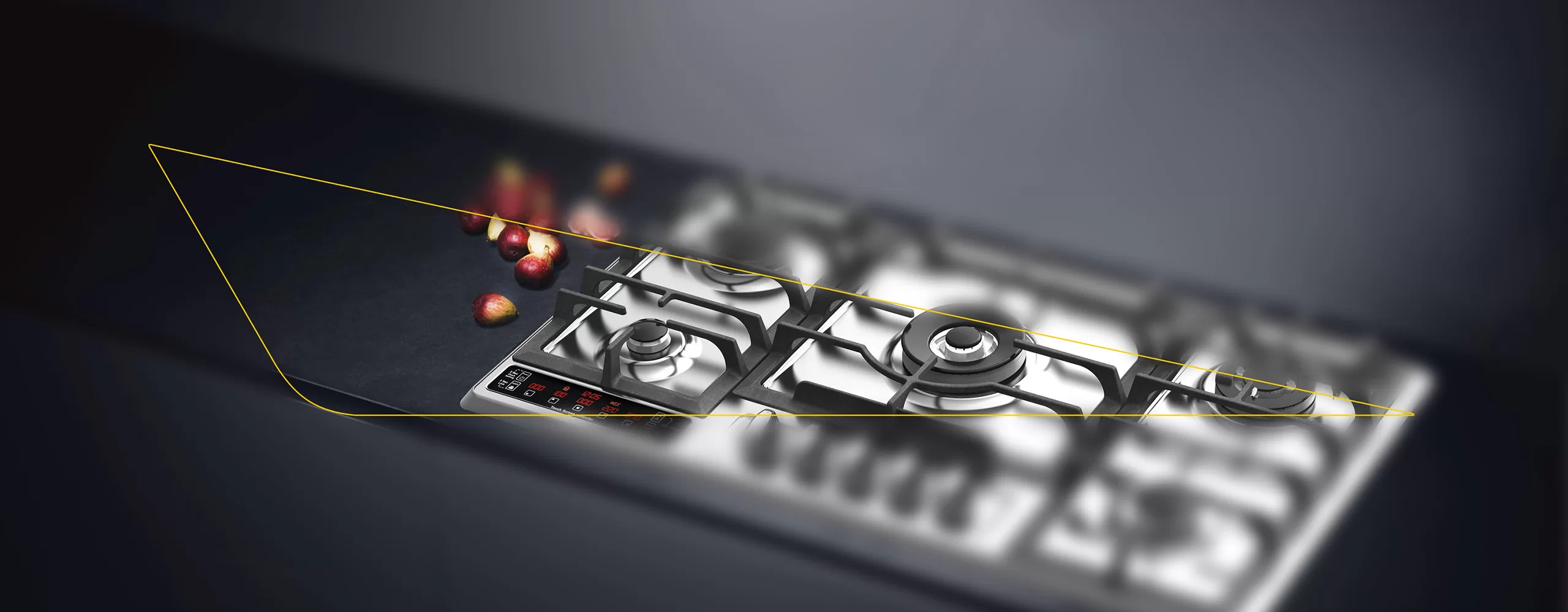
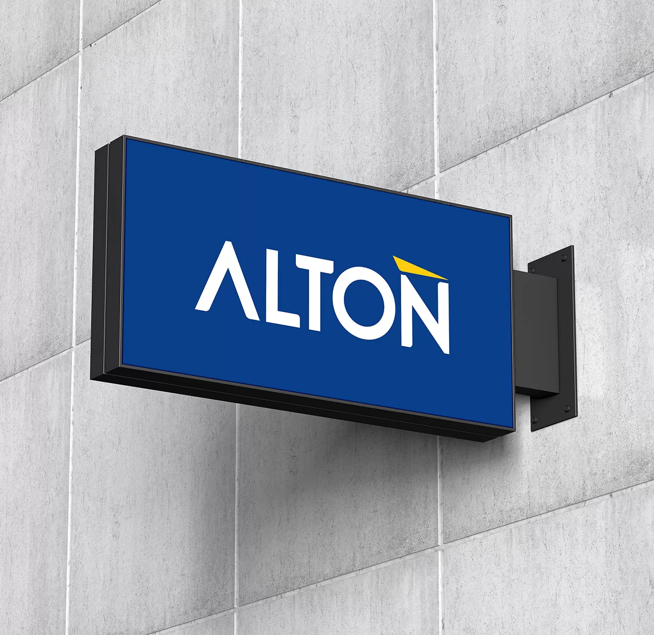
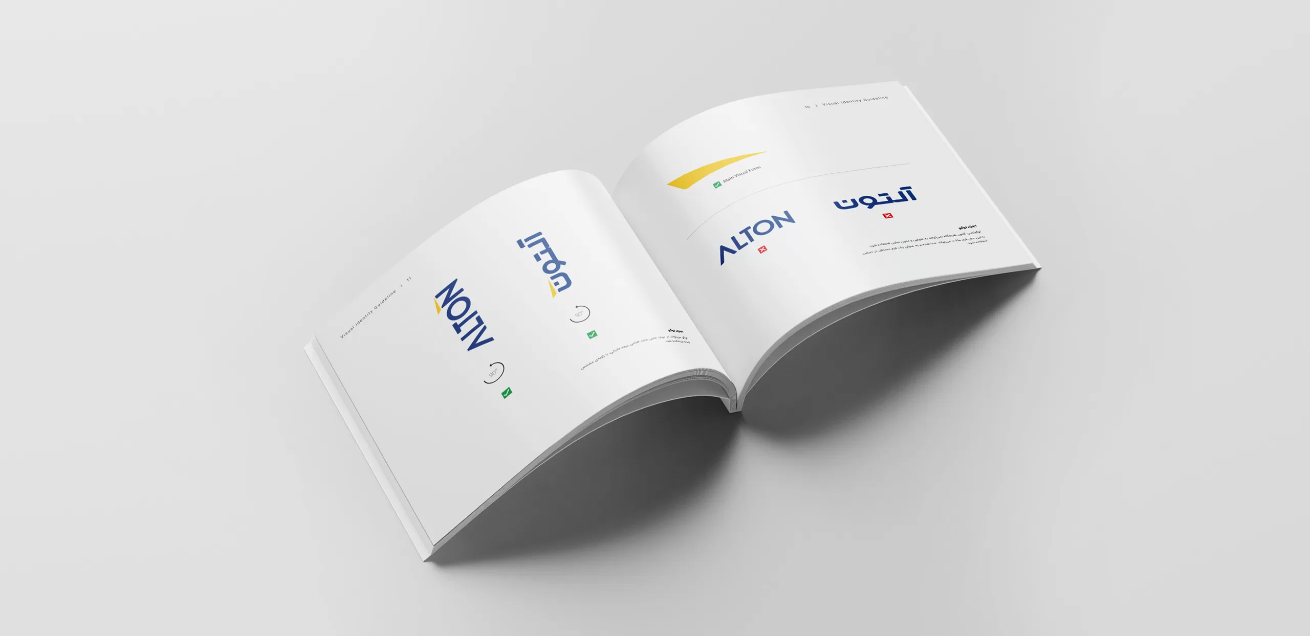
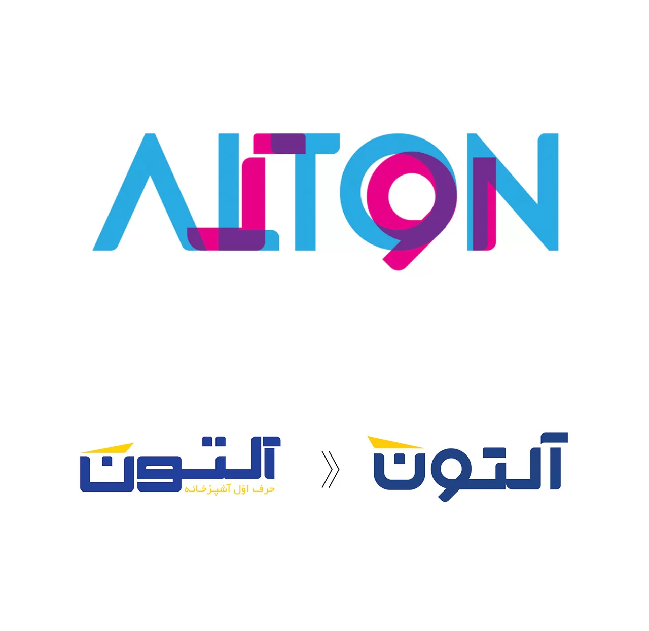
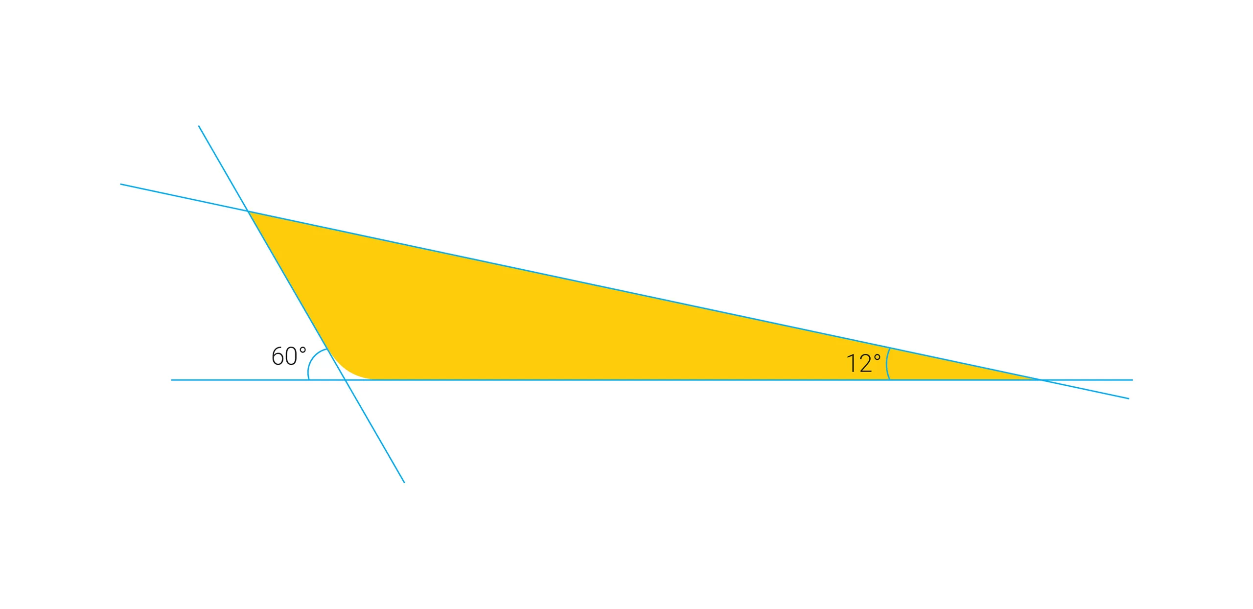
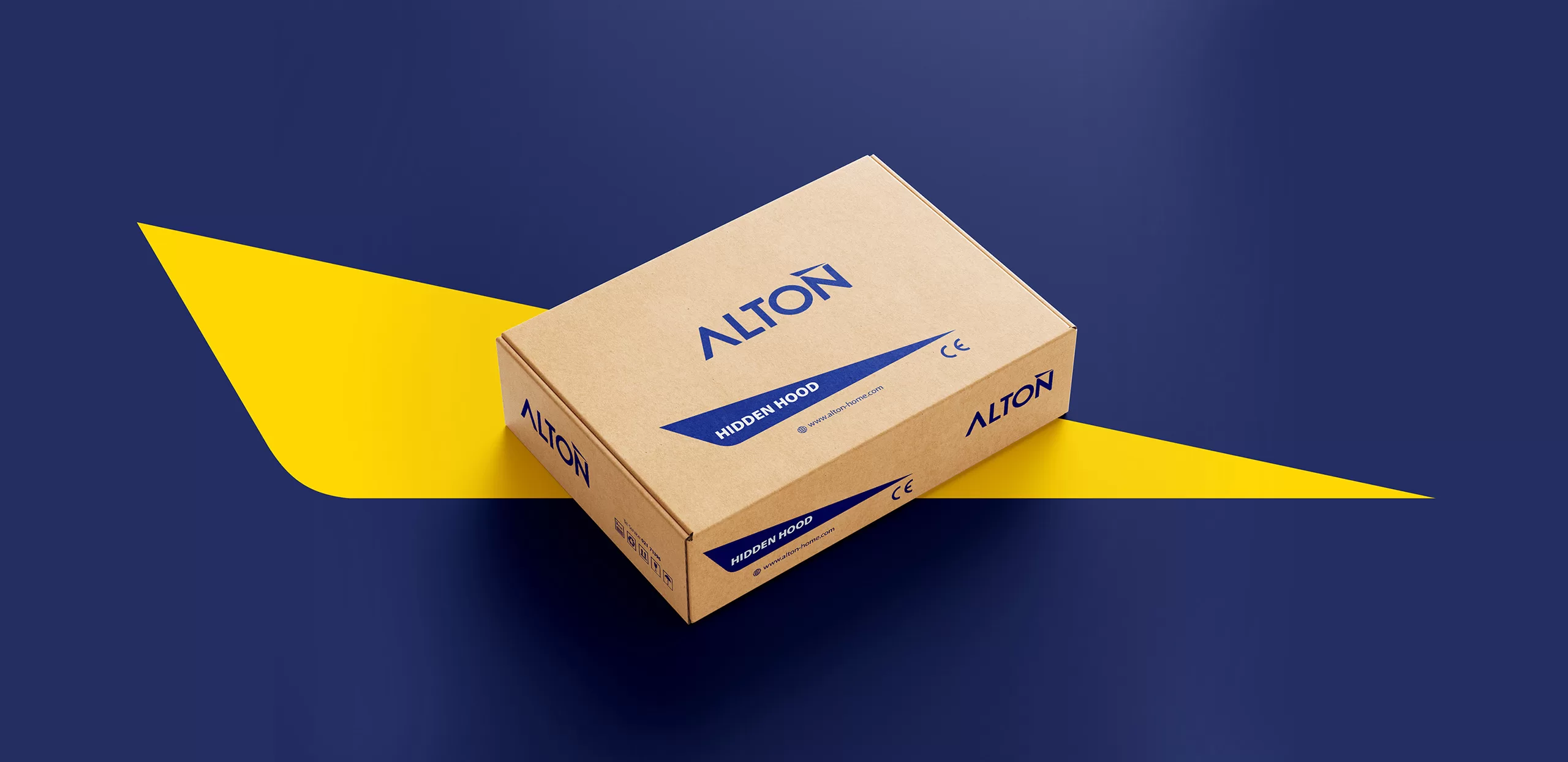
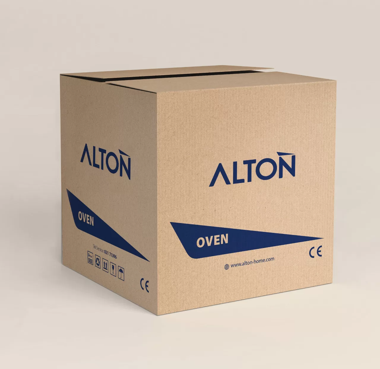
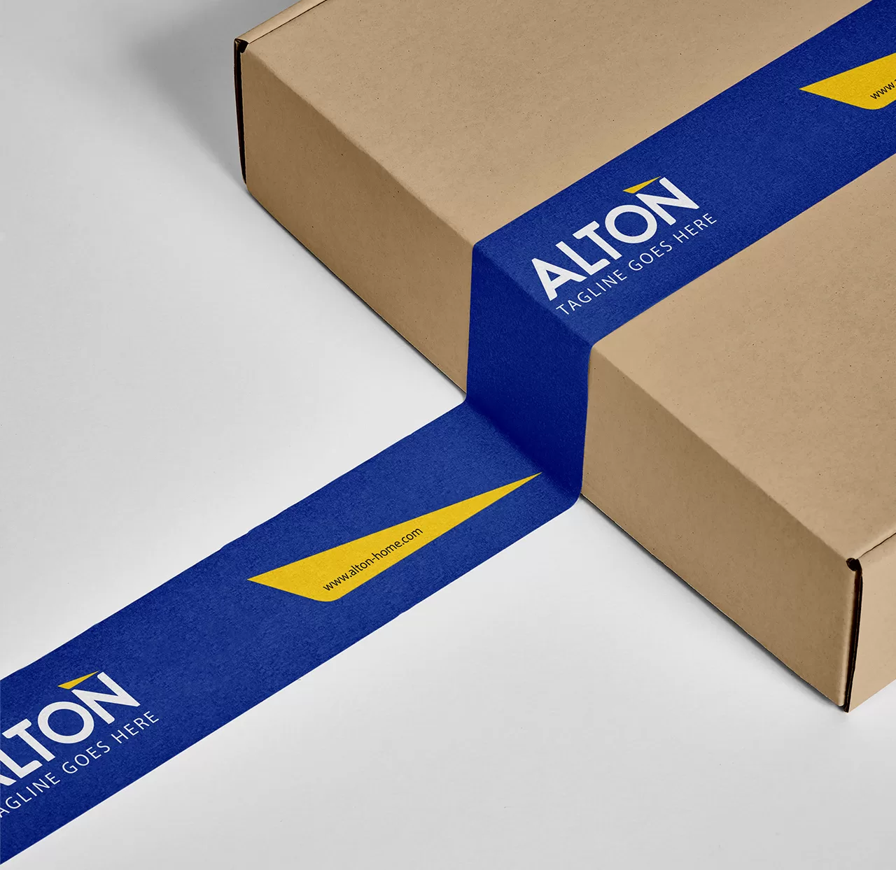
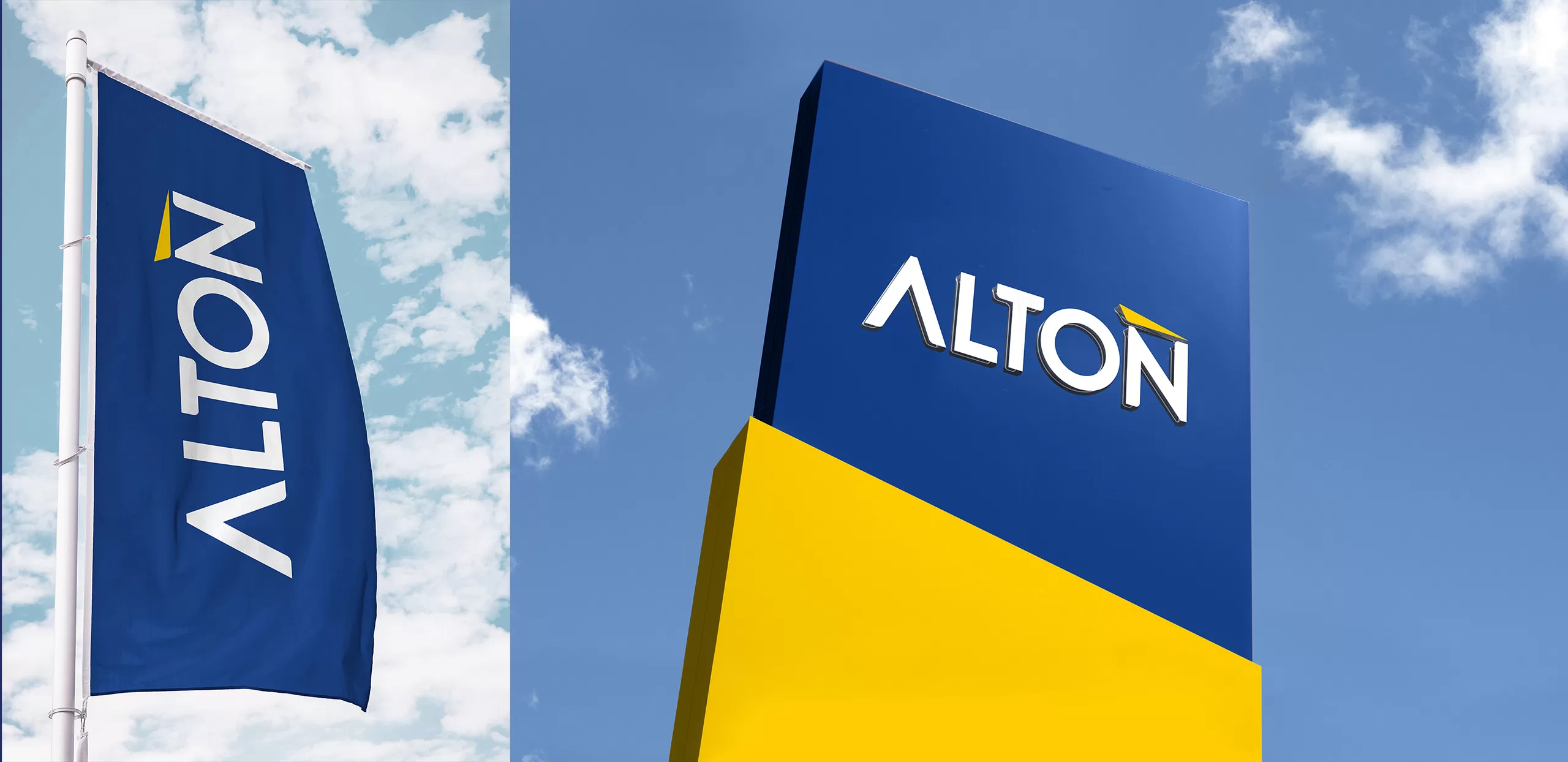
According to the market research conducted for Alton, there was a need to increase brand awareness among the audience. Therefore, as a first step, the appearance of the brand’s logos needed to be structured, and in some cases, revisions were made. The English logotype was kept constant, but the Persian logotype was redesigned due to its inconsistency with the brand’s English typography. To increase the audience’s visual association, a memorable visual element of the brand was needed. Alton’s logo, within its logotype, had a triangular form with a distinct color. To create this association, this form was used separately from the logo on all brand collateral.
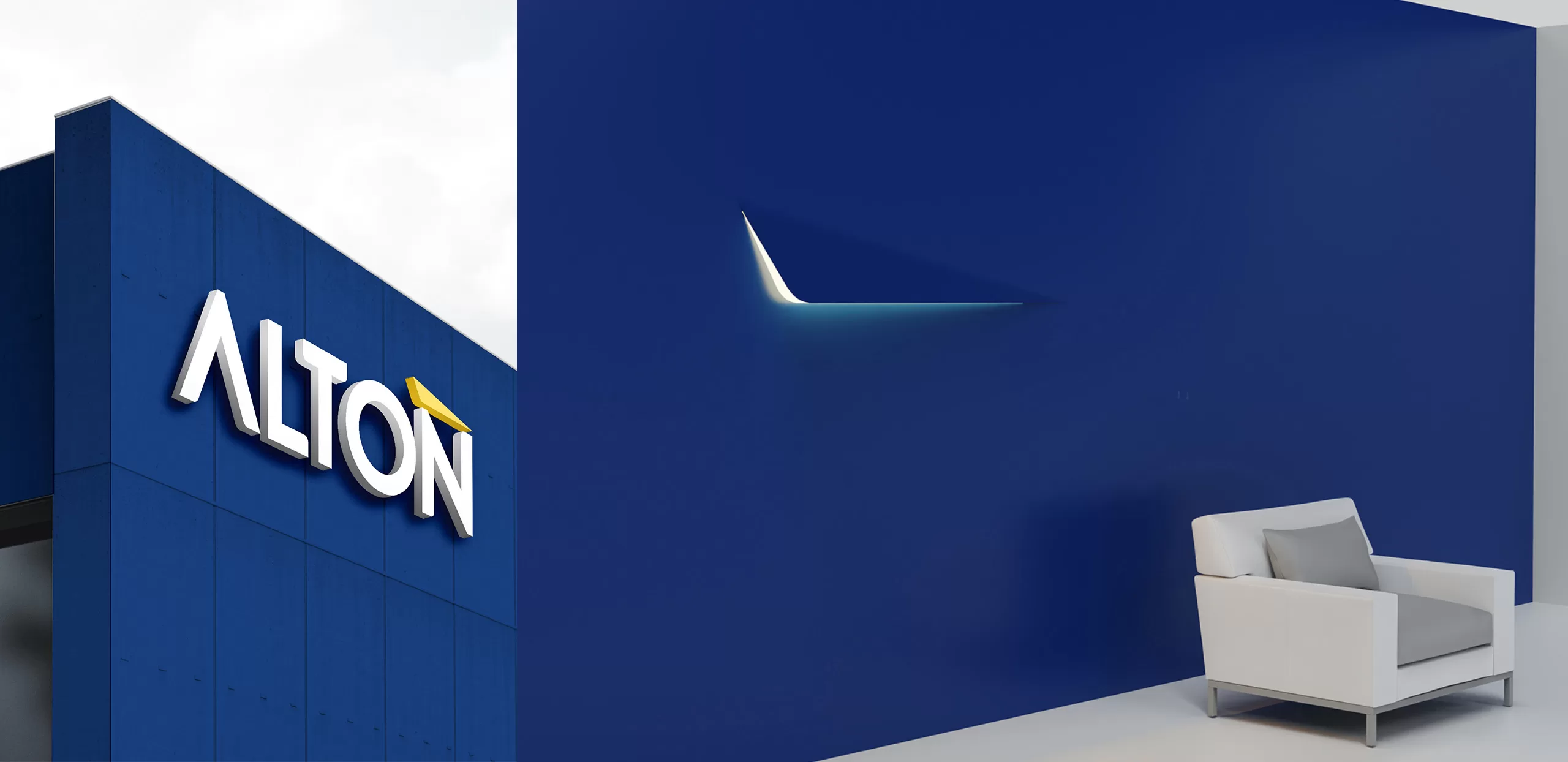
The Alton triangle shape is used prominently in store fronts, printed on packaging, and in the design of Alton products in the form of cutting, lighting, and more.