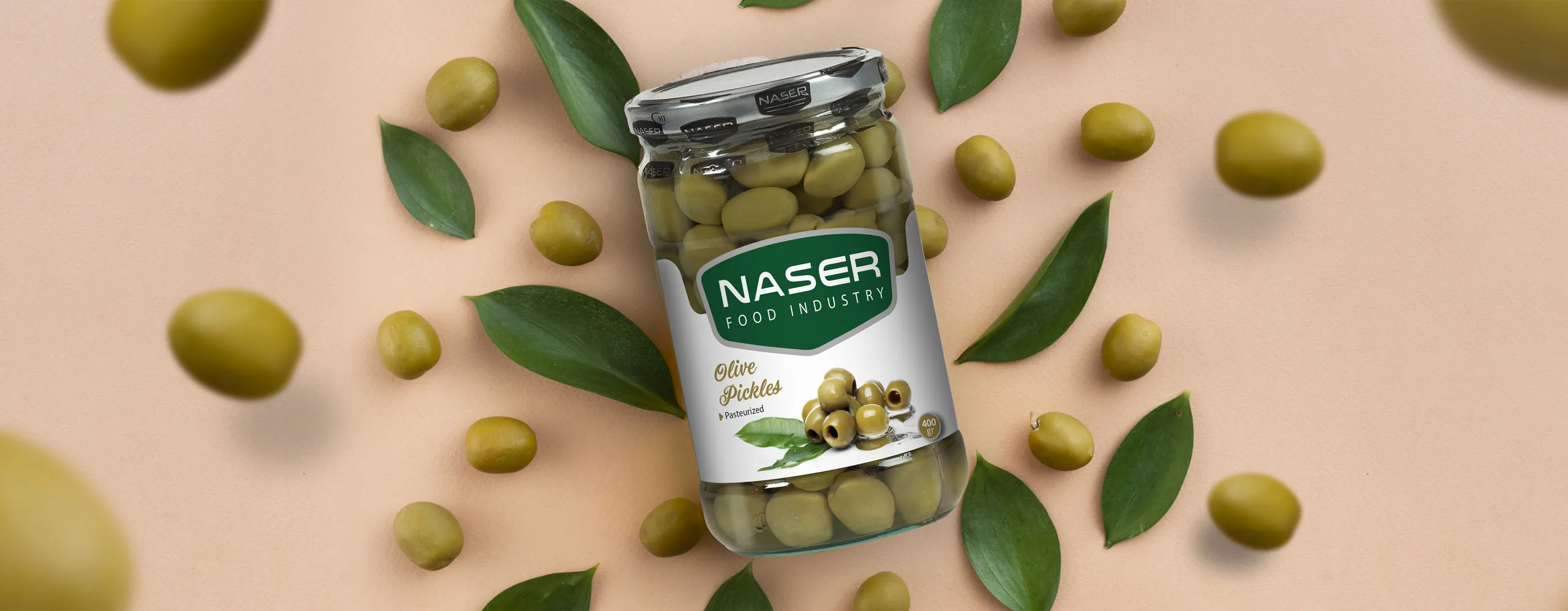
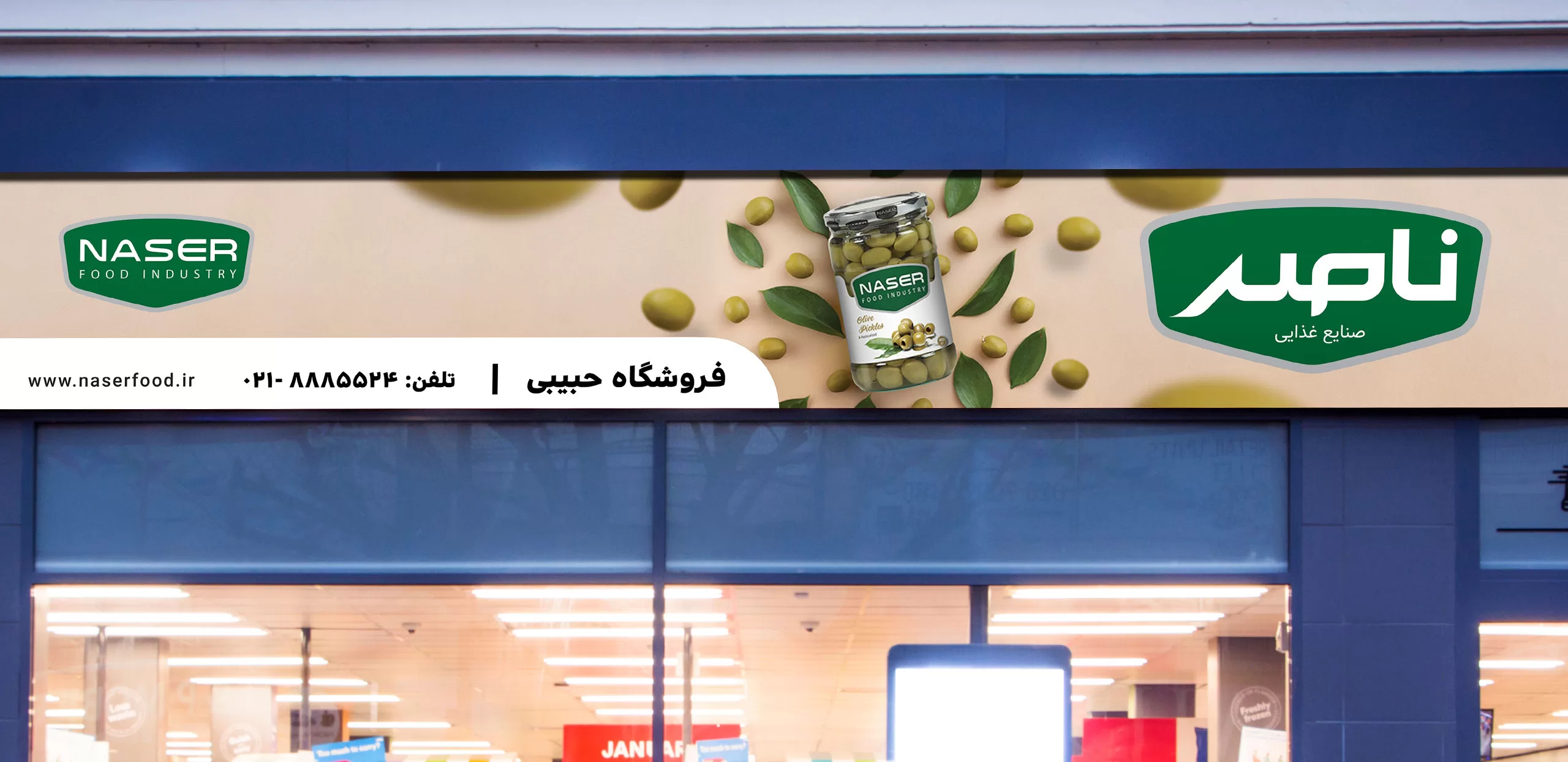
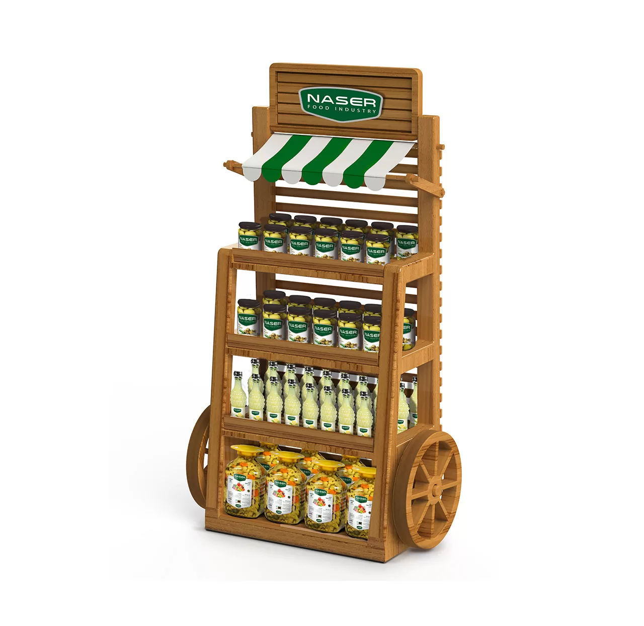
With over 25 years of experience, Nasser Food Industries Company produces high-quality food products with a distinctive taste. The company had a unique competitive advantage in the market and was able to produce high-quality lemon juice. Accordingly, the Nasser brand had a good market share in the northern and northwestern regions of the country and was communicating effectively with its target audience. In its vision, the brand decided to enter the domestic markets nationwide and develop its market.
The Nasser brand needed to expand its identity to expand its geographical boundaries, and this identity had to be designed in such a way that the brand could communicate with the target audience at the national level and create an appropriate association with the main advantage of the products.
Experience gained
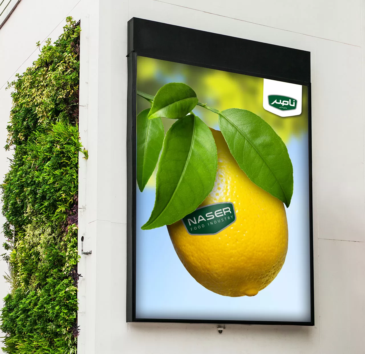
To create the identity of the Nasser brand at the national level, extensive qualitative and quantitative research was conducted. During the qualitative research, the brand image and the range of benefits desired by the consumer were extracted. This research was conducted in the two provinces of Tabriz and Tehran with the aim of discovering the audience’s attitude towards the food industry, and on the other hand, a quantitative research was also conducted among supermarkets and store owners. Based on the analysis of the information obtained from the research, the Nasser brand identity was designed. The identity created for the Nasser brand had to express the geographical origin and history of the brand well, and also show the quality and competitive advantage of the products to the target audience and establish a connection with them. After creating the identity, an identity-based advertising campaign was designed and implemented at the national level with the aim of increasing awareness of the Nasser brand and creating an association appropriate to the identity.
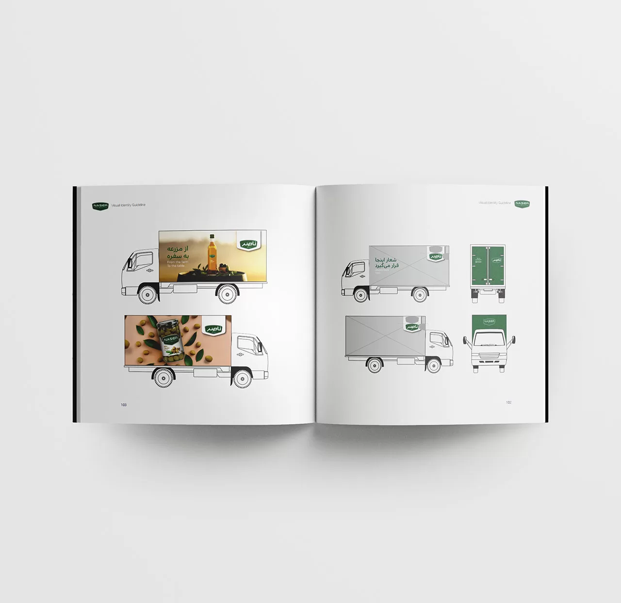
Brand Visual Identity
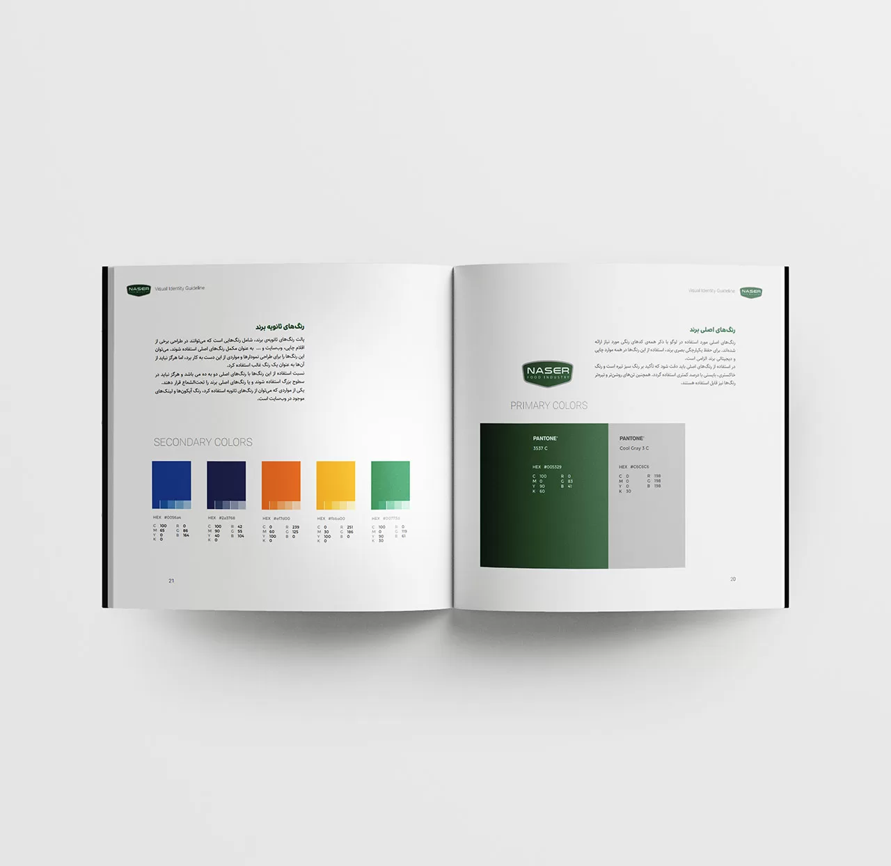
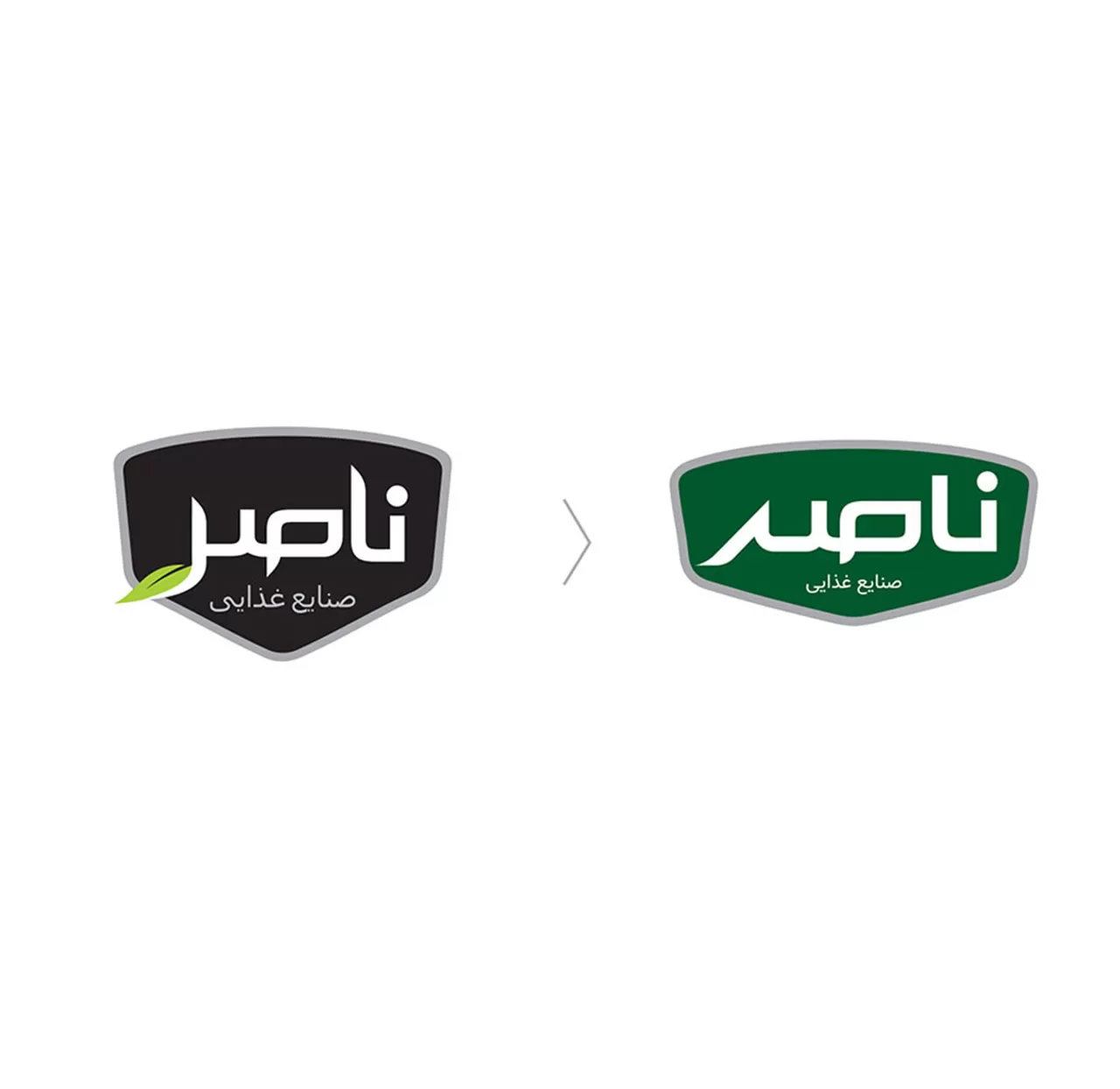
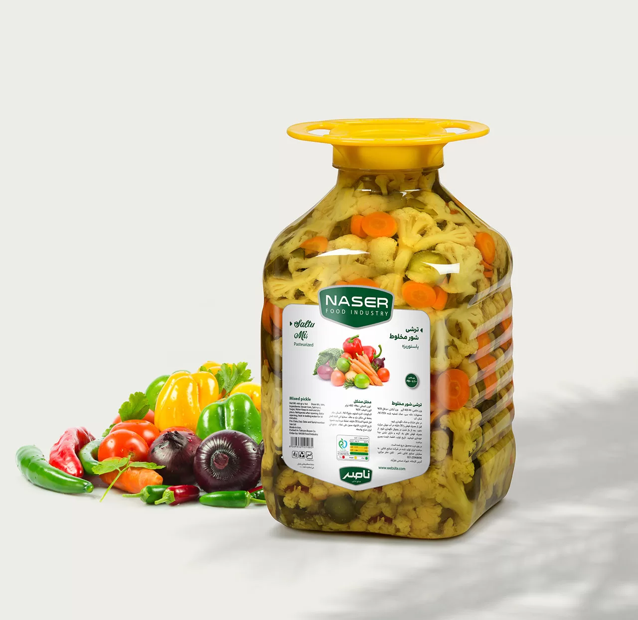
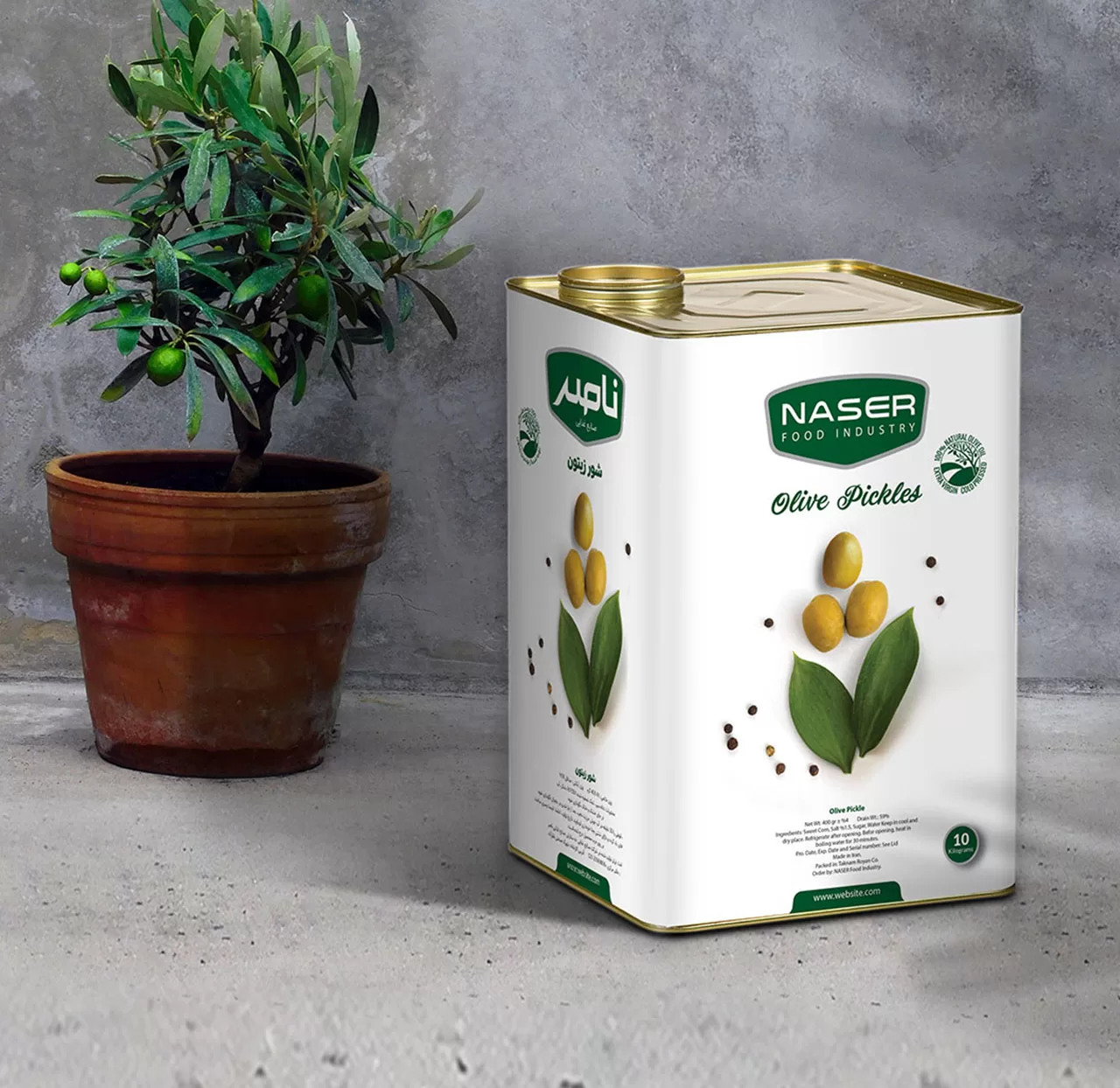
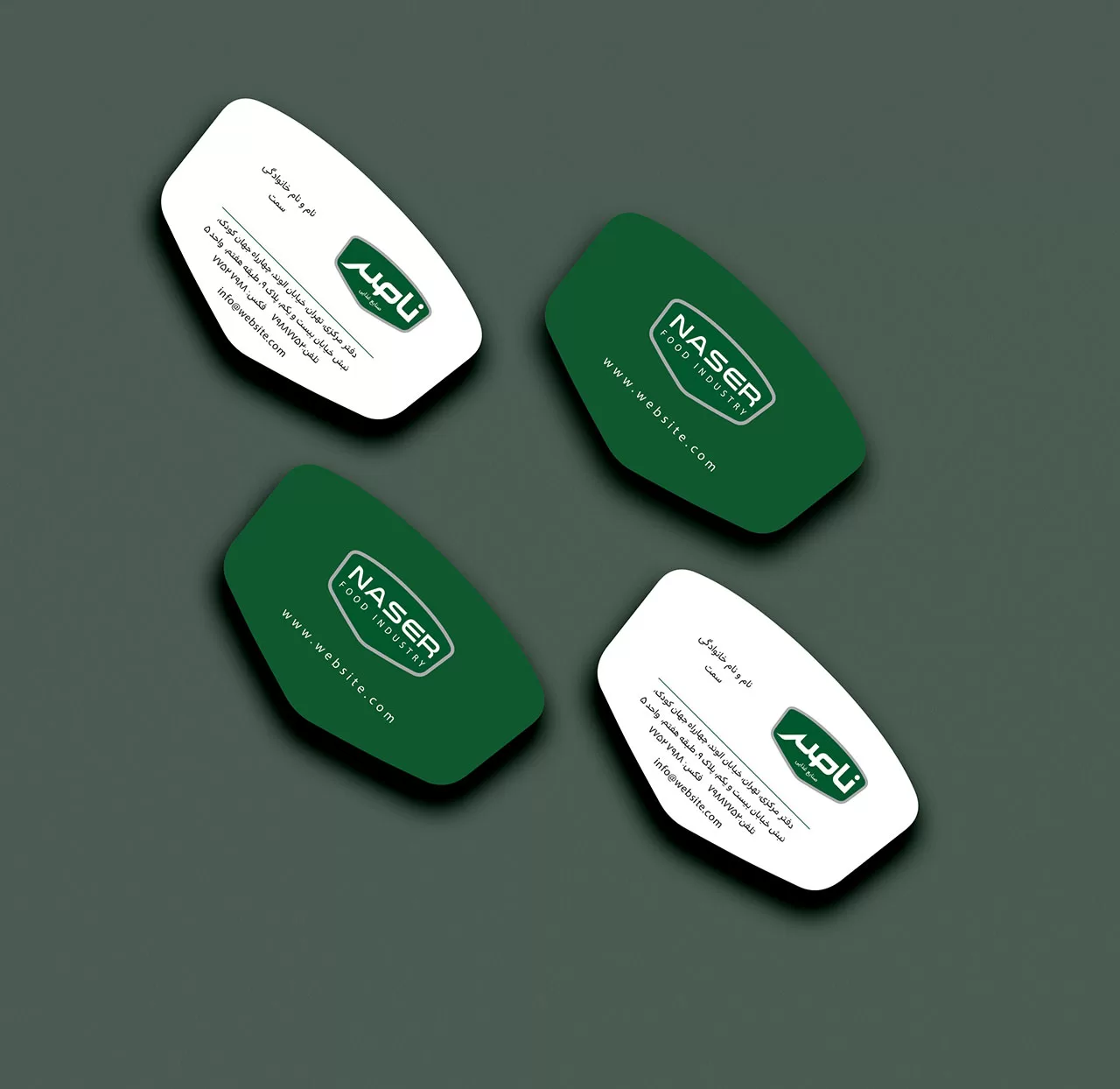
In compiling the Nasser Food Industries Visual Identity Guidelines, minor changes were made to the logotype form and logo frame, considering the brand’s history. However, in order to create an association of quality and health that was mentioned by the audience in the brand research, the brand color was changed from black to green so that the audience would have a perception of health and quality from the brand.
Also, by removing the leaf shape from the Persian and English logos, attention has been paid to the diversity of the brand’s products. Since Nasser Brand currently produces a variety of products, including honey, and this range of products is being developed, there should not be an element like a leaf in the logo that would limit this approach.