Mackenzie is a brand active in the field of food products that sought to provide a quality brand in canned goods to the market. Mackenzie’s strength was high-quality raw materials and needed an identity that could establish a proper connection with a segment of the market.
Experience
We began market research on this brand with focus groups and found out among different audiences that the needs of the younger generation in the field of ready-made and semi-ready foods have been ignored; therefore, we studied the younger generation. During this research, we found that one of the main concerns of the new generation is the unwillingness to spend a lot of time cooking and spending hours in the kitchen; because this generation does not have much patience to prepare meals and instead of hours of cooking, they want to spend time with their friends, do their work and enjoy being together. The process of designing Mackenzie’s brand identity and communication strategy was based on this finding and an attempt was made to present this message to the audience in the context of brand communication.
In this regard, we designed a tagline for this brand that expresses this idea:
“This is Mackenzie, moments must be lived”
Mackenzie products have also been developed and are growing in the market based on this need.
Brand visual identity
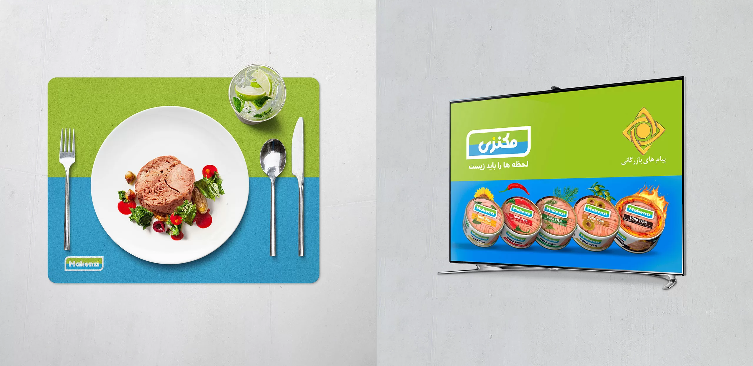
Based on Mackenzie’s strategy, which needed to convey the simplicity and speed of product preparation to the audience, this simplicity and instant enjoyment should be displayed at the brand’s touch points.
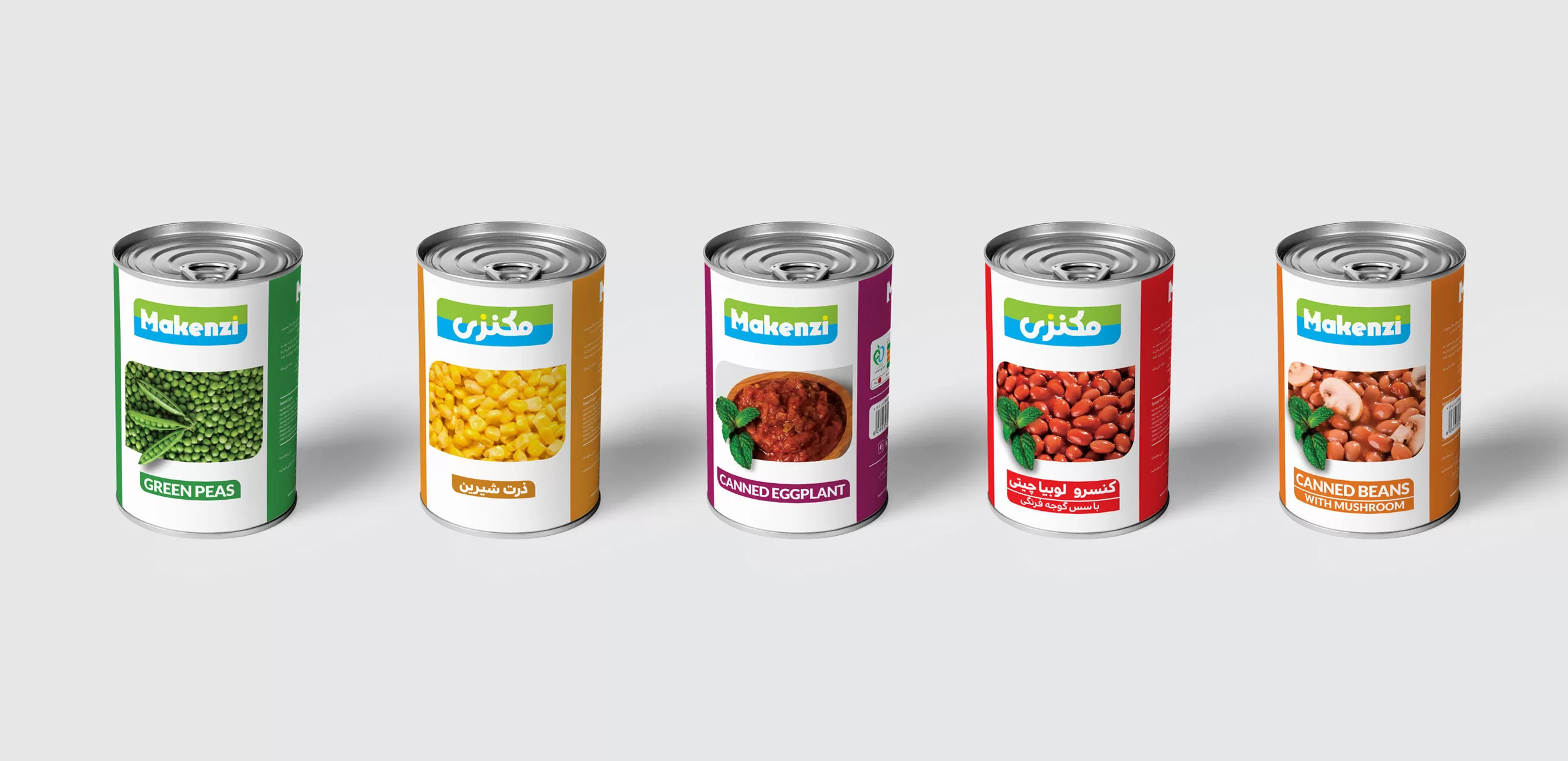
Developing a simple and structured design, by placing the logo on top of the packages and placing a photo of the prepared food in the frame, gives the audience the feeling that this product is prepared simply and quickly and to some extent conveys the brand’s message to the customer.
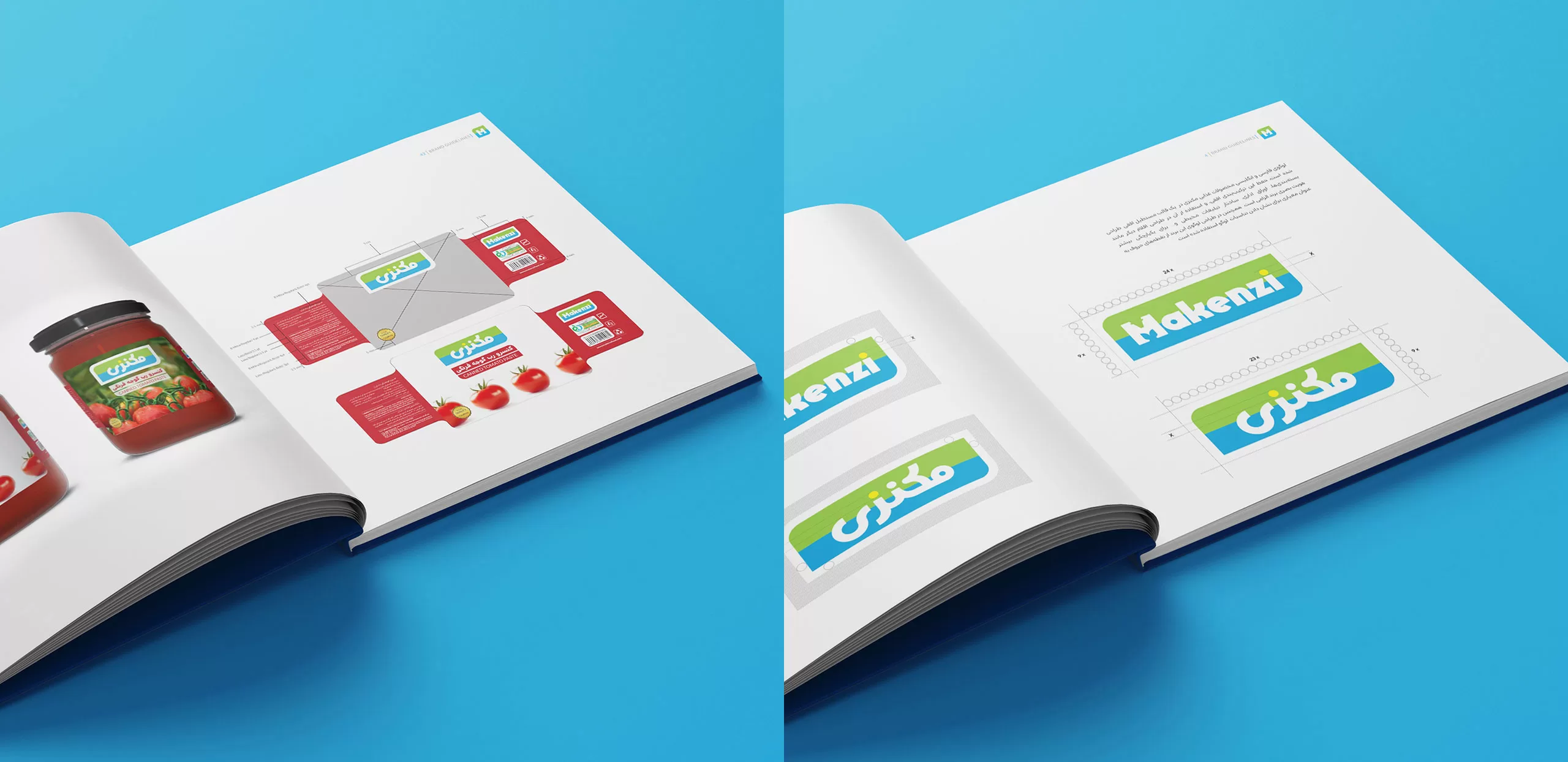
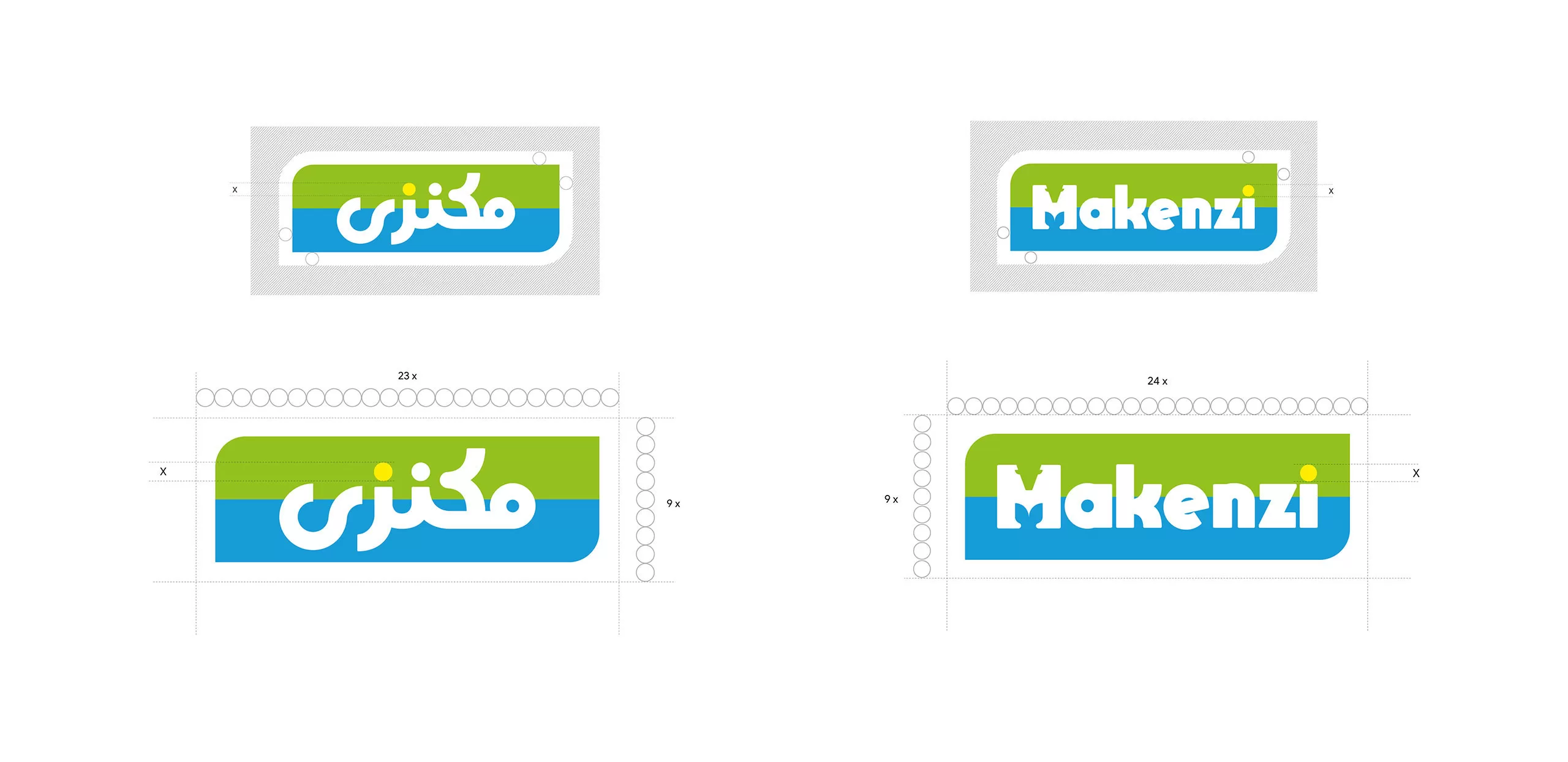
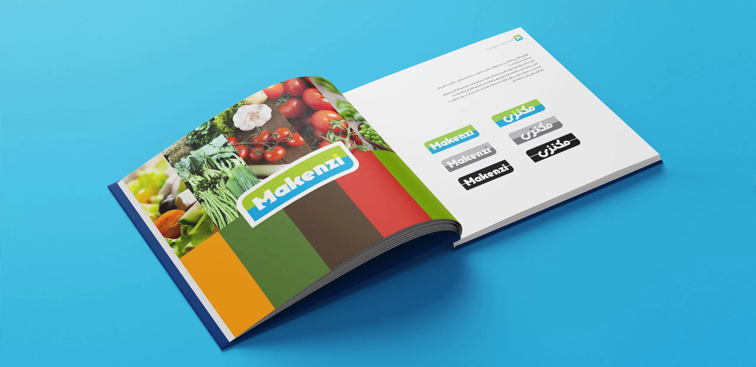
Developing the structure of the logo, Persian and Latin logotypes, and the structure of the packaging of various products were among the most important phases of Mackenzie’s visual identity design guidelines, because maintaining the brand’s visual integrity is largely conveyed to the audience by observing these structures.