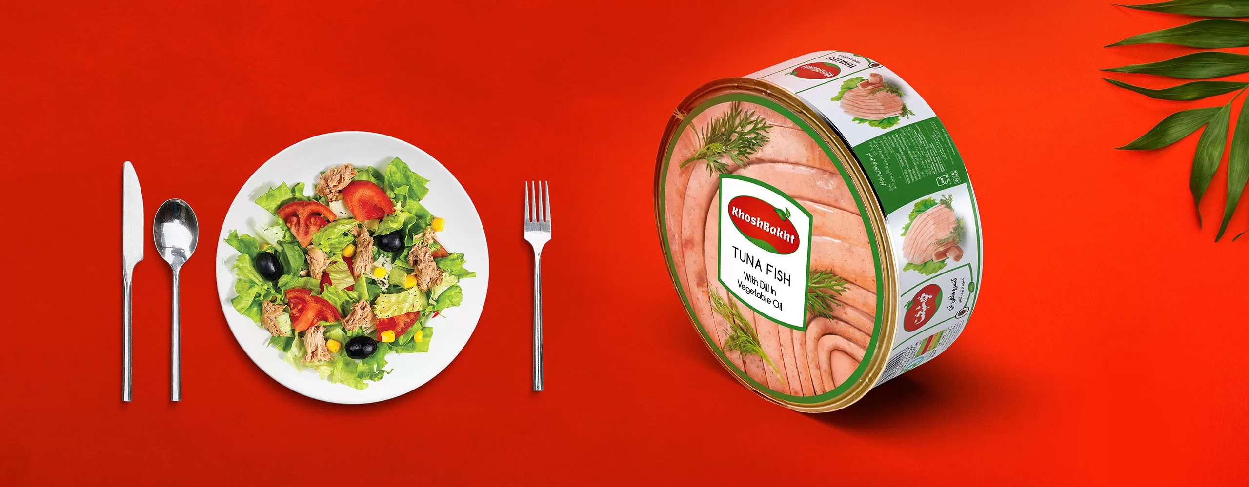
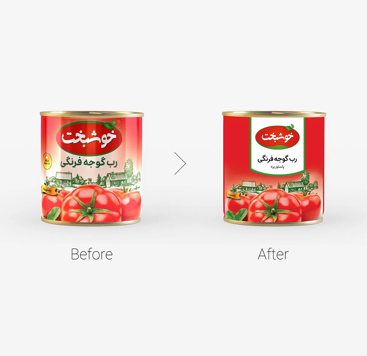
Khoshbakht is an active brand in the field of food products. In this project, by examining the relationship between the name and the product portfolio, we realized that the intended audience of the Khoshbakht brand is families, and the biggest challenge was to design an integrated identity that would establish a close relationship with families.
Experience
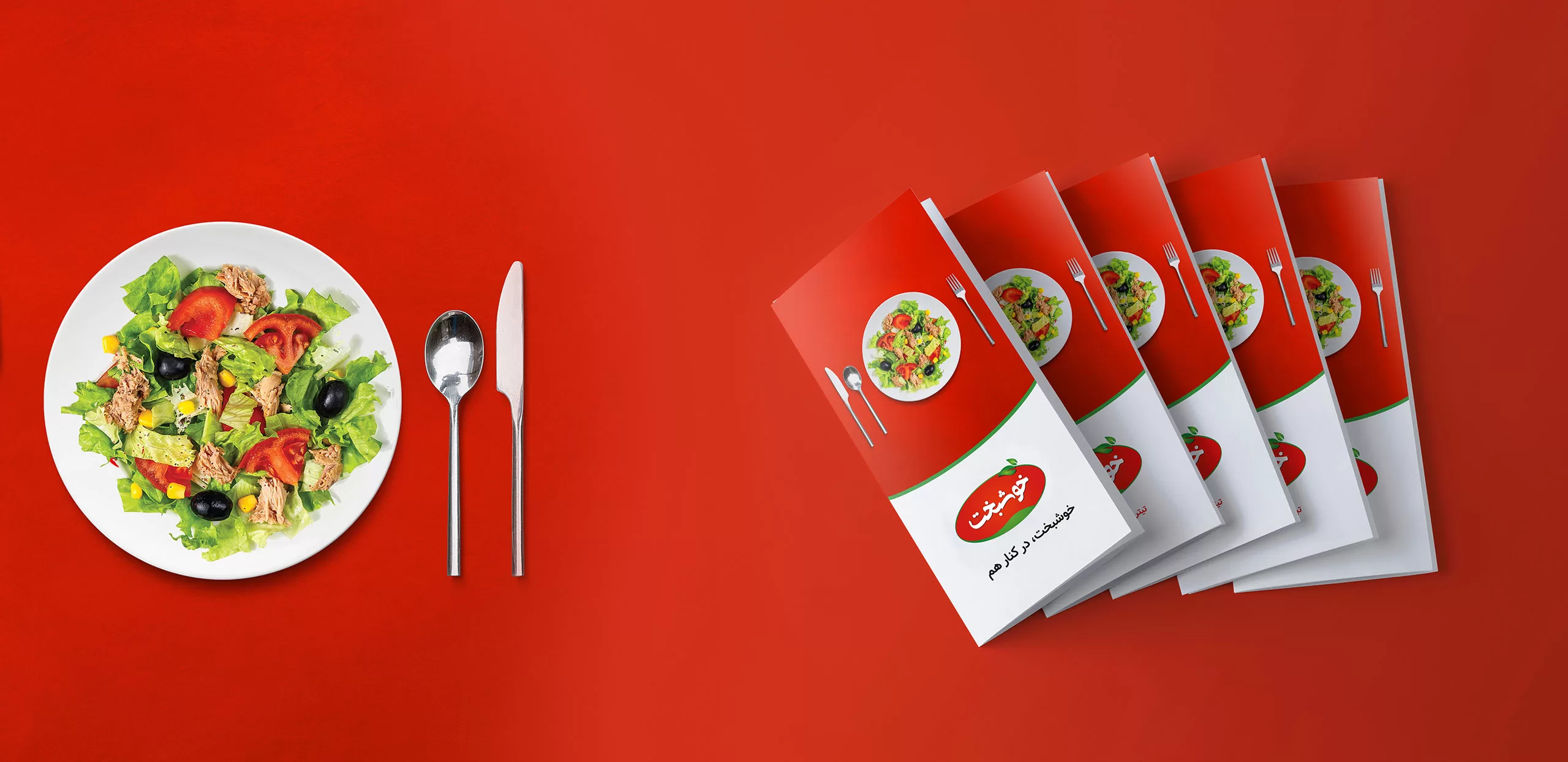
During a study conducted on the Khoshbakht brand audience, we found that one of the important things for families is being together and spending time together. Therefore, during the identity design process, this principle was taken into account, so that in brand communications, we also tried to create the concept of being with family in the minds of customers. For this purpose, the tagline “Khoshbakht together” was designed and brand communications programs were developed with this view.
Brand Visual Identity
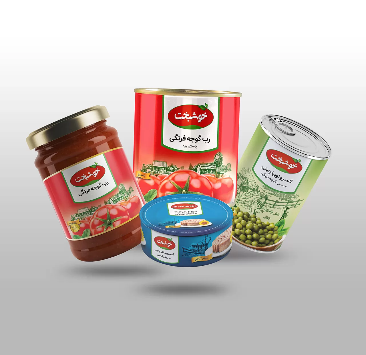
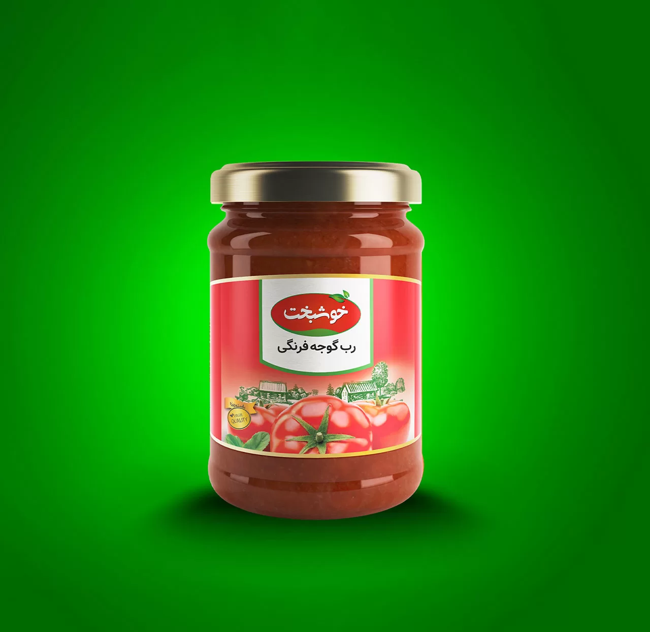
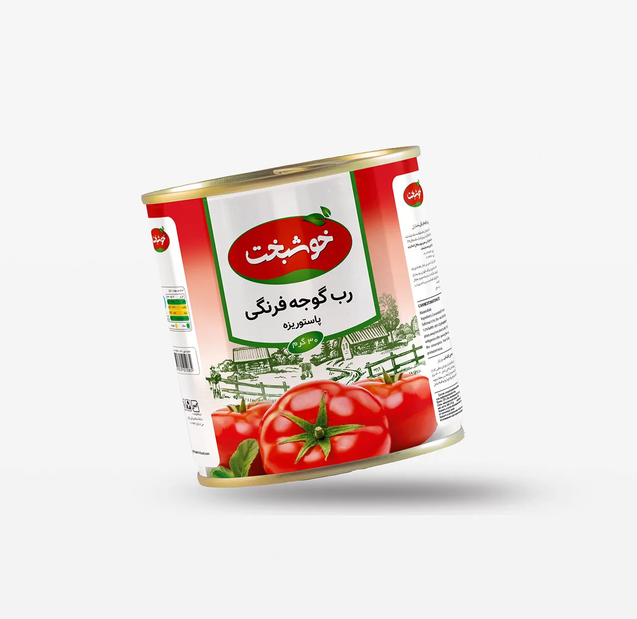
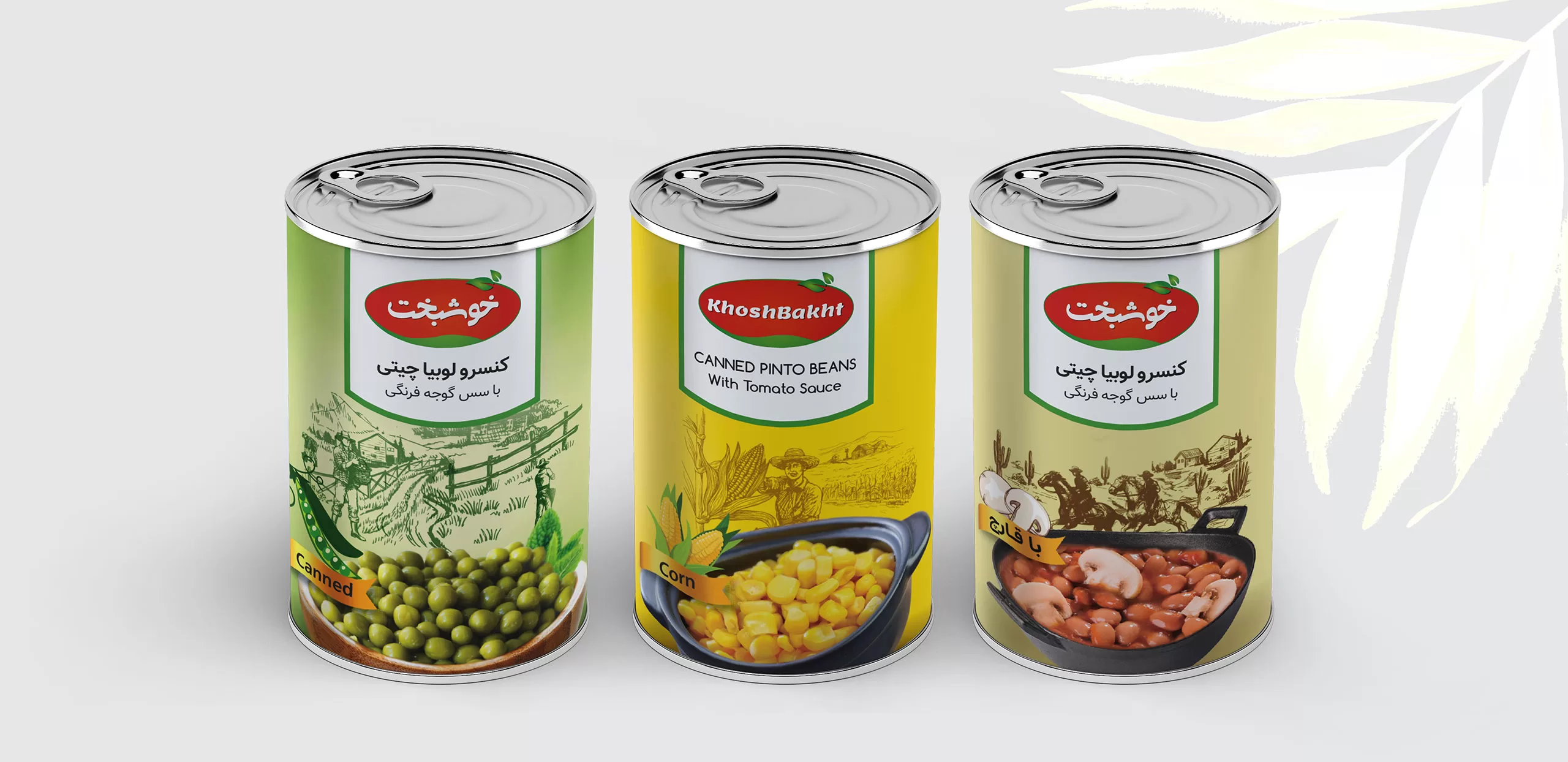
Given the importance of packaging in food brands as the main point of contact with the audience and customer, developing the packaging structure of Khoshbakht food products was the first priority in the visual identity guideline section of this brand.
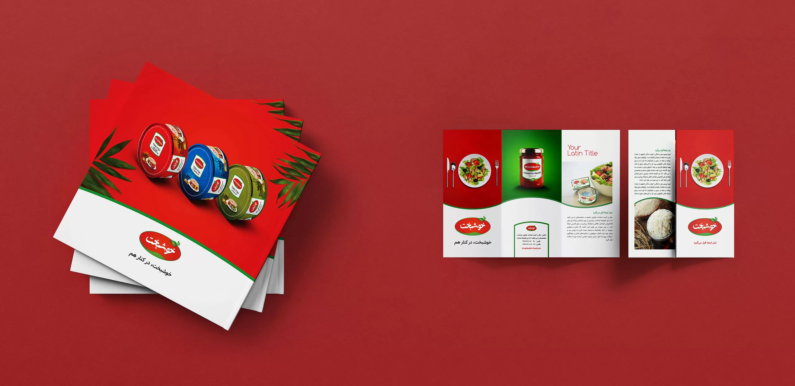
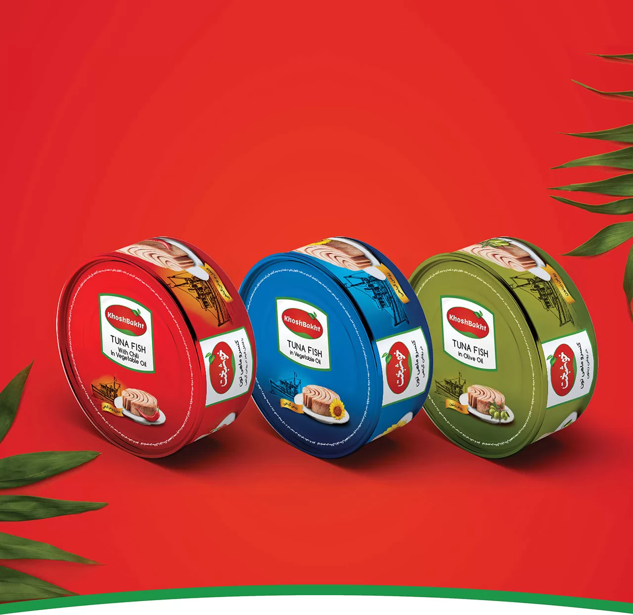
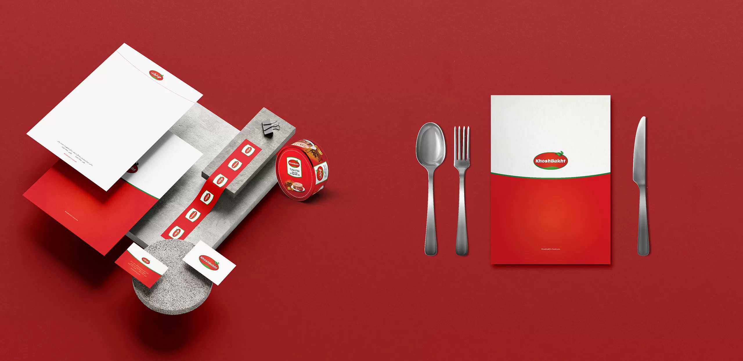
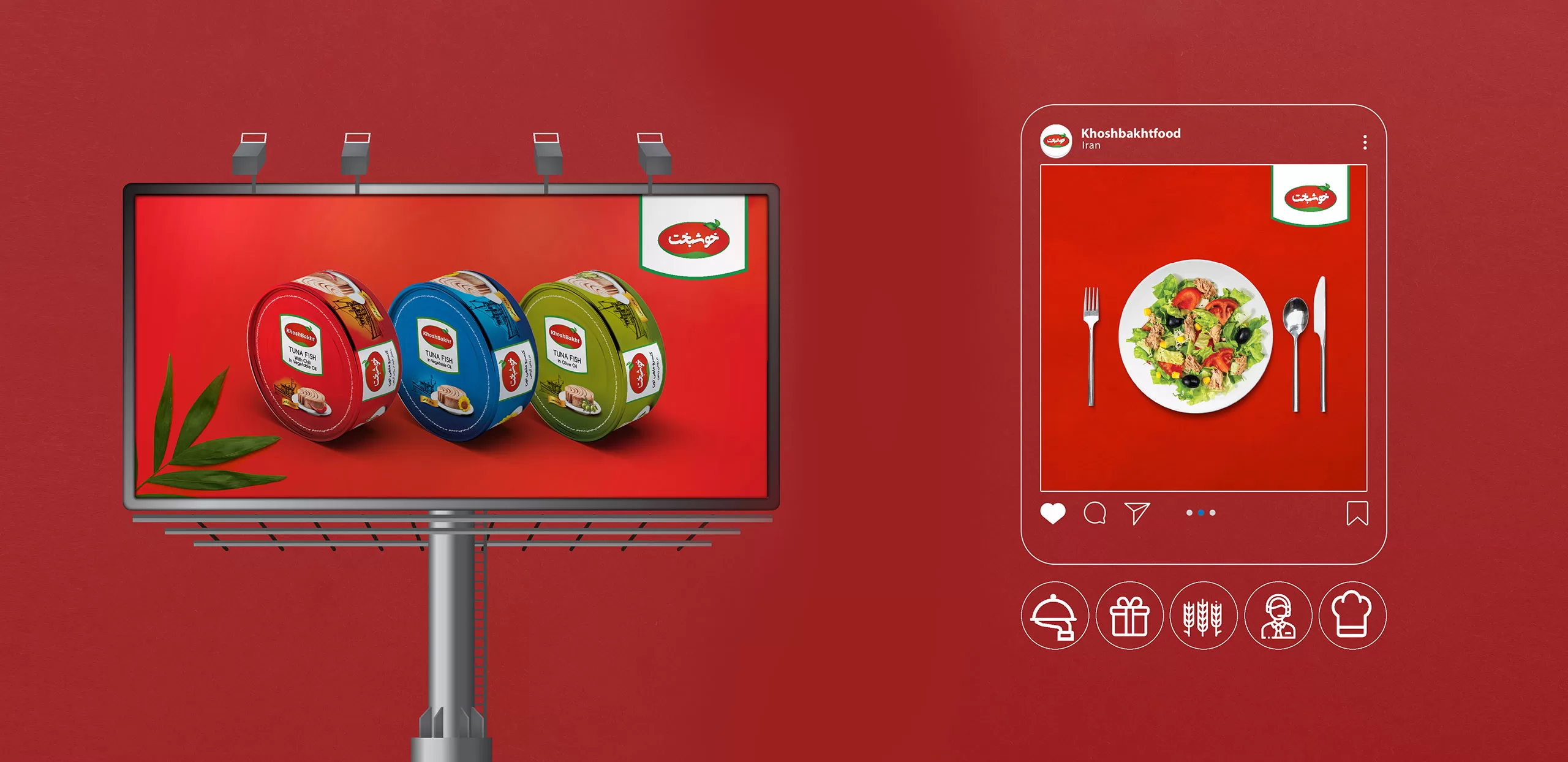
After designing the initial logo structures, standard colors, logo safe margins, logo placement boxes, brand fonts, etc., which were considered as brand visual identity requirements in the first phase of the guideline, other brand touchpoints such as digital space, outdoor advertising, product stands, shopping bags, and other brand items were designed and presented. All of these actions were designed in line with the brand strategy and with the central concept of “together”. For example, arranging products together for covers, advertising spaces, etc. are among these.