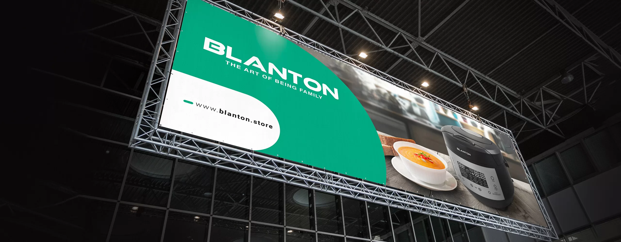
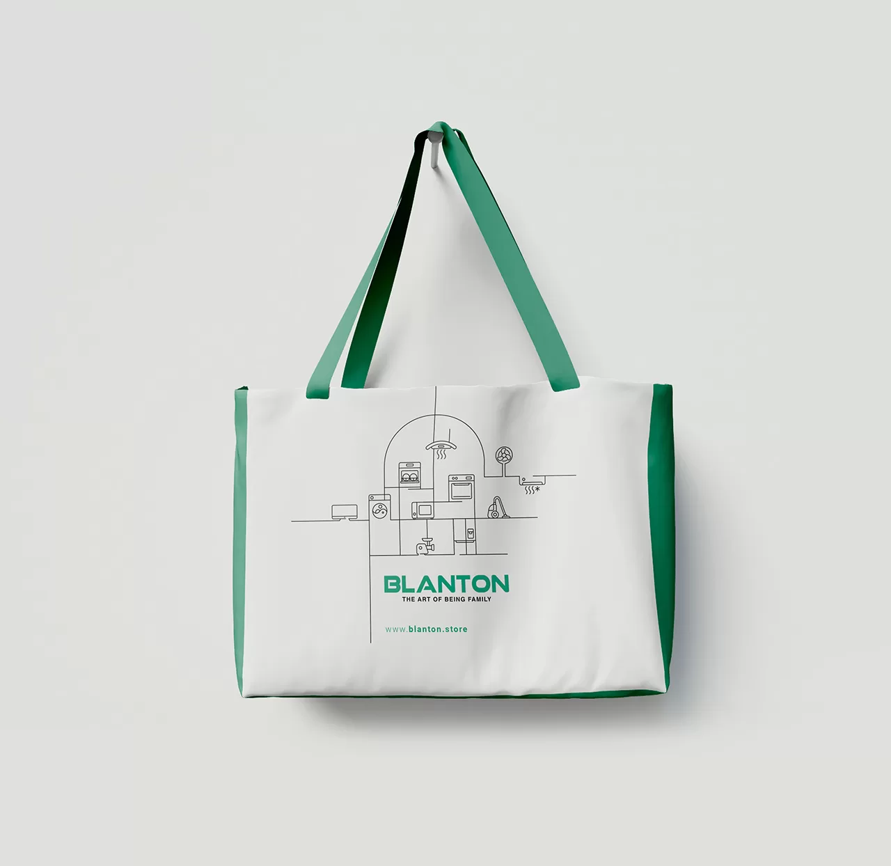
Blanton is an active brand in the home appliance industry that is considered a newcomer to the industry, but the experience of its founders in this industry has allowed it to capture a significant share of the market in a short time. The main features of this brand include its complete portfolio, which includes almost all home appliance products. The main challenges of the brand include the following:
1- The lack of a specific brand strategy for the integration of programs inside and outside the organization
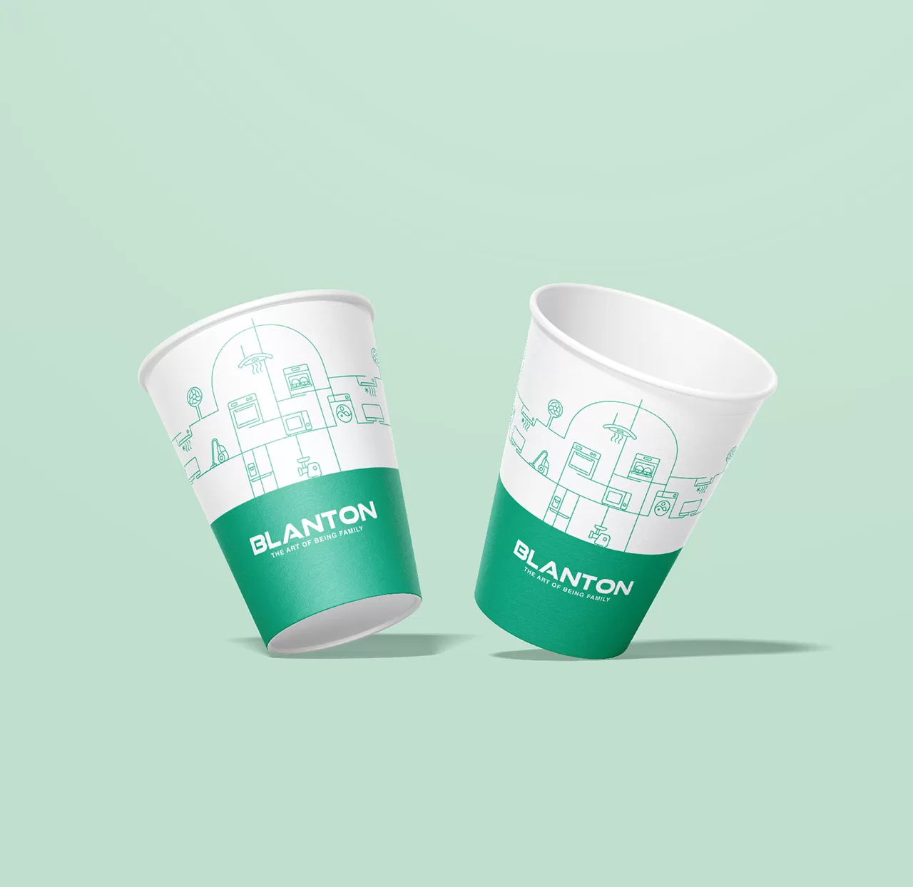
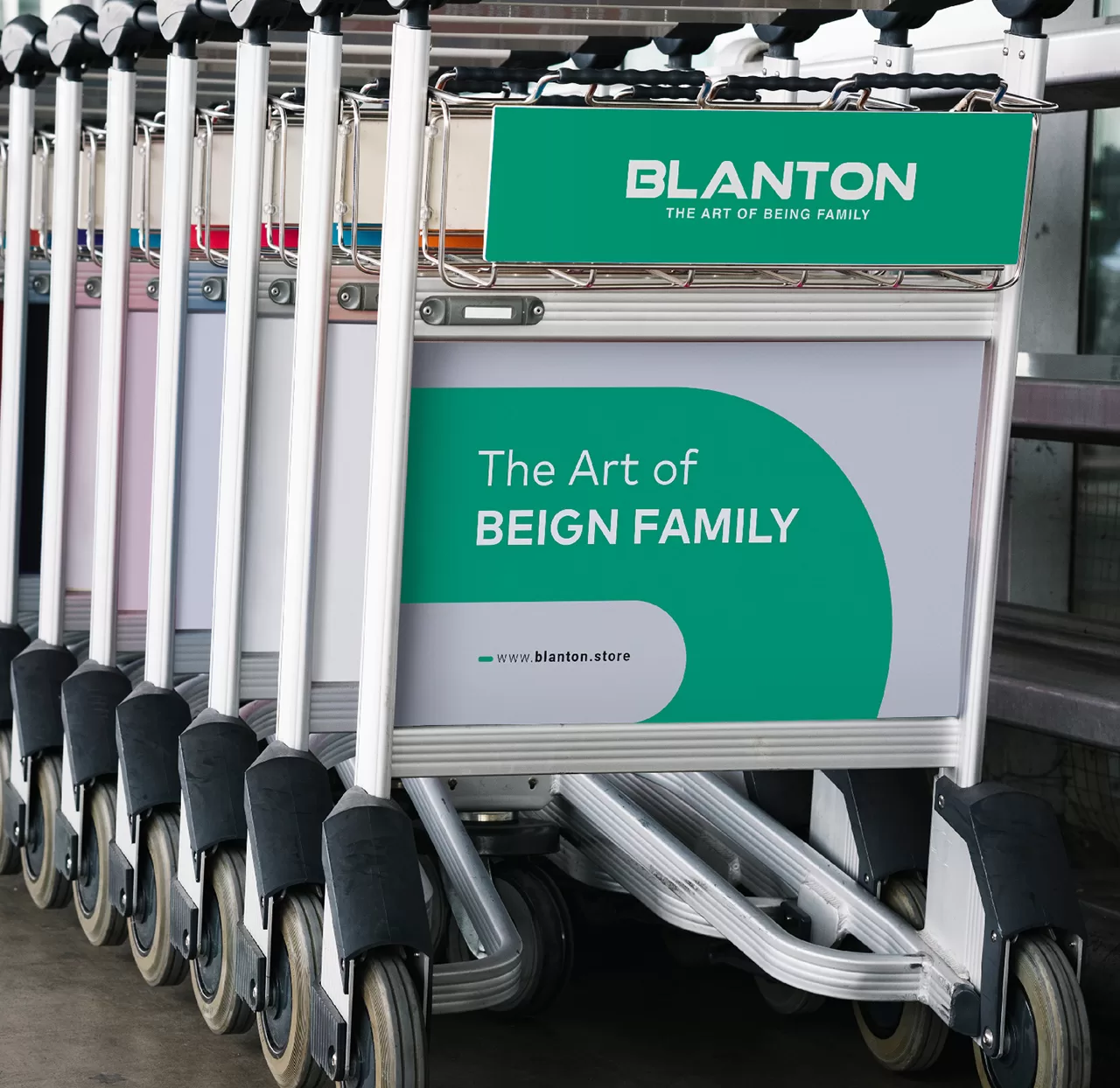
2- Lack of integration in visual elements such as packaging of various products, vending machines, store decor, etc.
3- The brand is unknown among end consumers and, consequently, the high bargaining power of the distribution channel in commercial transactions.
Experience gained
Brand research was conducted using qualitative methods and in-depth interviews to discover the expected benefits of customers, the strengths and weaknesses of the organization, and the insights of different layers (internal employees, suppliers, distributors, and end consumers). After detailed brand research studies, Blanton’s strategy was developed so that, in addition to creating brand differentiation among competitors, Blanton’s products would be placed alongside the family in line with identity and by combining art and technology, and ultimately be a brand related to the trends and needs of the younger generation. Based on this, Blanton’s brand slogan was designed as “THE ART OF BEING FAMILY”.
Next, in order to improve the brand’s weaknesses and maintain its strengths, operational plans were developed for the brand. And at the end of the project, a communication plan (including television advertising, holding events for the distribution channel, and strengthening the content production program on social networks) was developed to convey the new identity to the minds of the audience.
Brand Visual Identity
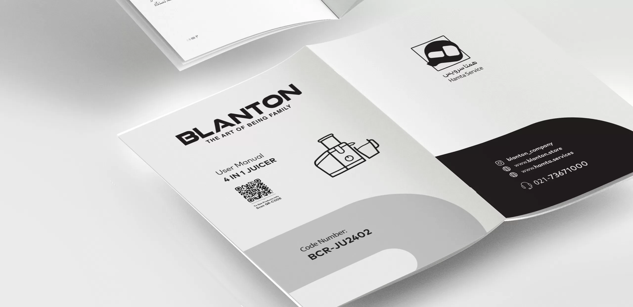
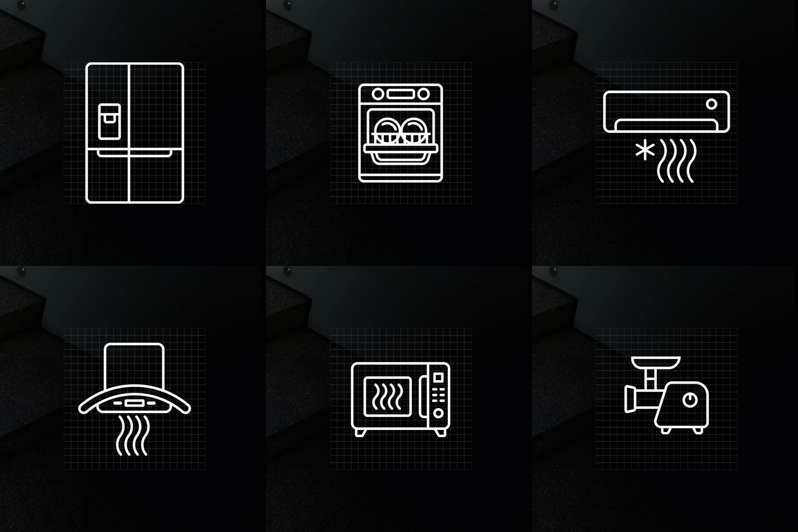
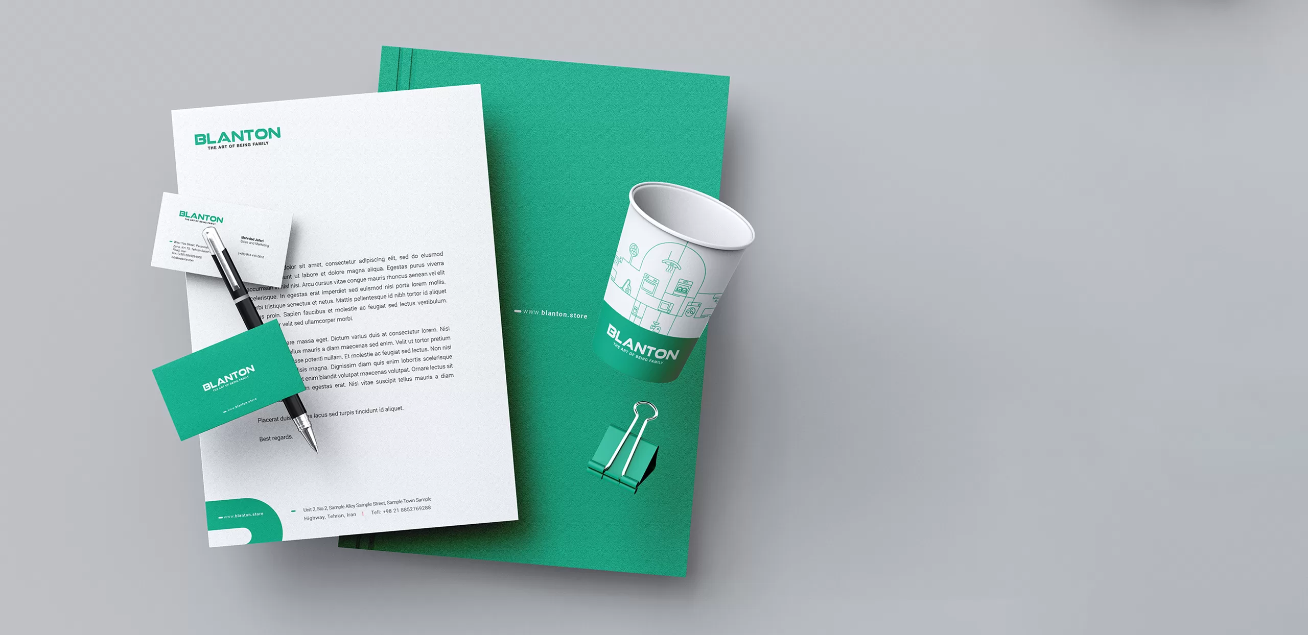
The main challenge in designing Blanton’s visual identity was the wide variety of products and the lack of recognition of this brand for the audience, so it was necessary to design the different parts of the visual identity guideline in such a way that over time and with the continuous use of fixed elements such as color, form and integrated icons, the audience would reach the necessary awareness of this brand.
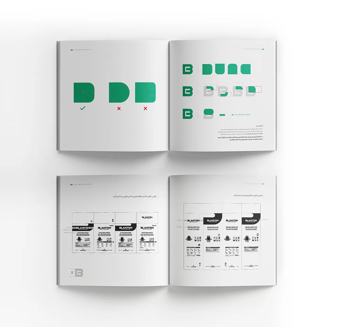
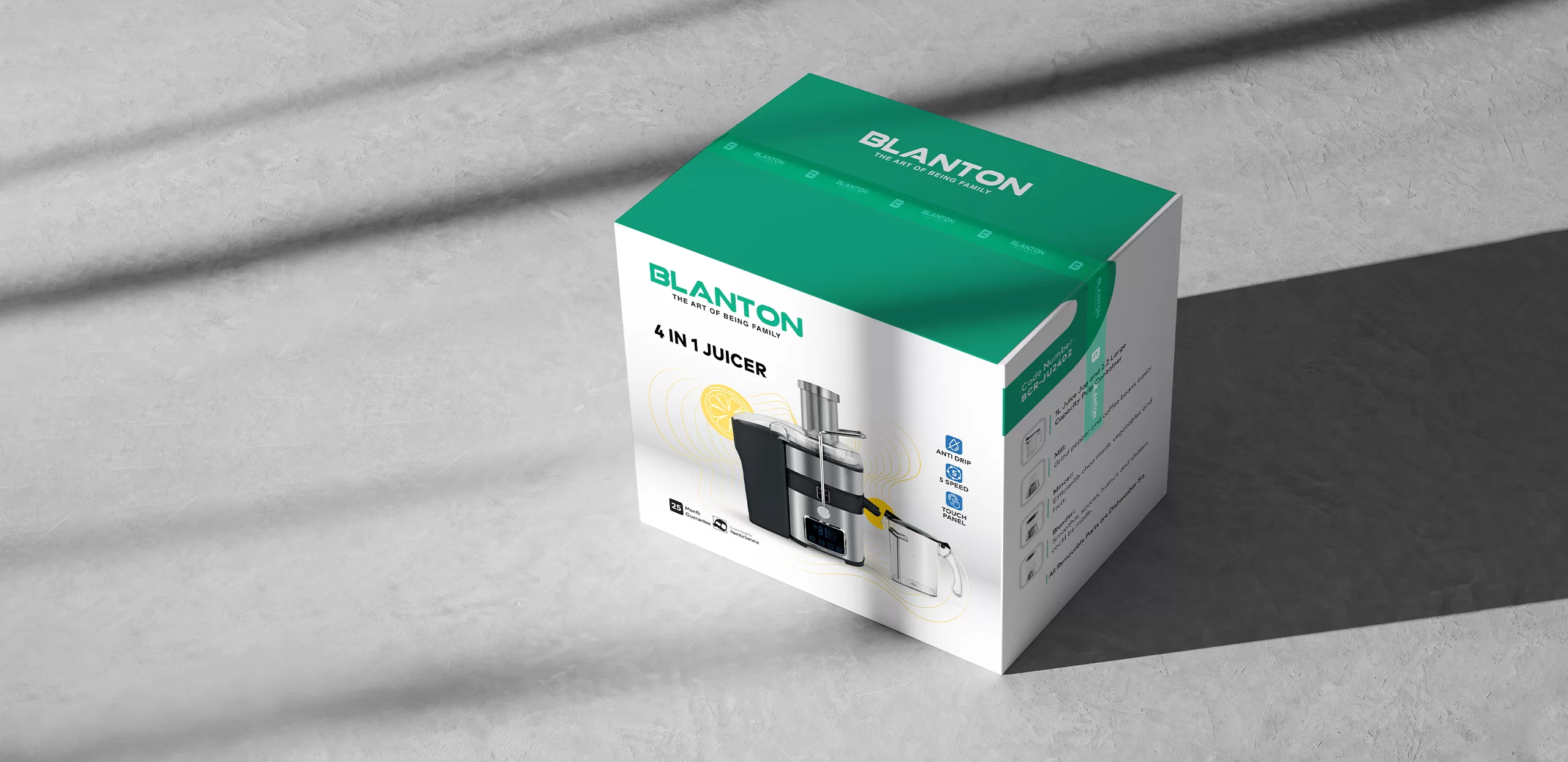
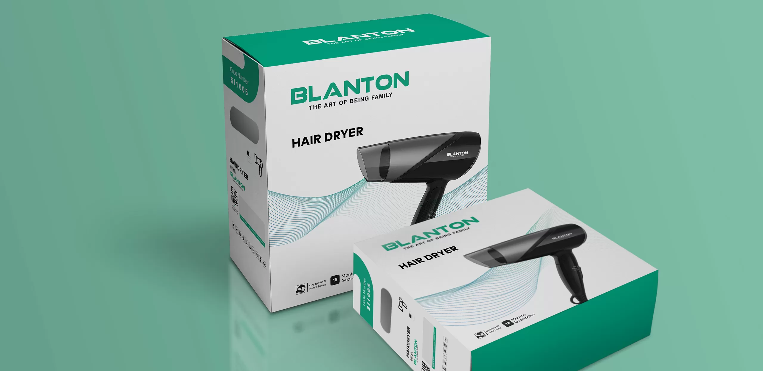
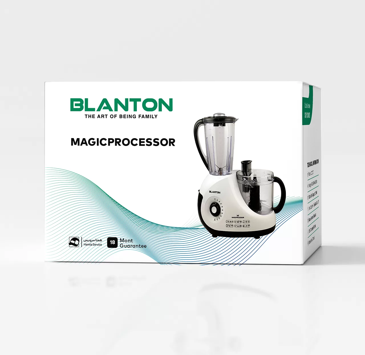
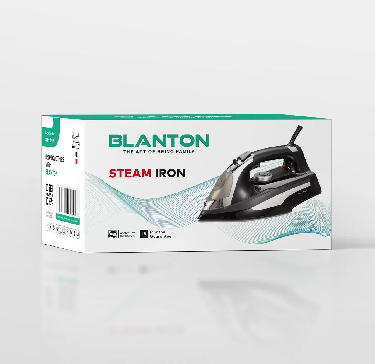
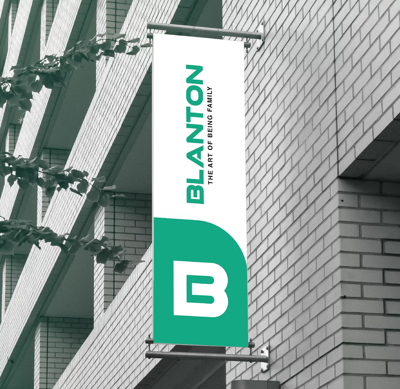
For this reason, the curves in the letter B were used as forms to help in designing various touchpoints. One of the main of these touchpoints was the product packaging.
The main goal in designing the packaging was to identify all of them as members of a family at a glance. In this regard, in compiling the visual identity guideline, rules and frameworks were determined that would cause the logo to be seen on all packaging with constant proportions and characteristics. The bright and transparent color space of the packaging should evoke the personality of the brand and the product category, and most importantly, the main color of the brand should be seen in constant aspects of the packaging. Also, the curved form derived from the letter (B) was used as a fixed element on the side faces of the packages and the location of the product code.