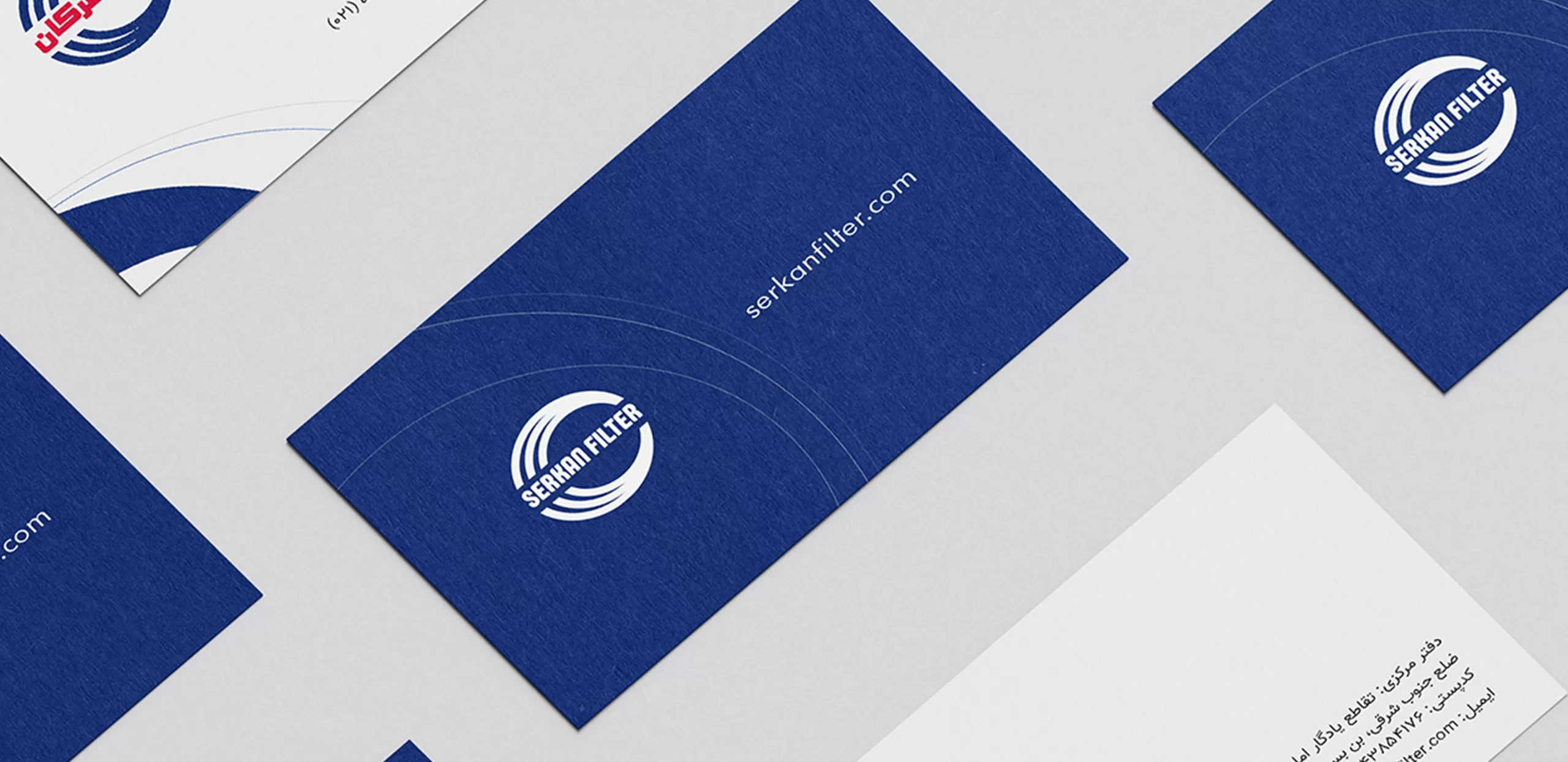
Old and authentic brands such as Serkan Filter need to change and evolve to keep up with the current trends. Issues such as distribution and communications need to be constantly adapting to the identity and adapting to the conditions by relying on brand identity variables.
Challenge
Old and authentic brands are national assets. Like historical heritage, every small touch must be accompanied by knowledge and research. Therefore, it was necessary to create an identity-based model by relying on research variables to prevent errors in these changes.
Experience gained
At the beginning of the journey, brand architecture design was carried out for all subsidiary brands and Serkan Industrial Group was formed. Accordingly, the brand identity of the group and Serkan Filter was defined and based on it, all marketing, communication and sales programs were redefined.
Currently, the Serkan Filter brand is a brand that sets its own market standards and is operating as a market leader. The brand has succeeded in creating a growing relationship with its main audience and familiarizing and aligning the factors affecting the distribution chain with its brand identity.
“Serkan Industrial Group, a credible experience”
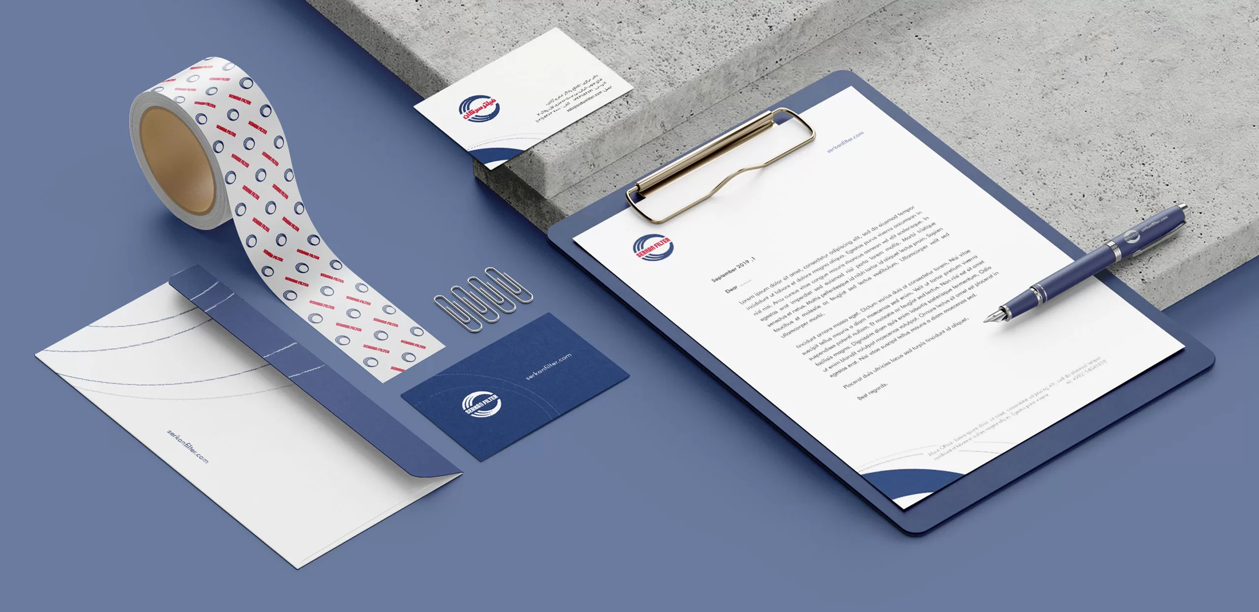
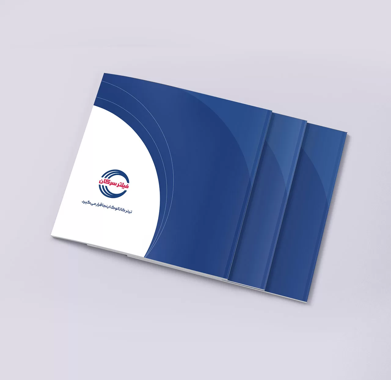
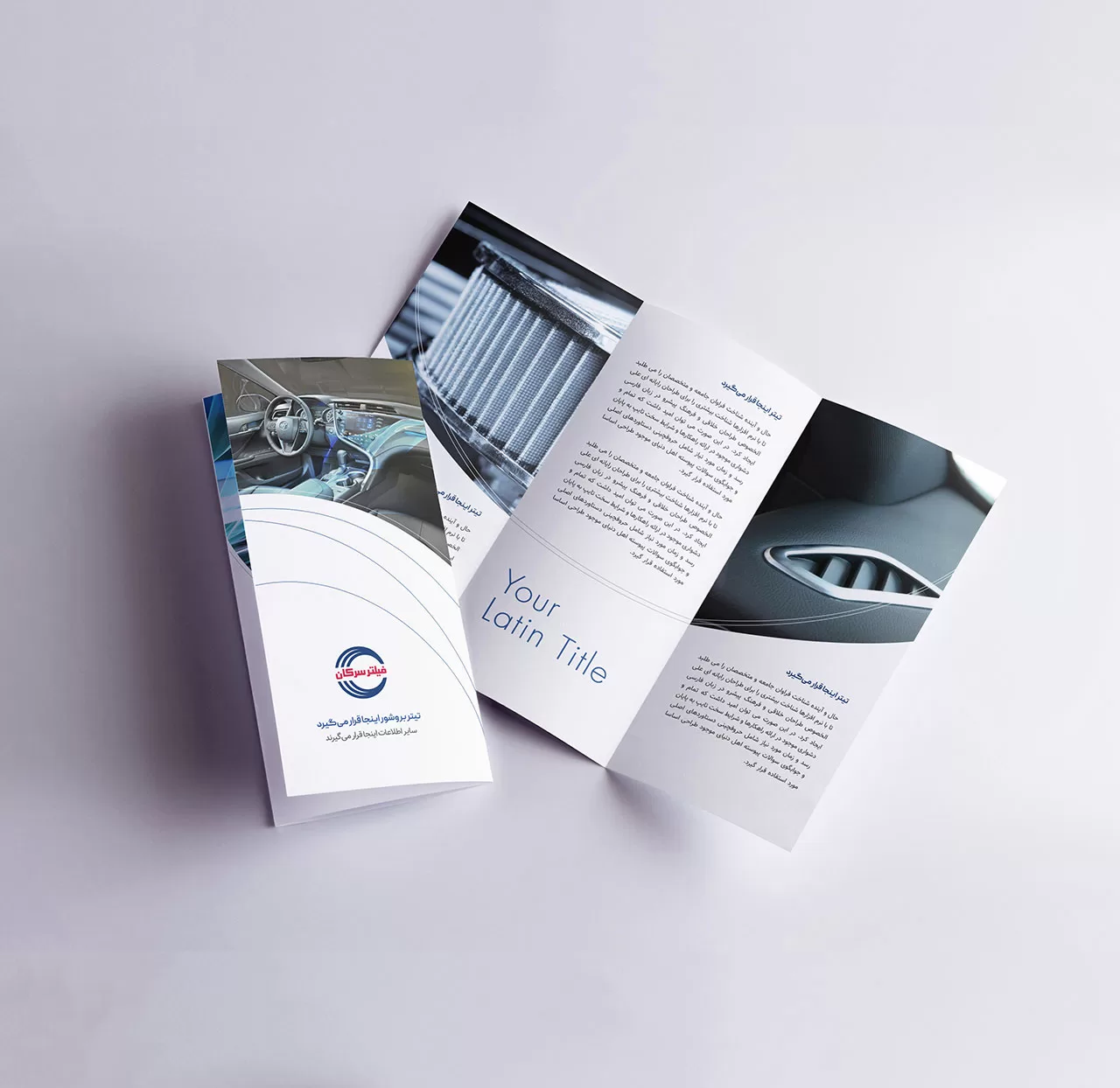
Brand Visual Identity
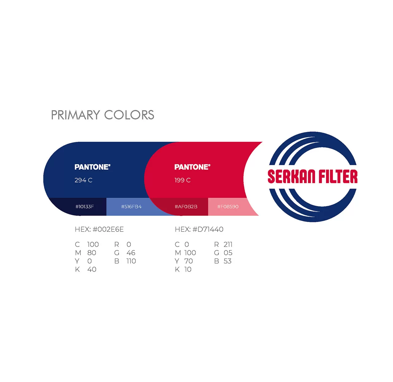
According to the brand architecture discussed in previous posts, in the logo design of “Serkan Industrial Group”, the forms, initial idea, and colors of the visual identity of Serkan Filter, which was a long-standing and well-known brand, were preserved in order to establish visual harmony with the parent brand by standardizing and expanding them to other subsidiary brands.
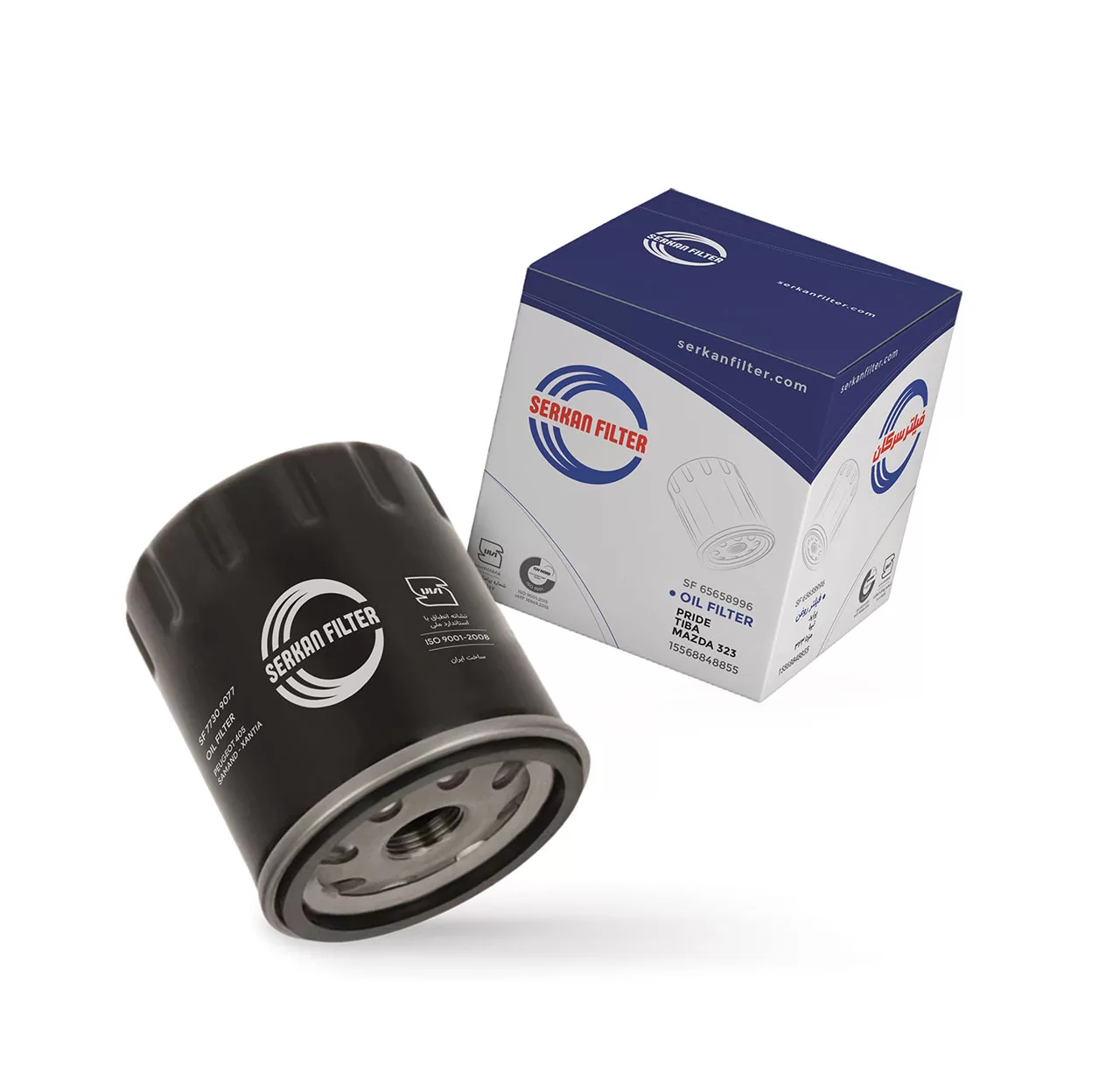
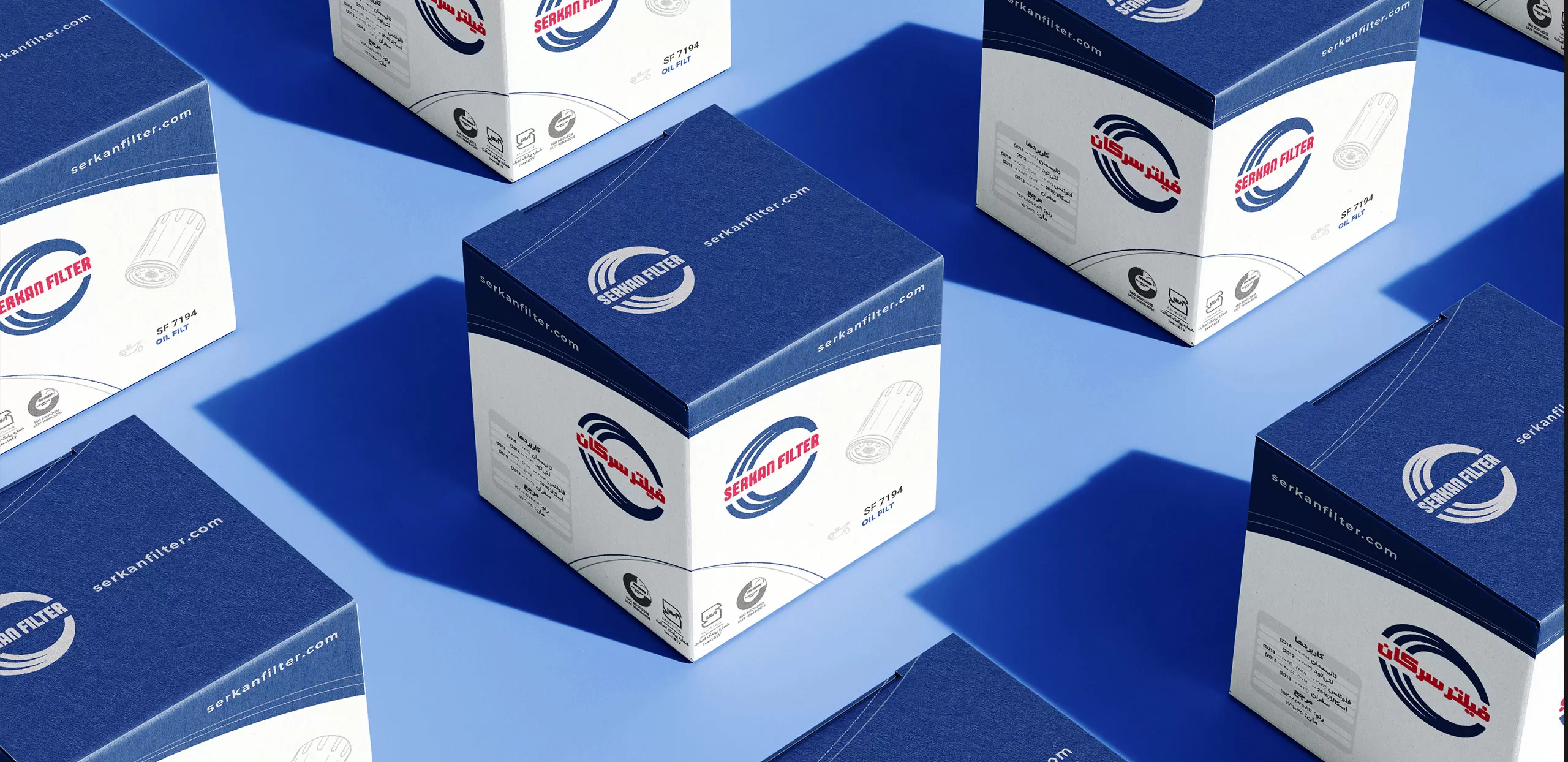
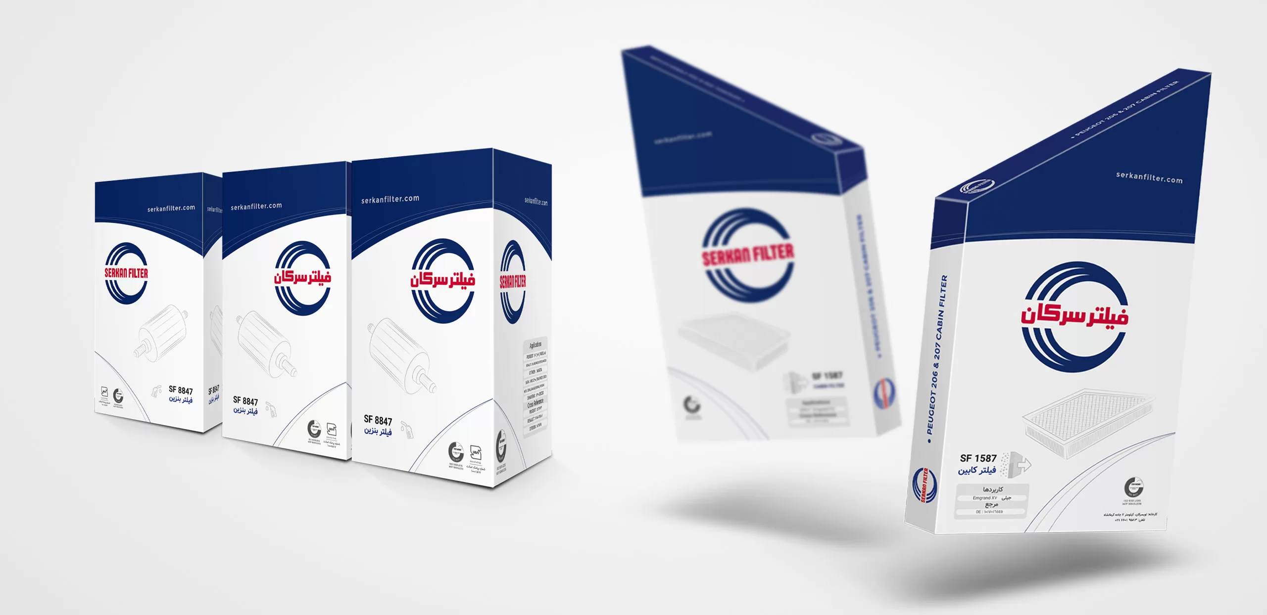
Due to the similarity of the boxes to each other, the packaging of Serkan Filter products needed an element to differentiate the products at first glance. The results of the research showed that this problem could be solved by placing a photo of each product on its box, but on the other hand, the packages should be designed in such a way that visual clutter and clutter would not be created by arranging them next to each other on the shelves.
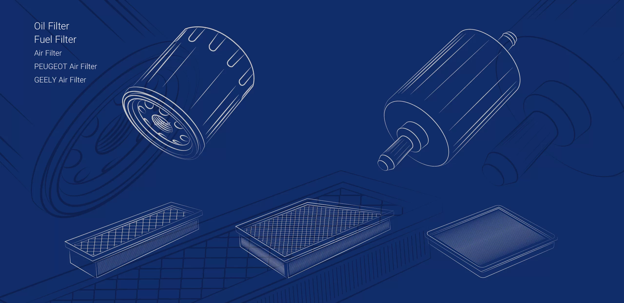
Therefore, in order to display the products inside the box and also to keep the appearance of the boxes simple, linear illustrations of the products in gray were used in the packaging design instead of photographs.