Designing Brand and Product Architecture, Developing the Identity and Strategy of the Main Brand
Brand Challenge
The Bartar Food Industries brand faced a multitude of product categories. The multitude of products made it difficult to be under the umbrella of a single brand. This multitude of different products made it difficult to focus on sales, and the main brand did not have a specific association in terms of products in the minds of the audience, which caused it to lose its position as the first choice.
Experience
Market research was conducted at different levels for Bartar. In this research, ordinary consumers in the three provinces of Tehran, Kerman and Gilan were studied and various indicators, such as brand awareness, brand recognition, brand recall, brand preference, etc. were extracted for different products. Then, the image of the Bartar brand in the minds of consumers was obtained and a clear path was created for designing the brand architecture. Finally, the Bartar brand architecture was designed in such a way that related products were placed in one brand and other products in another brand, and a unified identity was created for the main brand.
According to the characteristics of the products, two different brands are formed in two areas: packaging-based products (dried fruits, legumes, etc.) and production and cooking-based products (canned food, etc.).
Brand visual identity
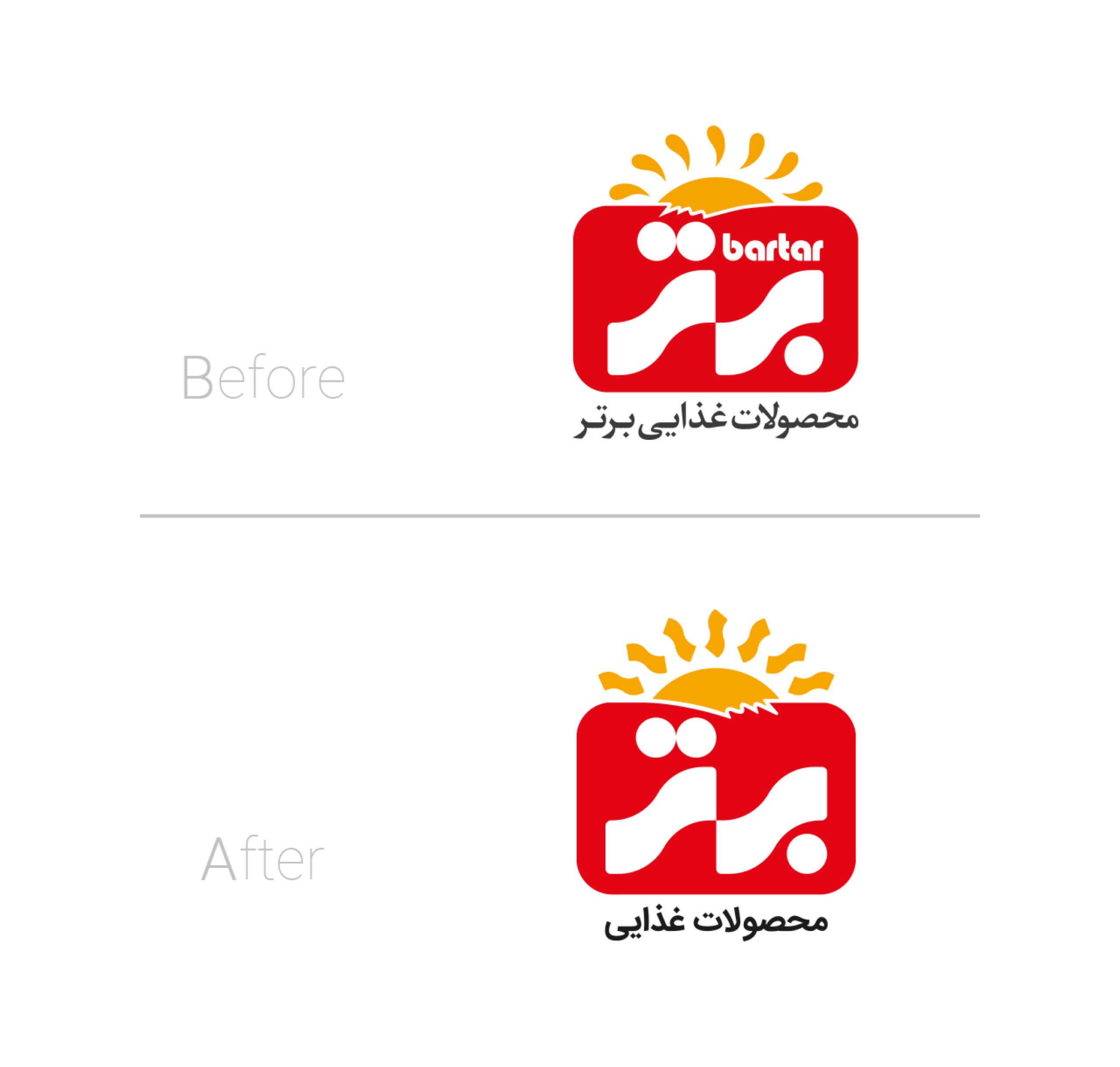
Brand research showed that the superior audience has a good association with the form (bar in Persian letter) of the superior logo. Therefore, in the redesign of the Persian logo, the form of letters (bar), which is a very dominant form in the Persian logotype, has been used as the rays of the sun. Also, due to the removal of English type from the Persian logo, the proportions of the logo frame were changed and the forms were better positioned in the new frame.
On the other hand, the superior brand faced the challenge of not being seen by the audience due to the lack of a separate English logo in the packaging of products in global markets. Therefore, in the redesign of the logo, the English type was removed from the Persian logo and its letters were modified based on the letters of the Persian type logo and the space of the logo frame to be used as a separate format.
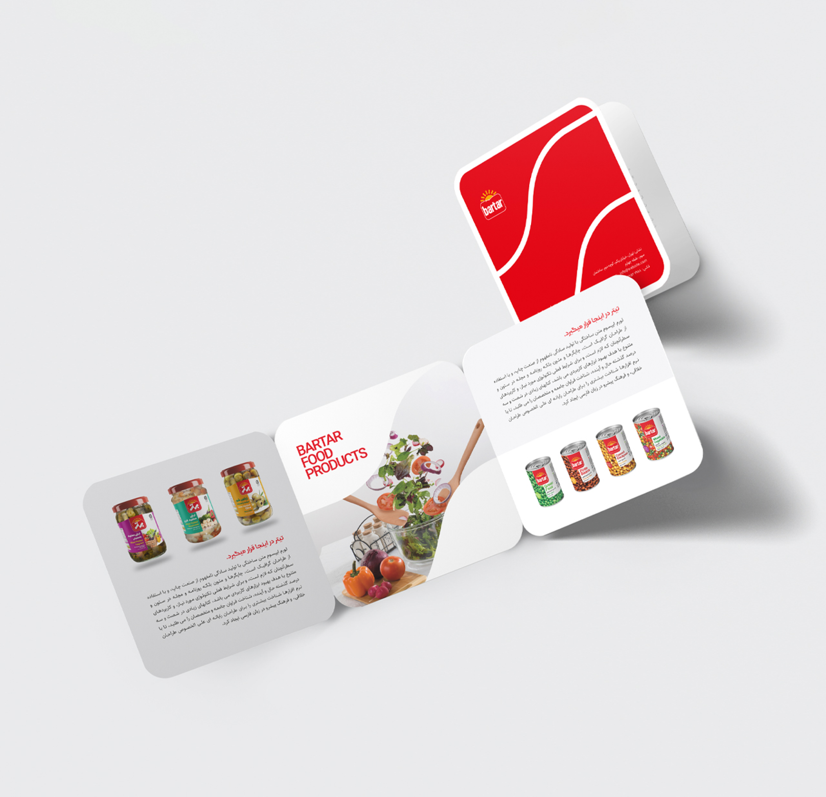
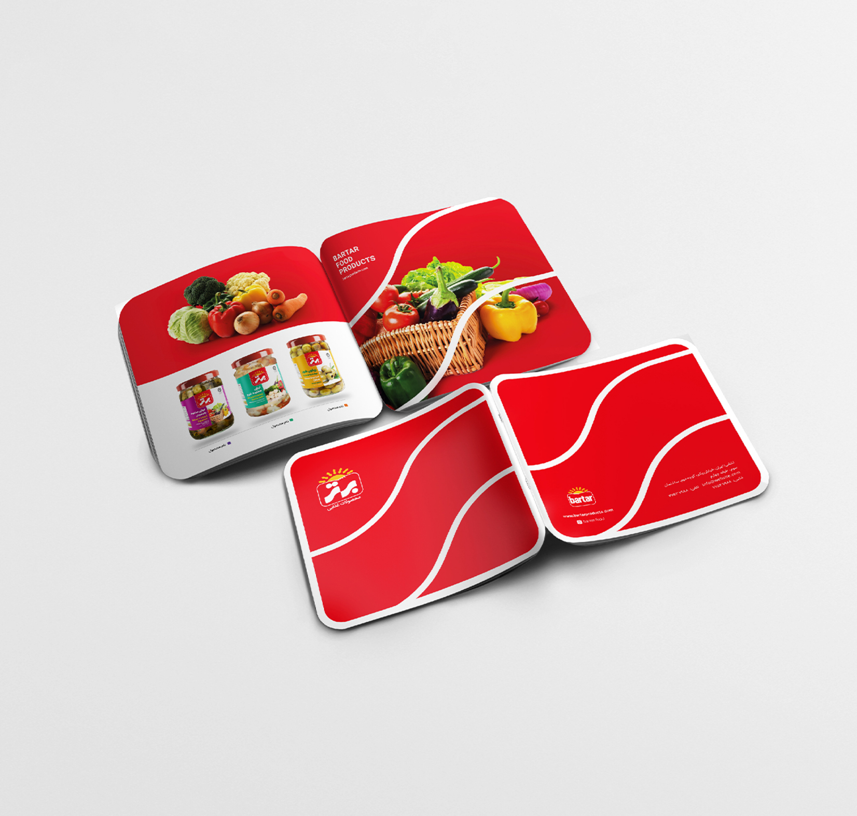
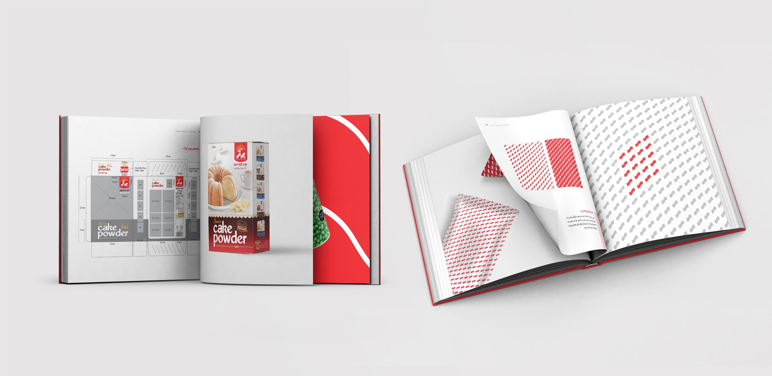
Also, in the design of the visual identity of the top brand, the forms in Persian type were introduced as fixed elements in the overall visual communication of the brand, and an effort was made to expand these forms well and based on the needs of the brand. Following this fixed design style will help the brand in the future, so that the audience sees all the brand’s touch points as a harmonious and integrated family.
developing the packaging
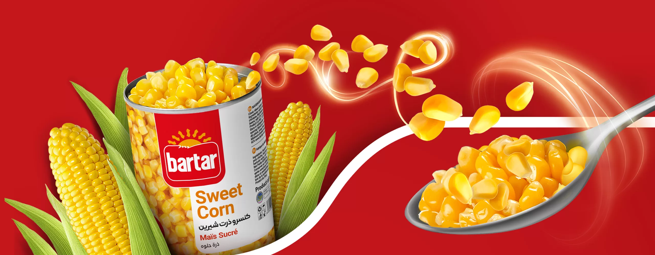
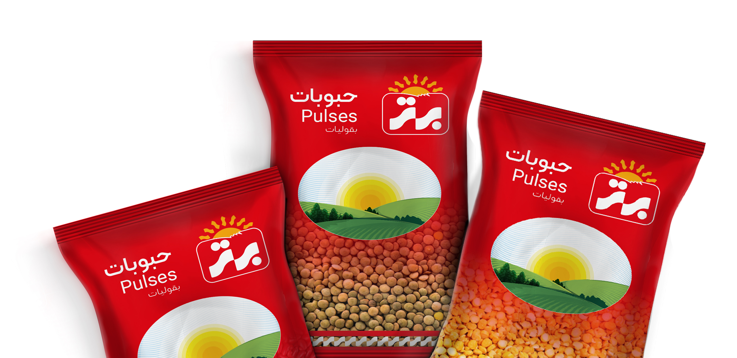
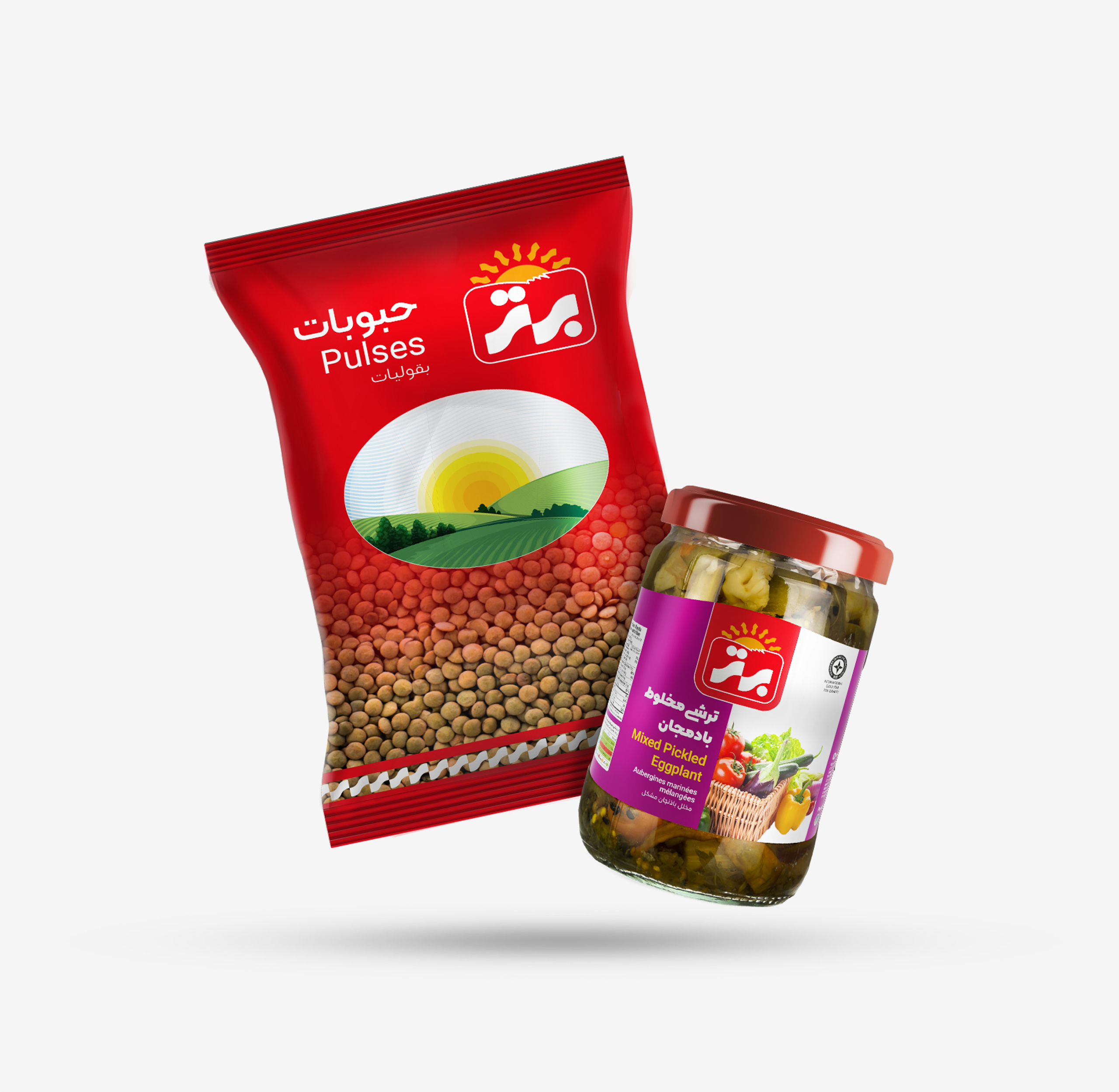
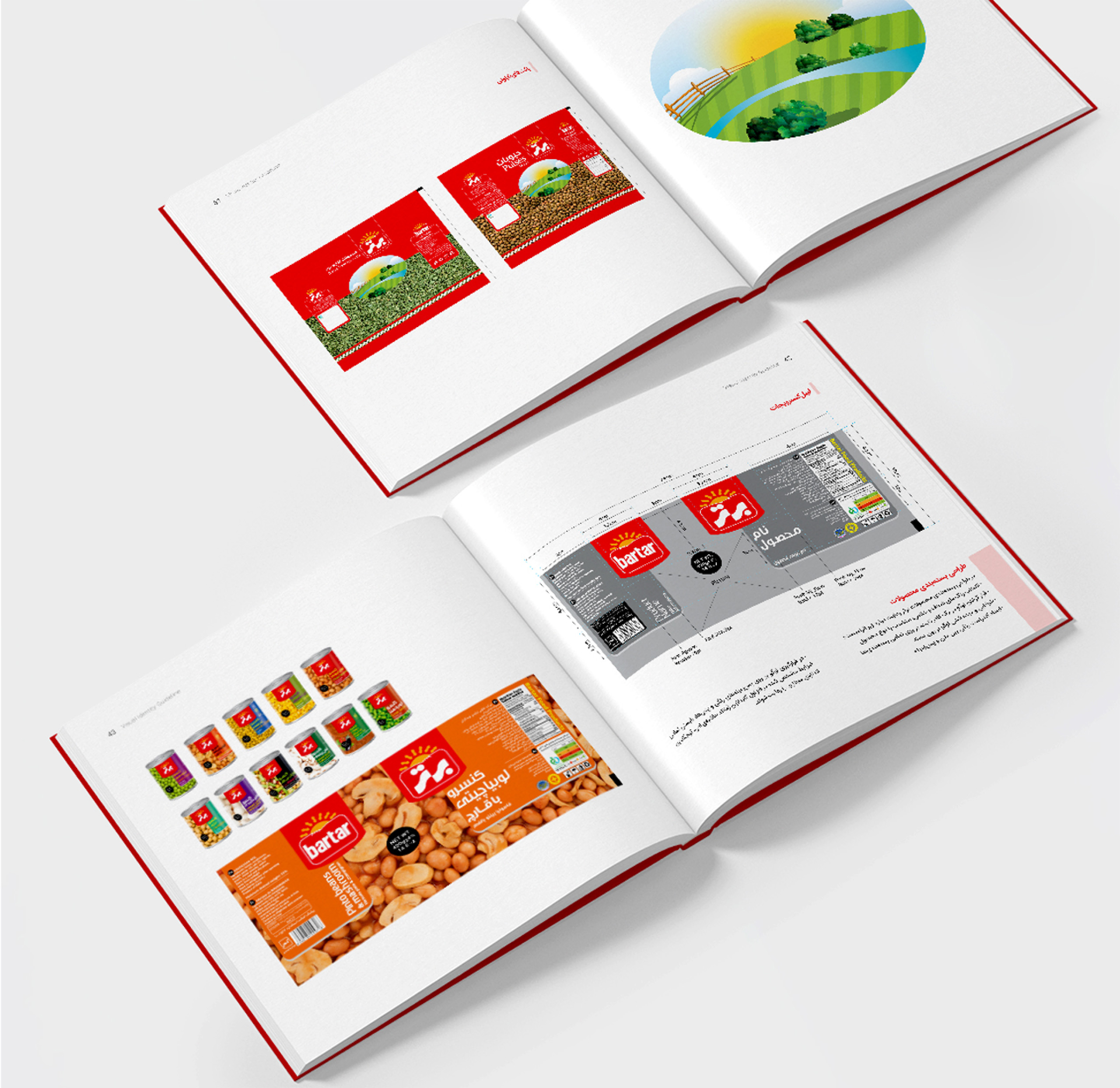
In developing the packaging structure of food products such as canned goods, pickles or legumes, the first challenge is the crowding of the sales shelves of these products in large stores. For this reason, in the redesign process of the top brand’s packaging, an effort was made to solve this problem by suggesting color corrections to help make the logo more visible and increase the readability of the writings, while maintaining the overall composition and structure of the packaging.