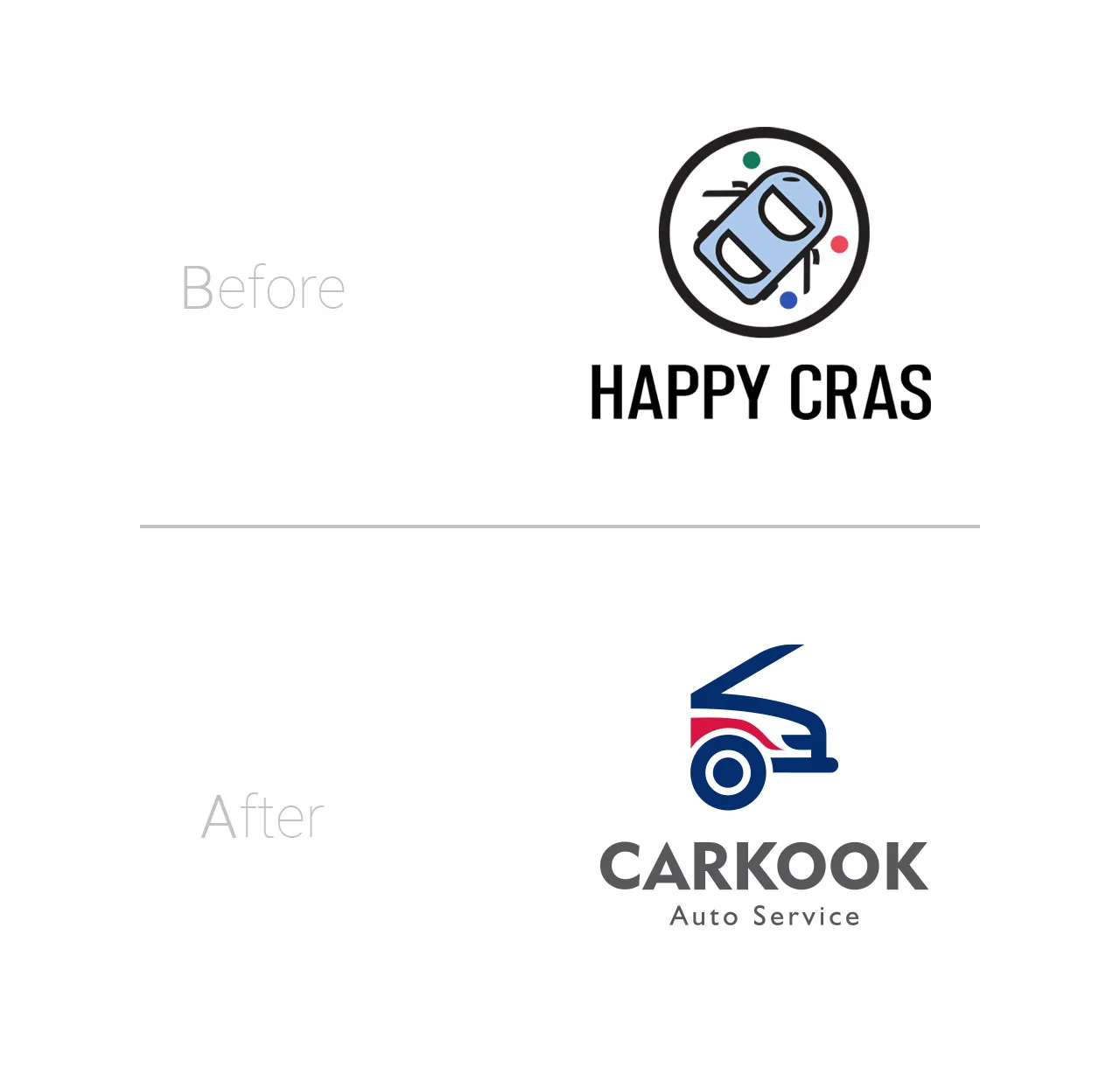
The Karkok brand is a brand that provides fast car services and belongs to the Serkan Industrial Group. This brand initially started with the name “Happy Cars” to provide services to its target audience, namely, audiences with a middle-income level. The challenge of this fledgling brand was that the target audience did not use the brand’s services due to the lack of recognition of the type of business and the lack of a suitable association in their minds. In fact, the association formed in the minds of the target audience was that the services were for the upper-class target audience and that the services were expensive. Another challenge for the brand was the lack of a specific process for providing services and also providing personalized services by the service personnel.
Experience
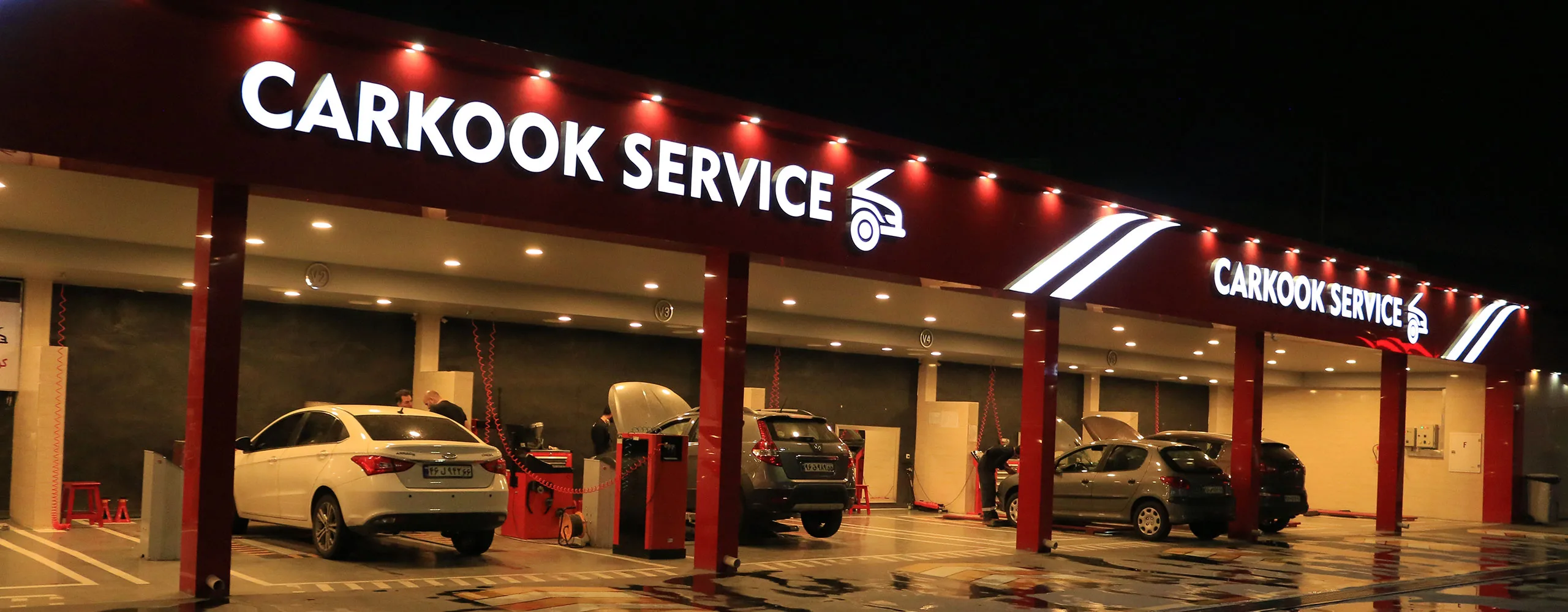
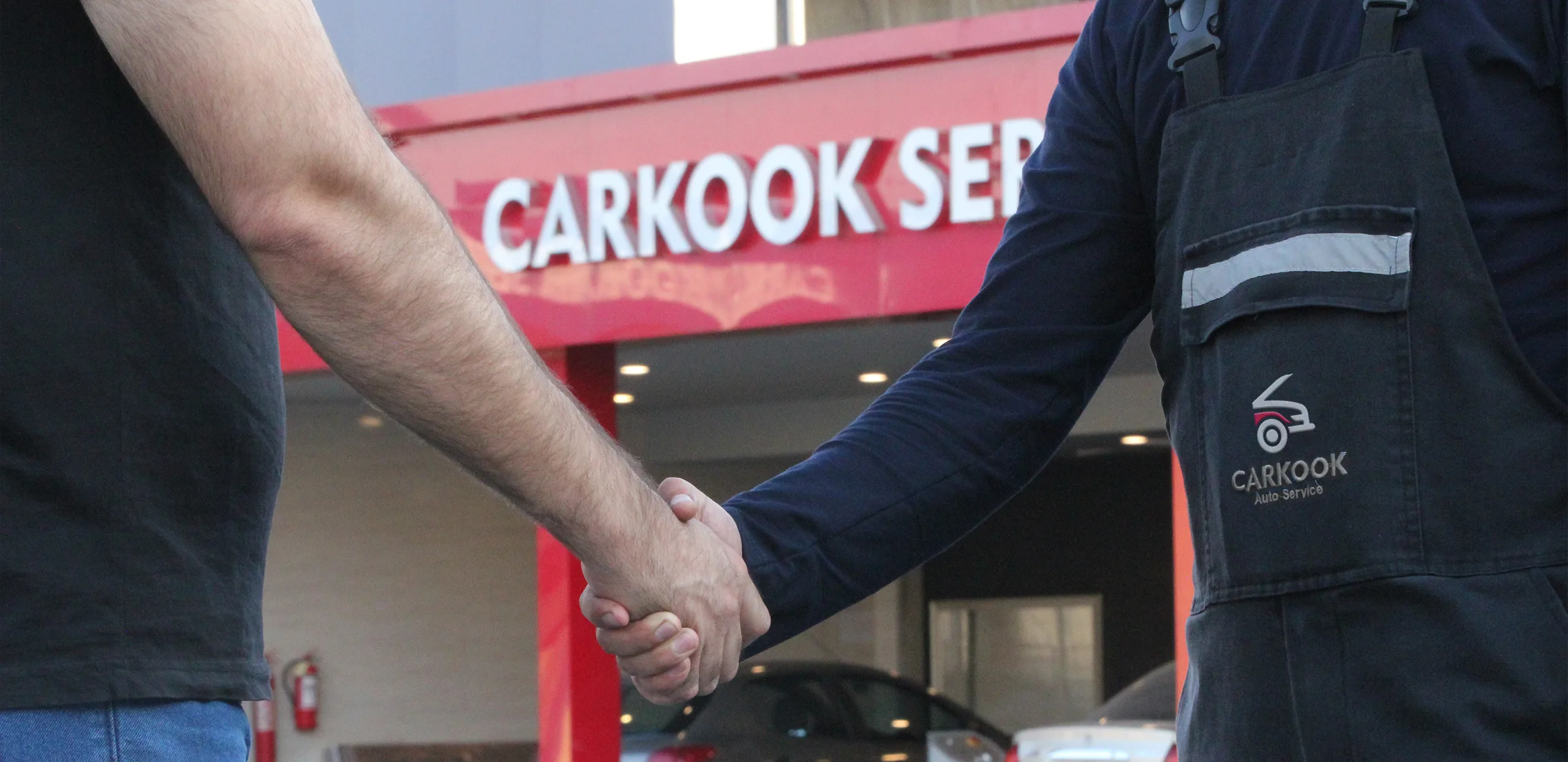
The Branding Agency’s research The results of the research conducted on the target audience showed that customers are looking for a brand that provides quality services at reasonable prices and has a distinction compared to dealerships and other auto services in the market. Therefore, a suitable name was initially designed for the brand; A name that evokes the services that the brand provides, and the name “Karkook” was the name that was considered for the brand. Then, considering the importance of the process in service brands, the brand identity of Karook was designed in such a way that executive activities were always carried out based on specific standards and separate checklists. In the meantime, it was necessary to use standard and up-to-date tools to provide services. On the other hand, due to the importance of the role of service personnel, behavioral and verbal guides were designed, and after designing visual elements appropriate to the brand identity, signboards were designed according to the visual guides and installed in different parts of the environment.
Brand Visual Solutions
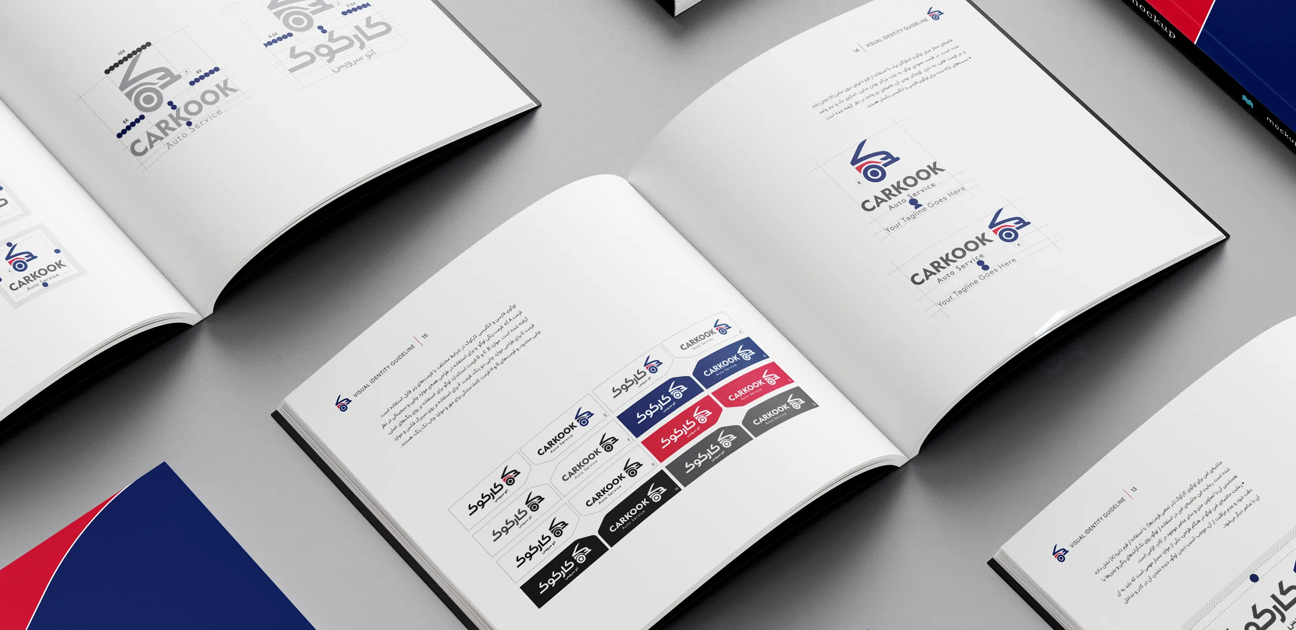
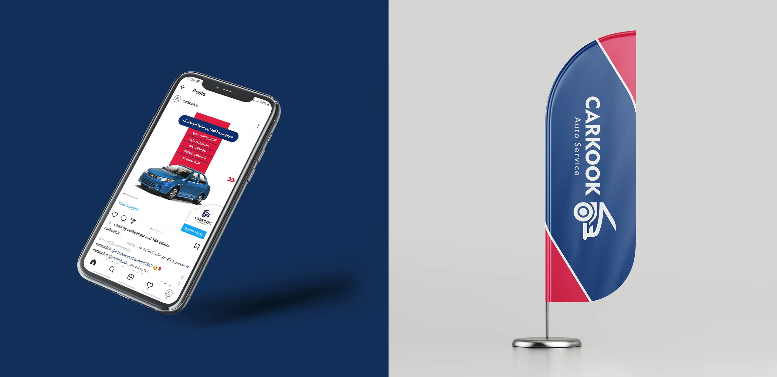
Given the change in the brand name from Happy Cars to Karook and the brand strategy’s emphasis on the requirement of speed in conveying the concept of auto service through the logo, a new logo was designed by iconizing the car and combining it with the letter K, which represents the first letter of Karook.
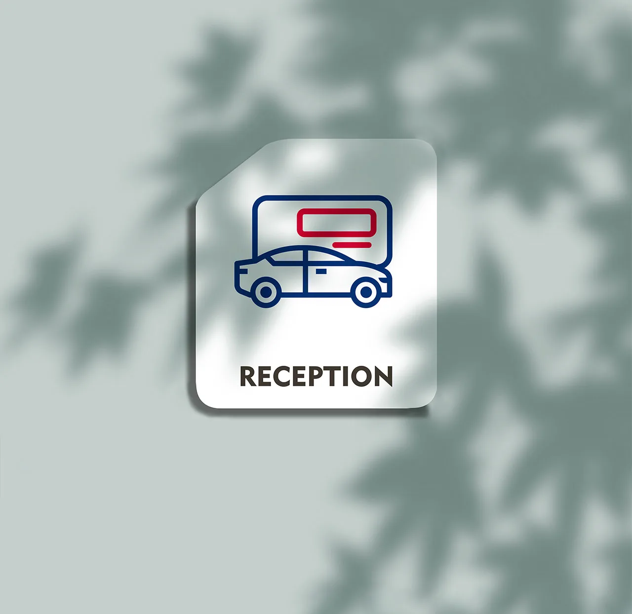
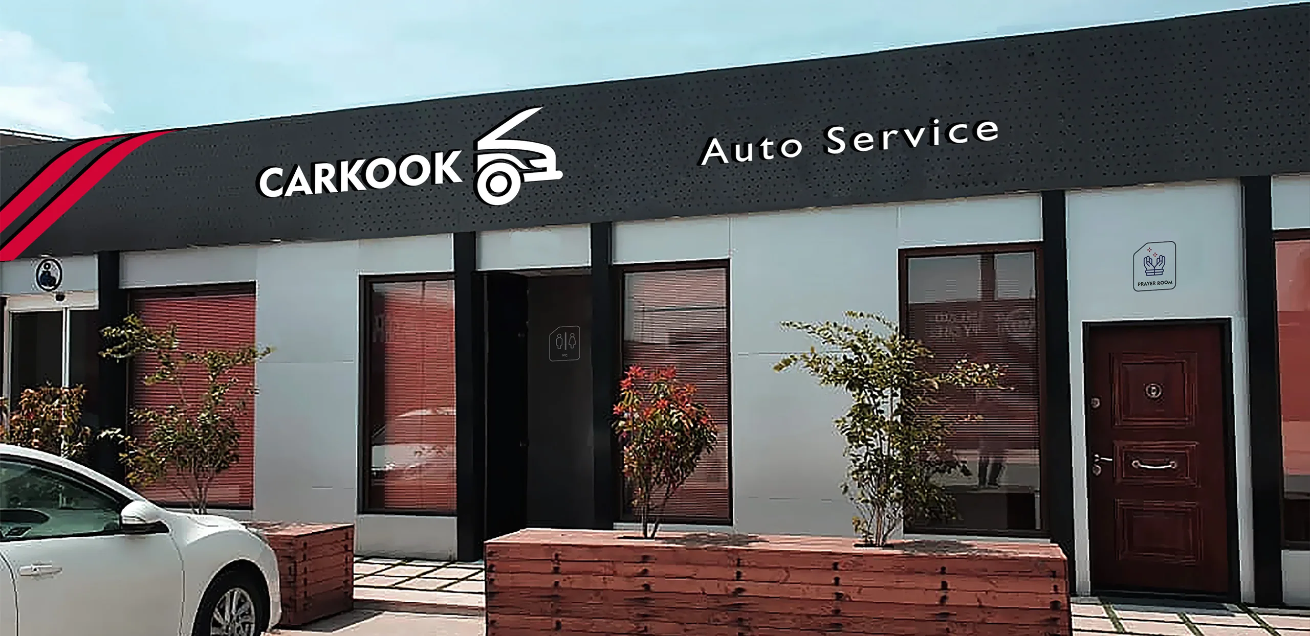
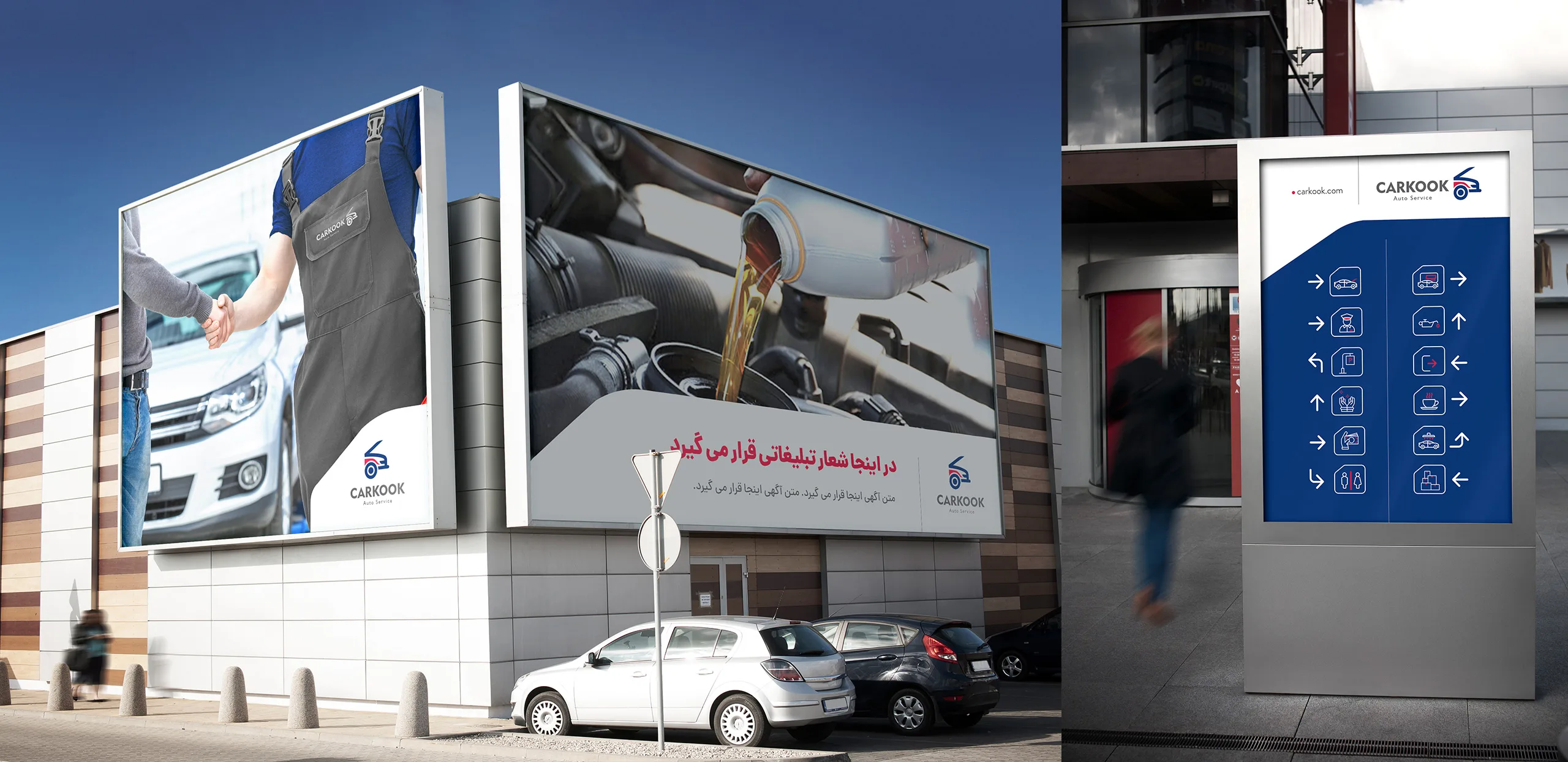
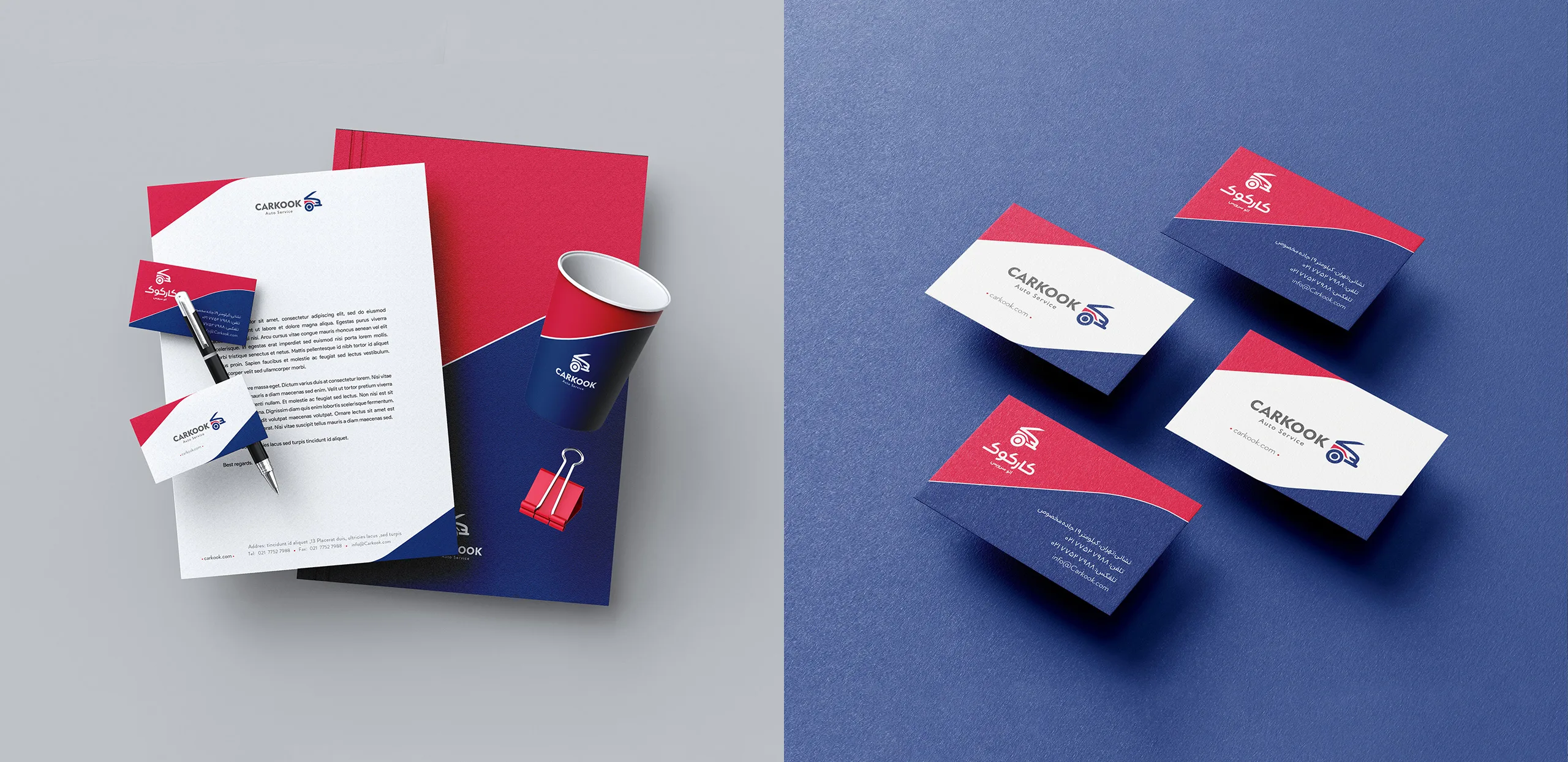
Next, by visually standardizing the car service environment, space signboards, designing exclusive brand icons, office sets, promotional items, designing brand digital spaces, etc., an attempt was made to fully feel the visual integrity of the brand space by the audience.