Brand Challenge
Every branding project begins with identifying the key business challenges—not as obstacles to growth, but as launchpads for progress and success. This is a core belief at THE Branding Agency, where every challenge is transformed into an effective solution.
With over 40 years of experience, Iran Potk has focused on producing durable industrial tools within Iran’s highly competitive industrial equipment market. However, due to a lack of transparency in pricing behavior and insufficient understanding of and communication with its target audiences, the brand’s intended personality traits were not clearly formed in the minds of consumers.
The Iran Potk branding project aimed to uncover audience needs and benefits through qualitative research, field studies, and in-depth interviews conducted with four key groups: primary users, organizational managers, sales representatives, and buyers (both organizational and end consumers). All required data was collected by THE’s research team.
These insights served as the first step in developing the brand strategy. Through in-depth analysis by THE’s branding specialists, the data was transformed into valuable brand insights for Iran Potk. Research revealed that customers consider high quality and product diversity to be the main reasons for choosing Iran Potk. Additionally, the sense of power and durability in the performance of its tools plays a key role in shaping the brand image.
Resulting Experience
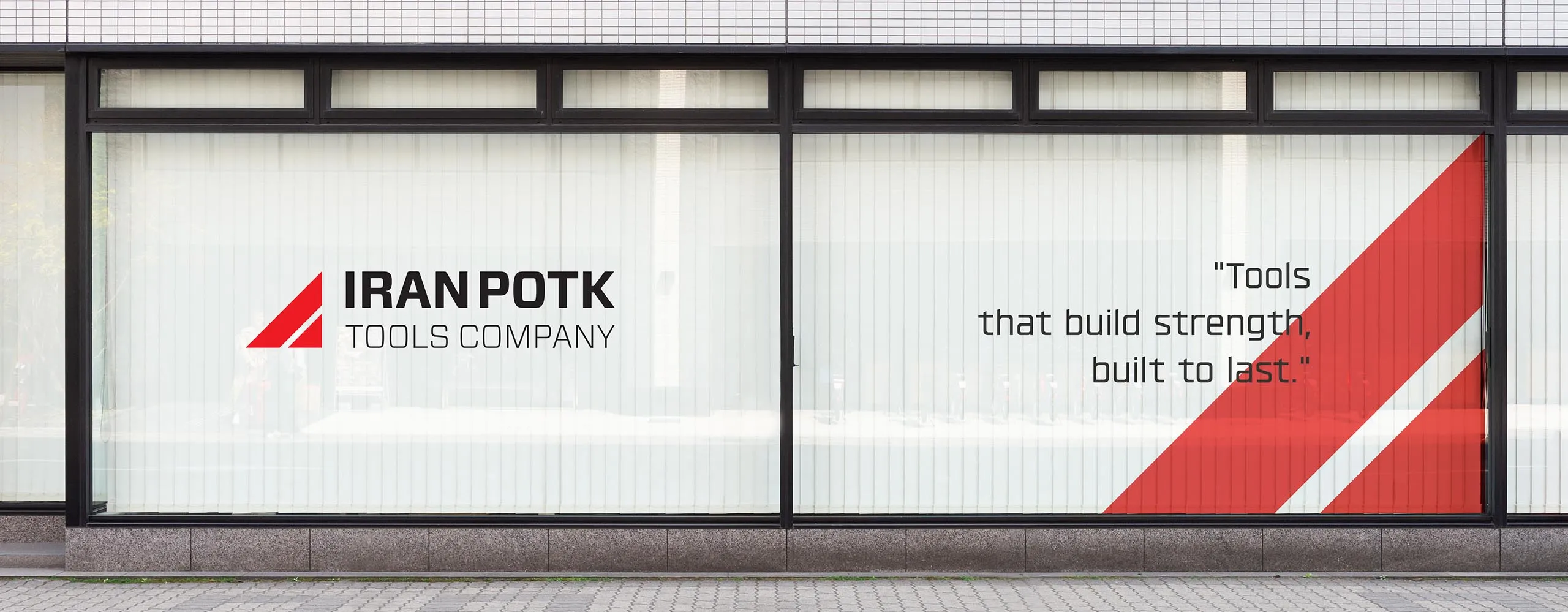
In developing Iran Potk’s brand strategy, the focus on producing high-quality and specialized products guided the brand into a path of identity transformation, enabling it to establish a strong and precise position in the industrial and professional tools market.
In-depth research and analysis of management mindsets showed that the company’s primary focus had historically been on product quality, while pricing behavior lacked a clear identity-based strategy. Furthermore, the need for dynamic and continuous communication strategies with target audiences was strongly evident.
Accordingly, a wide range of functional, financial, emotional, self-expressive, social, and symbolic benefits were designed for each target group—including brand representatives, organizational purchasing managers, service technicians, and repair professionals—to create deep and effective brand relationships.
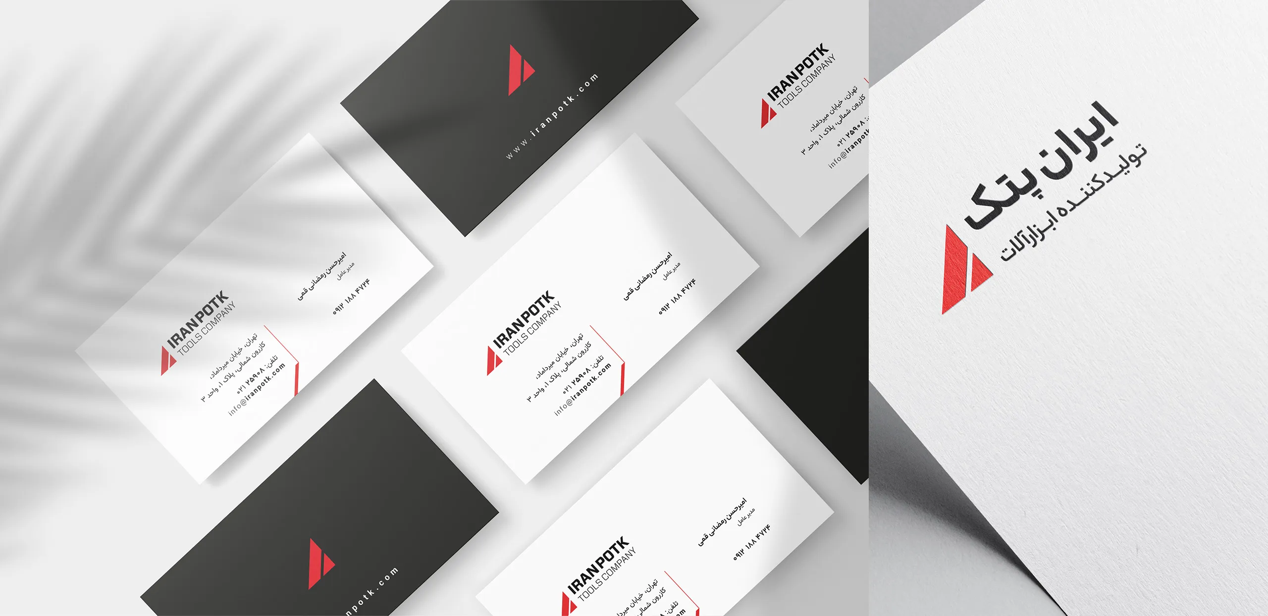
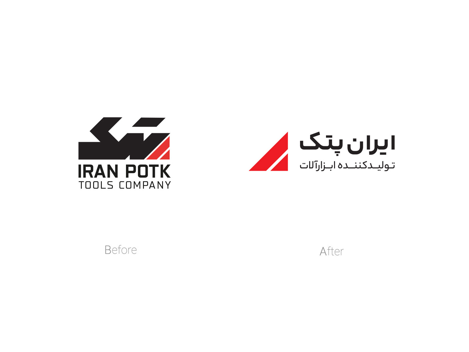
In the next phase, Iran Potk’s brand identity was designed based on the Allport–Moghaddam Identity Model, encompassing three core layers: core, extended, and situational identity.
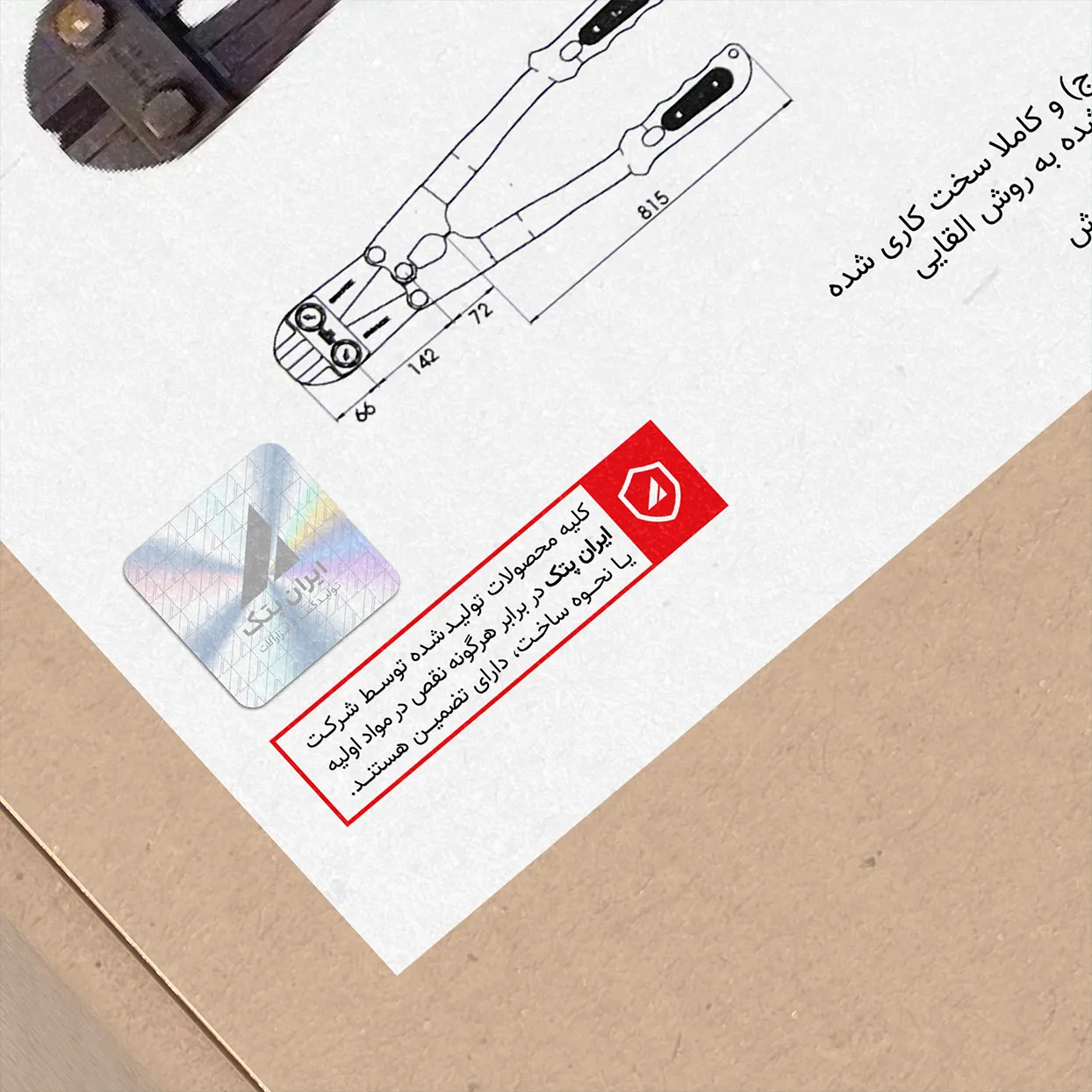
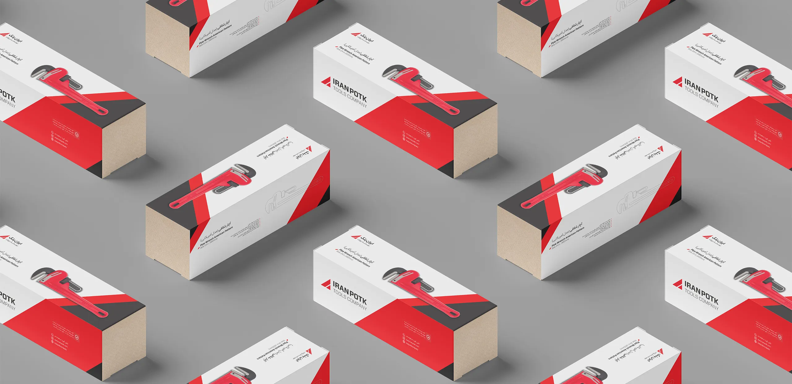
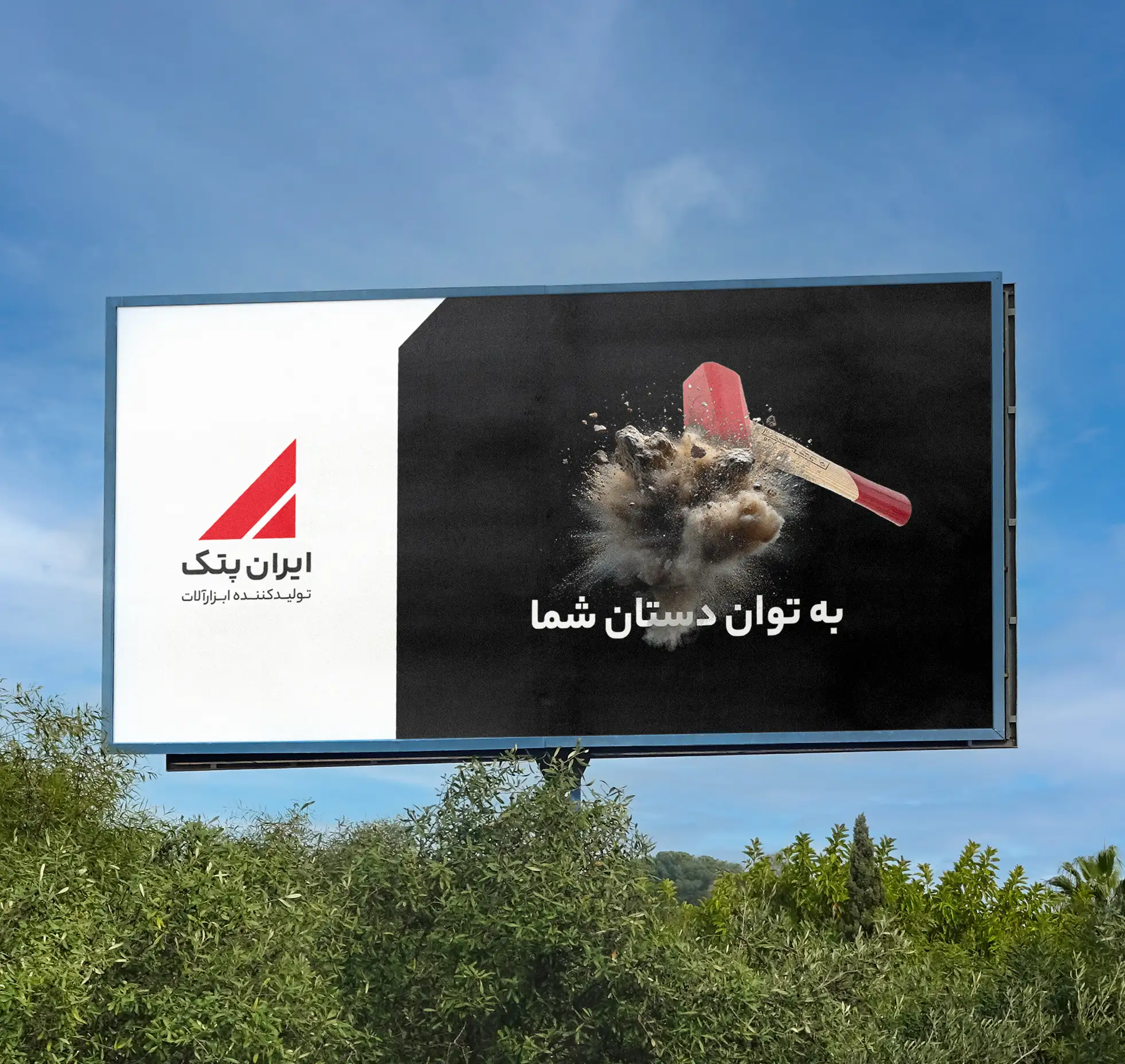
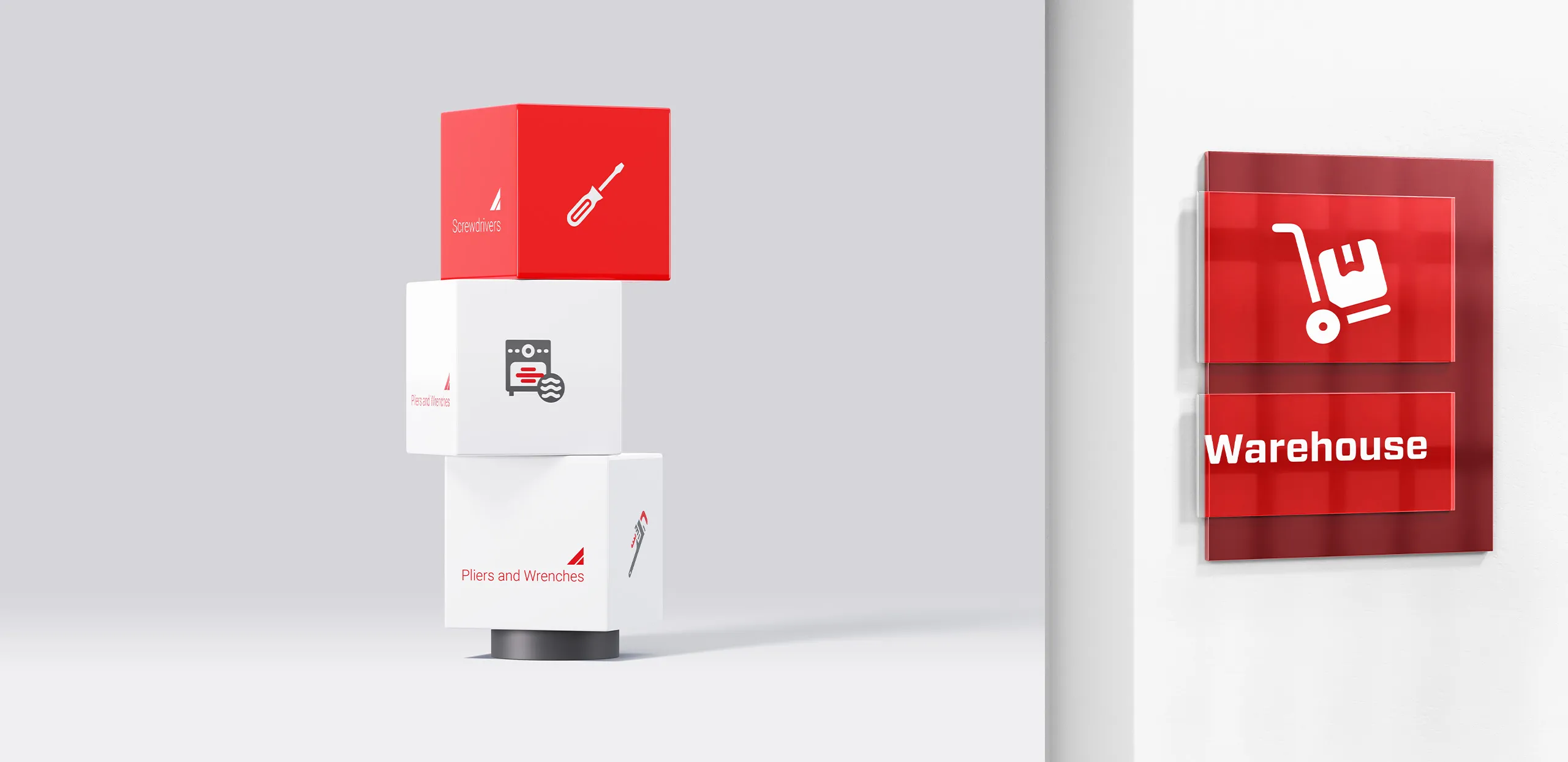
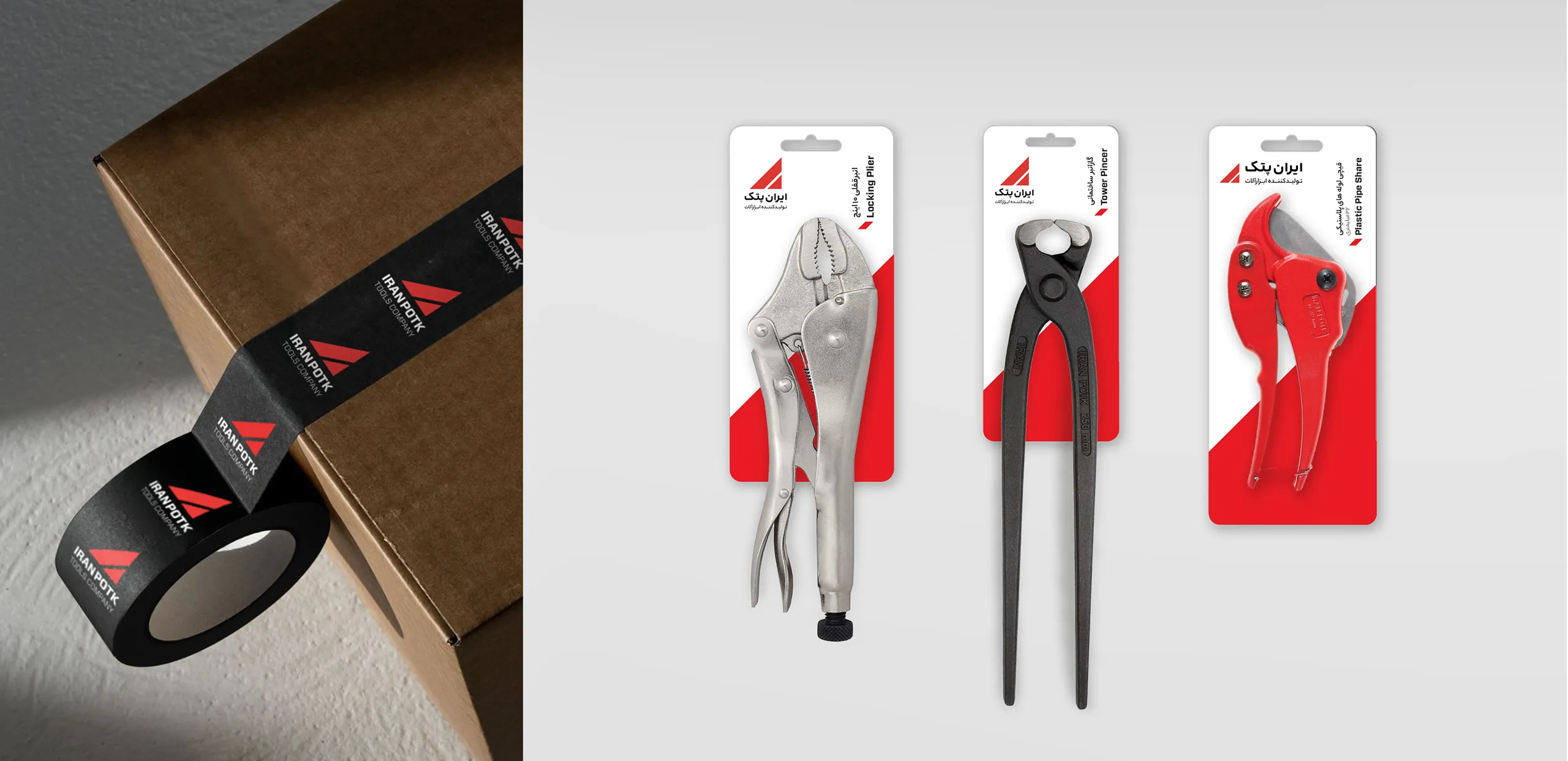
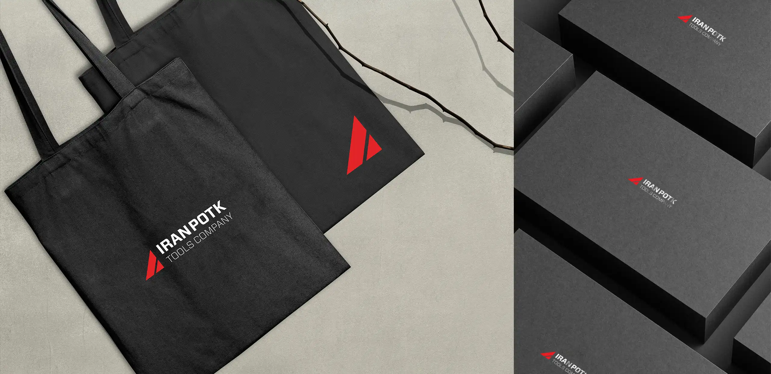
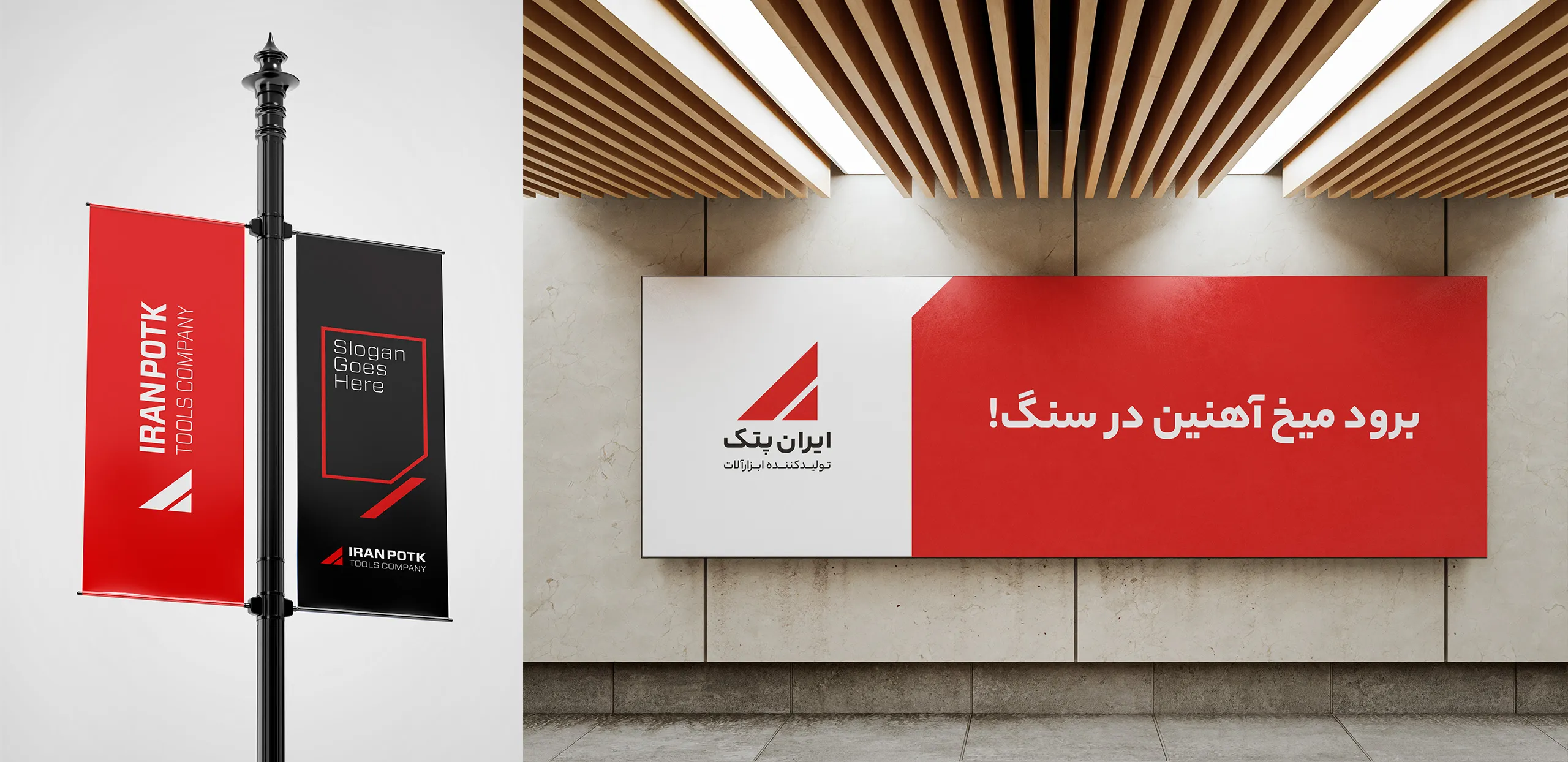
To activate and institutionalize the new brand identity, identity-driven execution programs were developed. These included producing specialized and educational content tailored to each audience group, creating a customer club to enable effective engagement, structuring and tiering representatives, organizations, and service technicians, and redesigning packaging aligned with the new brand strategy.
In later stages, additional tactics were proposed to address brand challenges and enhance market positioning. These included hosting specialized events, delivering technical and advisory training, producing content focused on price transparency and brand heritage, creating specialized sub-brands, and developing an optimized product portfolio to better respond to market needs.
Visual Brand Solutions
In redesigning Iran Potk’s visual identity, strategic brand shifts and the need for product portfolio expansion were carefully considered. The wordmark “Potk” in its previous form carried limiting and negative associations for brand growth. However, within the typography of the word “Potk,” a form was discovered that embodied the brand’s renewed personality and identity.
Two solid triangles with predictable angles and a familiar structure emerged—symbolizing a brand that is skilled, powerful, and precise.
Based on this concept, the new visual identity system adopted this form as the core logo, while its colors and angles became key brand elements used to extend the identity system. In packaging design, this form appeared as the central visual element and was creatively expanded across various brand touchpoints to ensure strong visual consistency and coherence.