After several years of activity and experience in traditional steel markets, Mobtekaran Industrial Group was established by acquiring engineering knowledge and expertise and started selling steel and also performing heat treatment based on its knowledge and expertise, in a coherent manner in one complex; this gave Mobtekaran Industrial Group a great competitive advantage in the industry. An advantage that came from years of experience and knowledge. In fact, Mobtekaran Industrial Group had the ability to sell steel and perform heat treatment on steel according to customer orders, and it was distinguished in the industry by providing operational services in addition to product sales. The problem that Mobtekaran Group faced was the breadth of the brand’s product portfolio, which affected the brand’s image in the industry and reduced the perceived quality of the brand in the minds of the audience.
Experience gained
To provide an efficient solution to Mobtekaran Industrial Group’s problem, the current brand image in both the steel sales and heat treatment service sectors was extracted through qualitative and in-depth research. Then, the brand architecture structure was developed to determine the type of relationship between the steel sales department and the operational services department. According to the brand architecture structure, the strategy of products that can be included in the sales department’s product portfolio was determined; that is, the product portfolio of the Motbakaran brand was optimally determined. Also, by creating an integrated identity in the service department, a coherent relationship with customers and target audiences in the industry was put on the agenda of the brand managers. Carrying out these steps will strengthen the brand image in the minds of the audience and increase the perceived quality in proportion to the brand identity.
Brand Visual Solutions
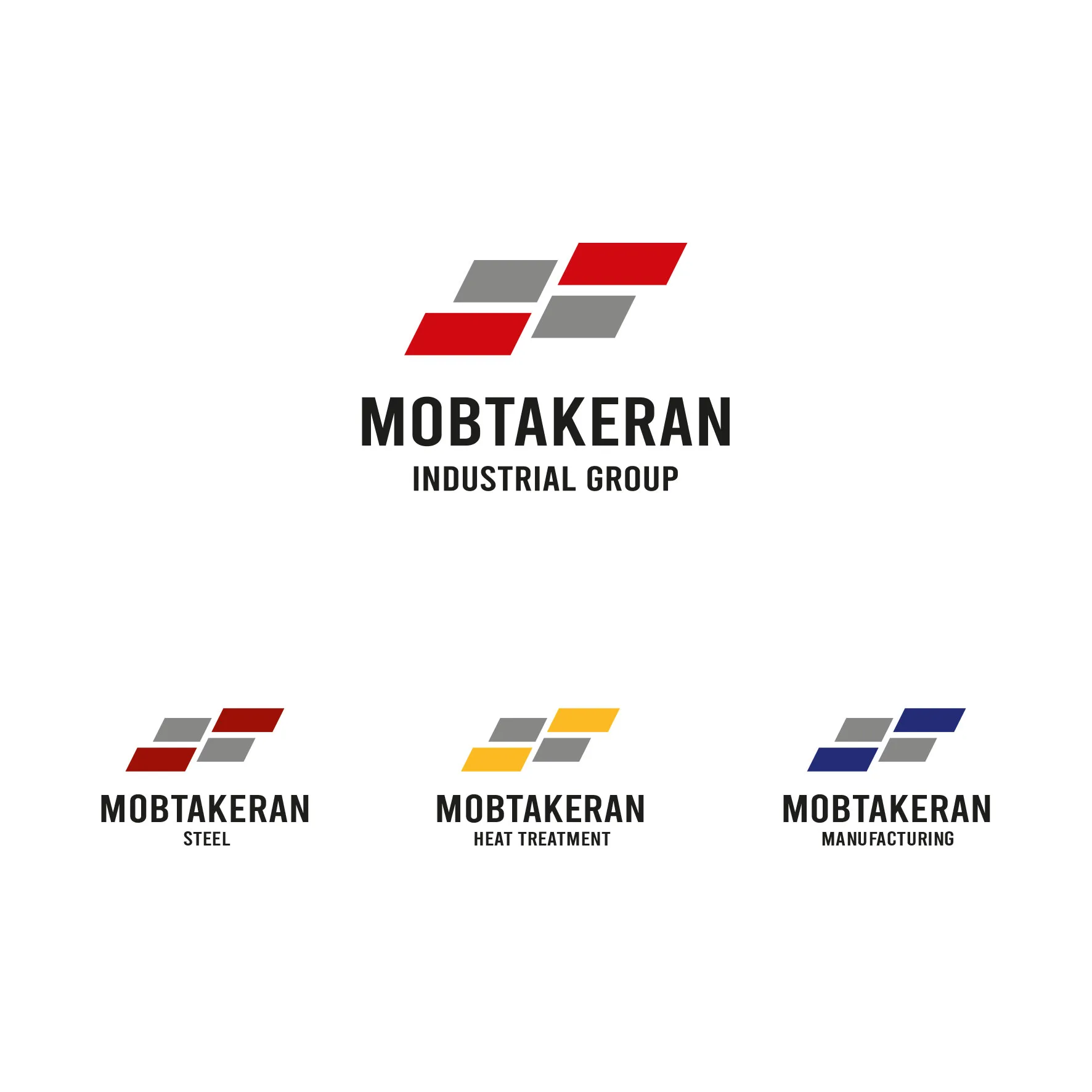
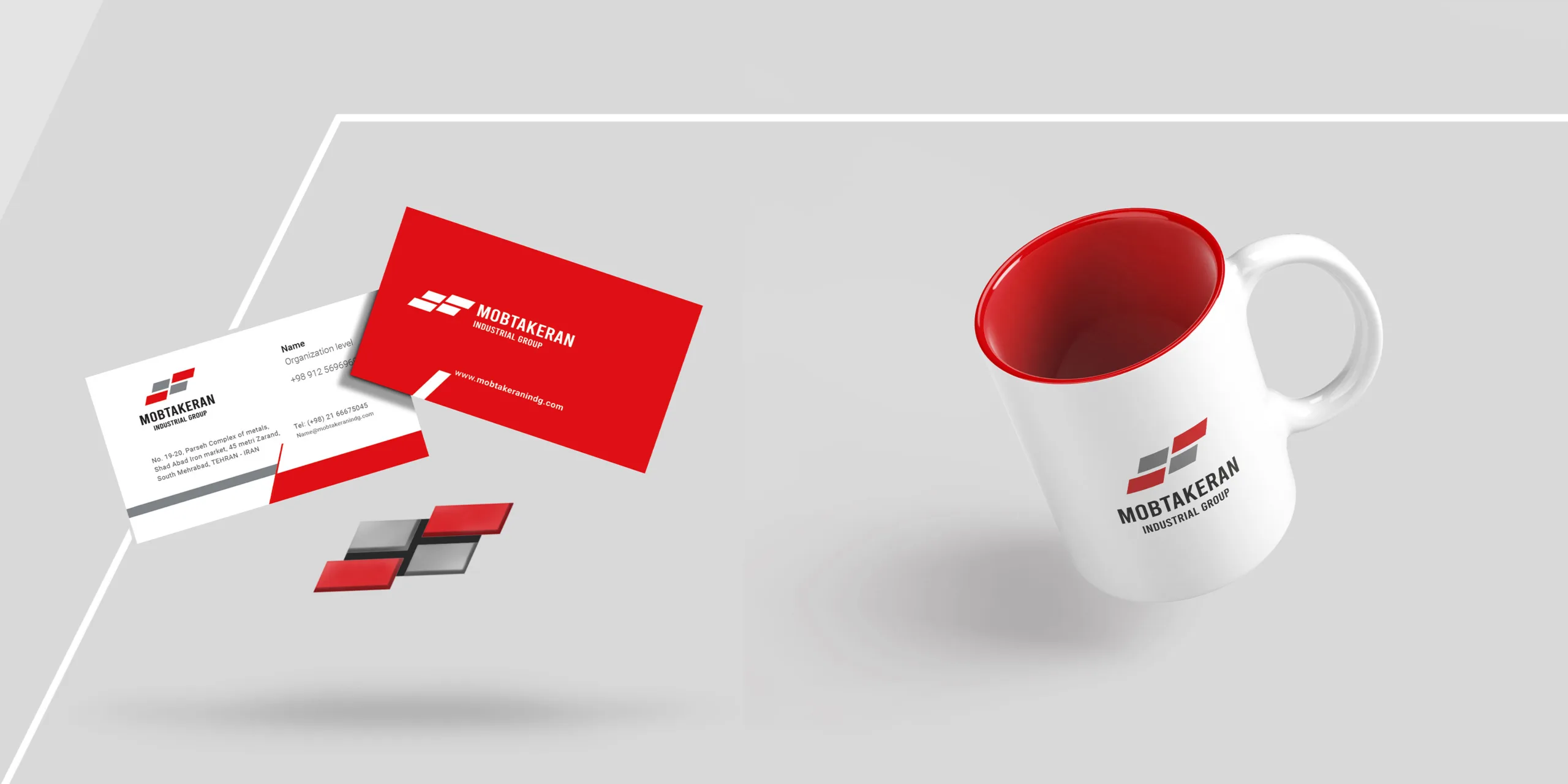
According to the developed brand strategy and the transformation of Motbakaran Steel into Motbakaran Industrial Group with various sub-brands, in the brand visual identity phase, it was also necessary to design the element as a logo that could independently show the sub-brands by changing the form or color of a part of it.
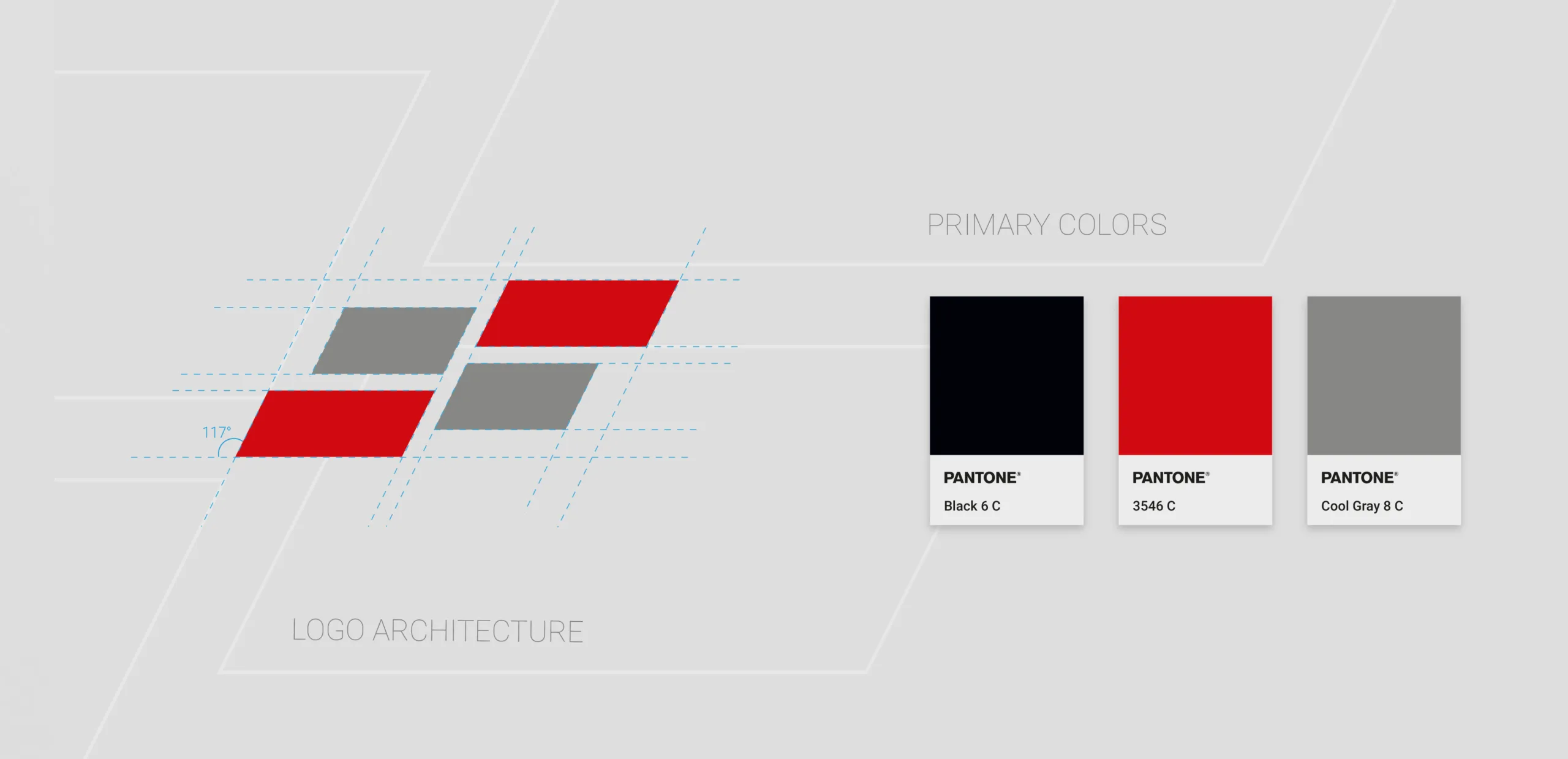
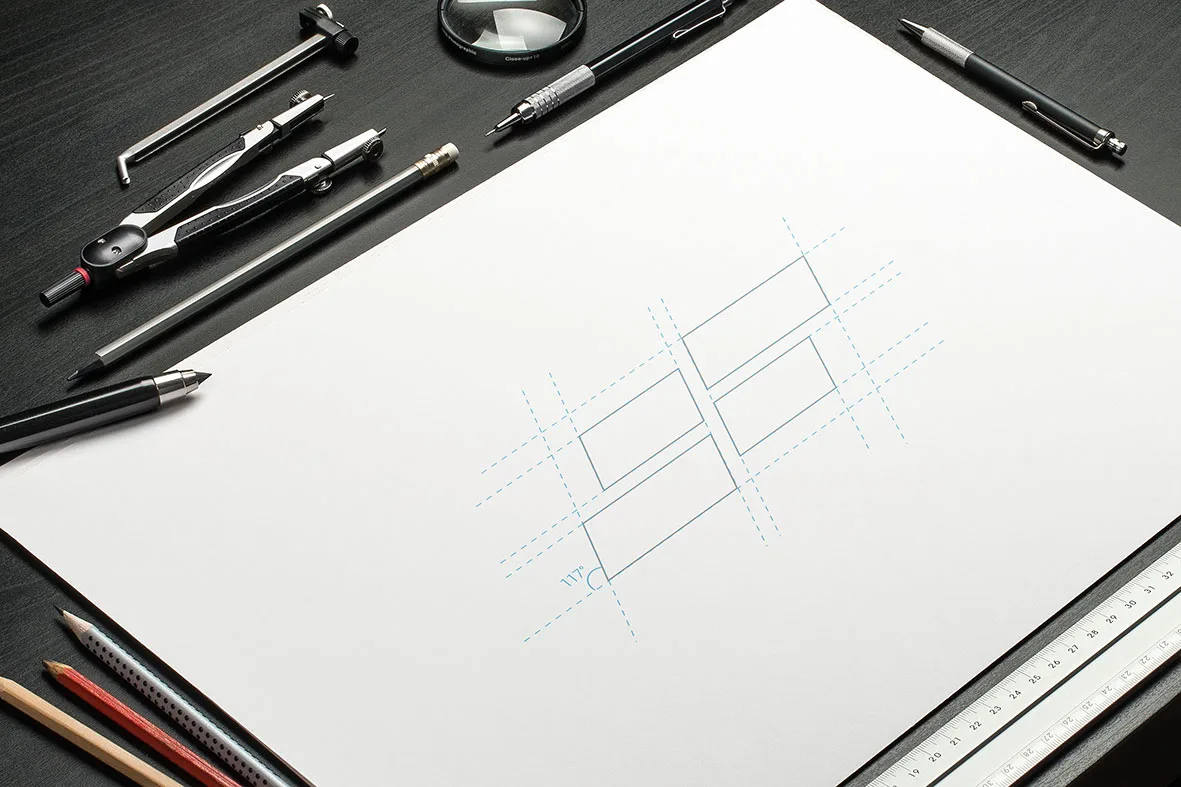
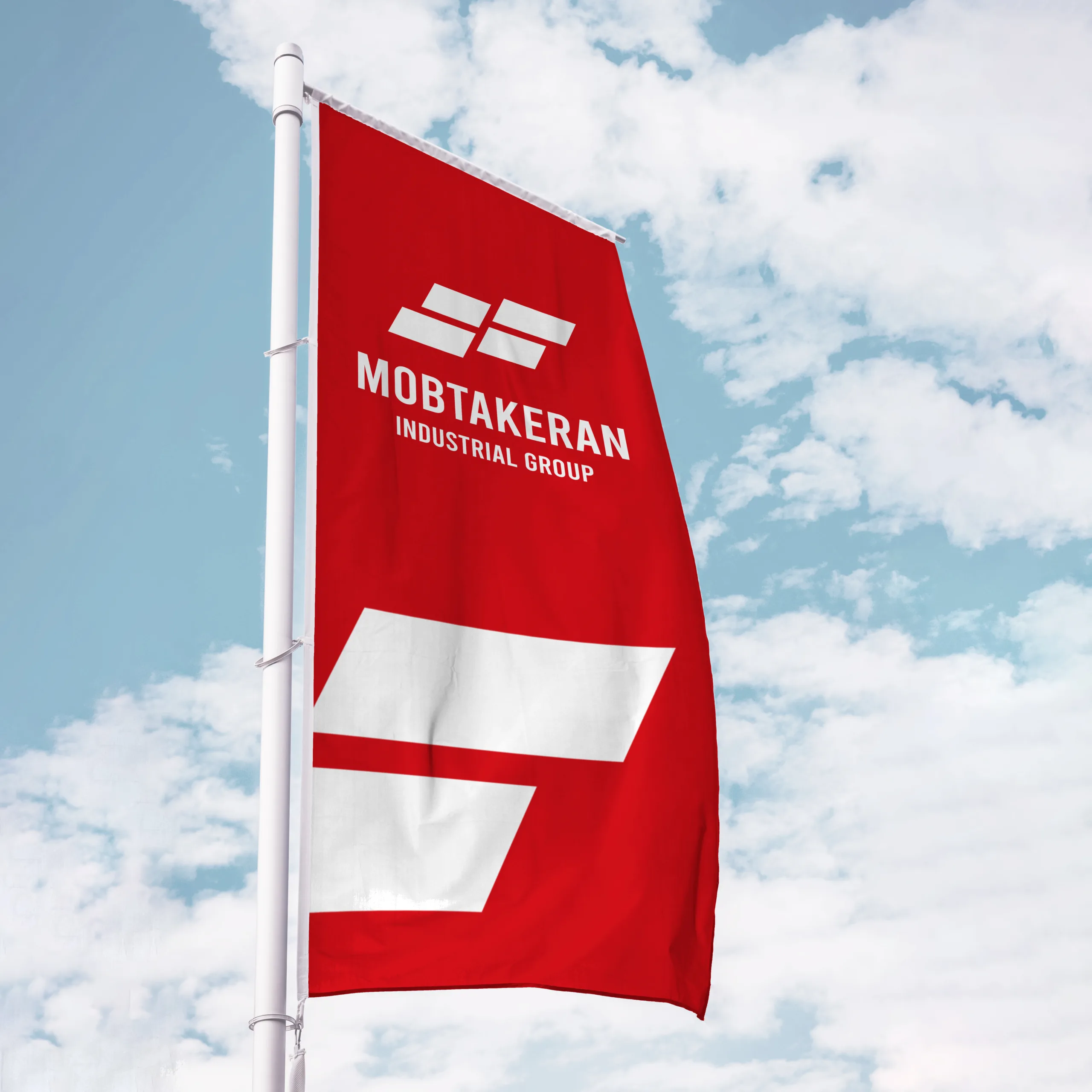
In this regard, an angular form representing steel sheets was selected, which could be developed for the sub-brands by changing the color of two parts of it.
Given the association of red with the steel of the innovators, the color of the group was considered red, and a dark red color was chosen for the steel part to create a greater association of this color in the minds of the brand’s audience.