The SAARC brand started its activity in the field of women’s clothing and has a history of nearly forty years. Less than a decade has passed since the brand’s presence in the retail sector, and it has faced numerous challenges. How to develop the new men’s and children’s product portfolio and how to enter the market for these products (brand architecture), the disproportion between sales and investment in branch development, and the lack of awareness of the brand among the target audience were the main challenges for the SAARC brand in this project.
Experience gained
After conducting qualitative research on the brand’s target audience groups, namely senior managers, internal employees and store employees, satisfied and dissatisfied customers of the brand, and future target audiences at The Branding Agency, we concluded that despite the positive association with customers, the brand is still unknown among the target audience and has low awareness and perceived quality. Therefore, communication campaigns were designed in line with the brand identity to enhance brand awareness, and considering the vision developed for the SAARC brand, in order to enhance the perceived quality of customers, the need for a sub-brand with a smart casual style that has a non-Iranian origin was considered essential and was taken into account in the development of the brand strategy. The SAARC brand should play the role of changing the clothing style and life of its target audience in line with the designed identity, to the extent that the slogan of this brand is a testament to this claim:
“SAARC, harmony of color and style”
Visual brand solutions
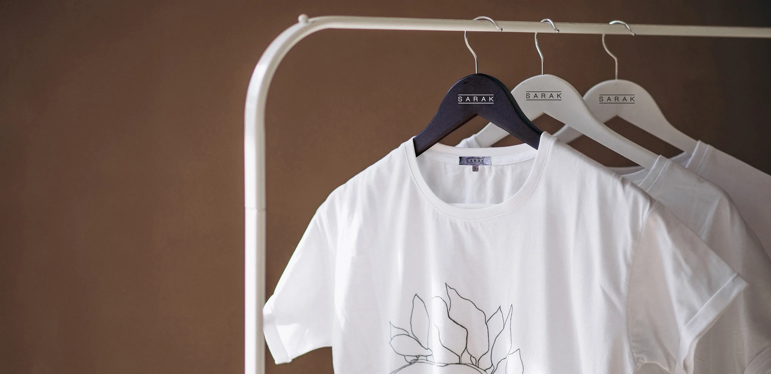
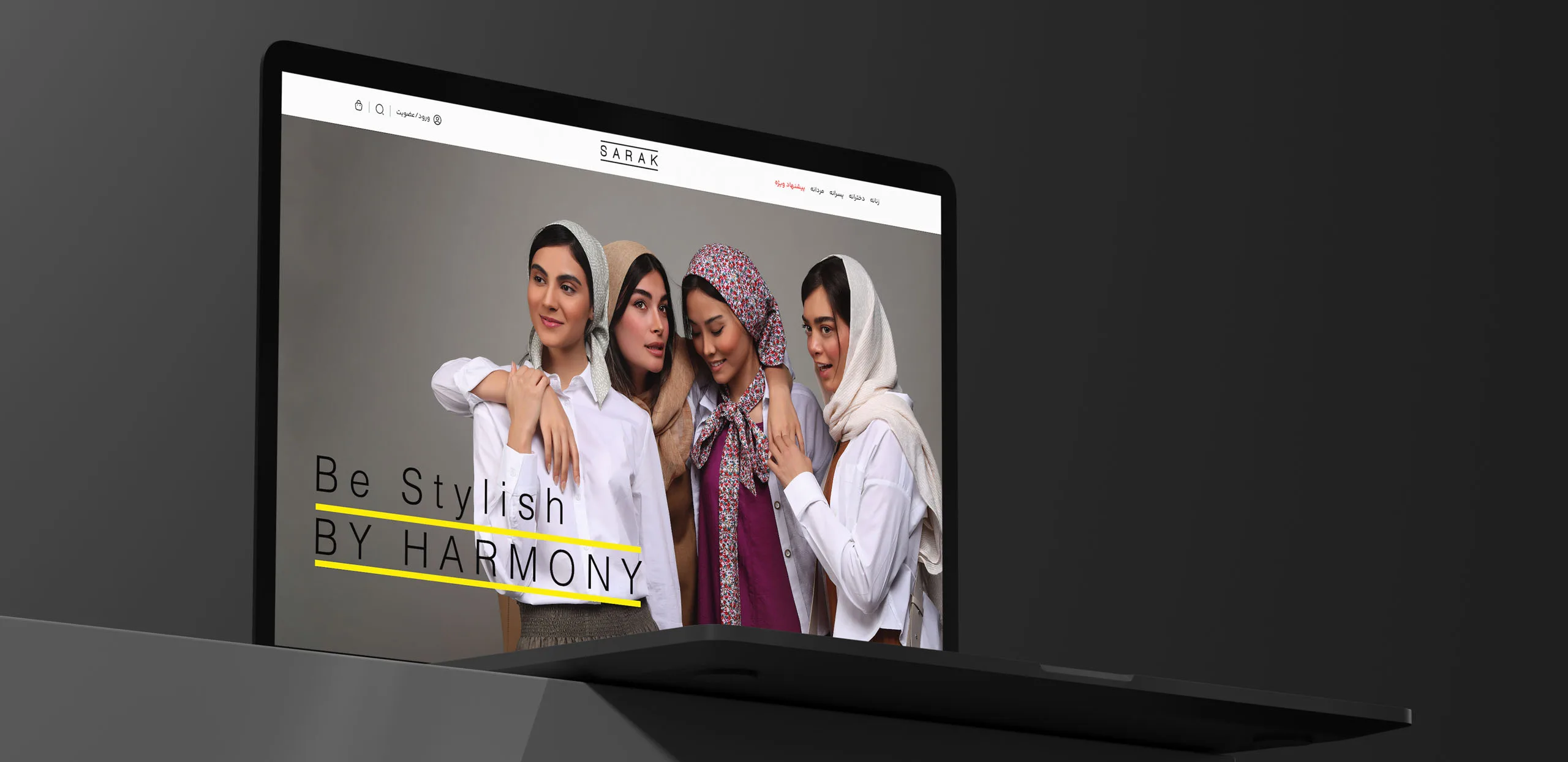
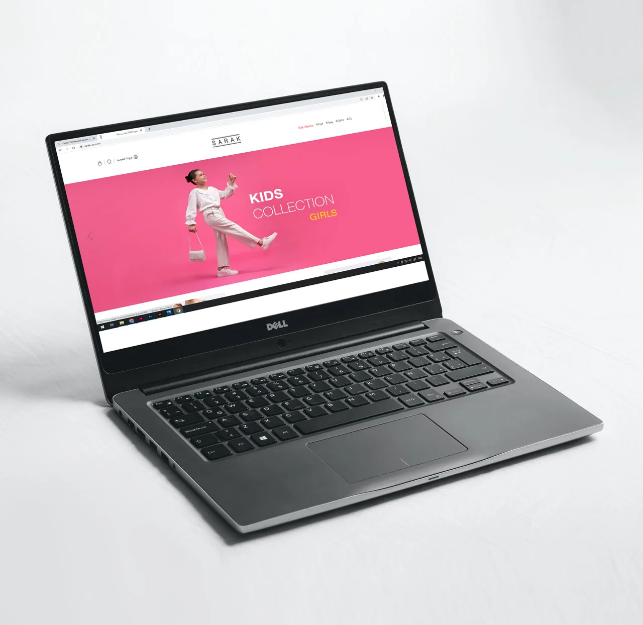
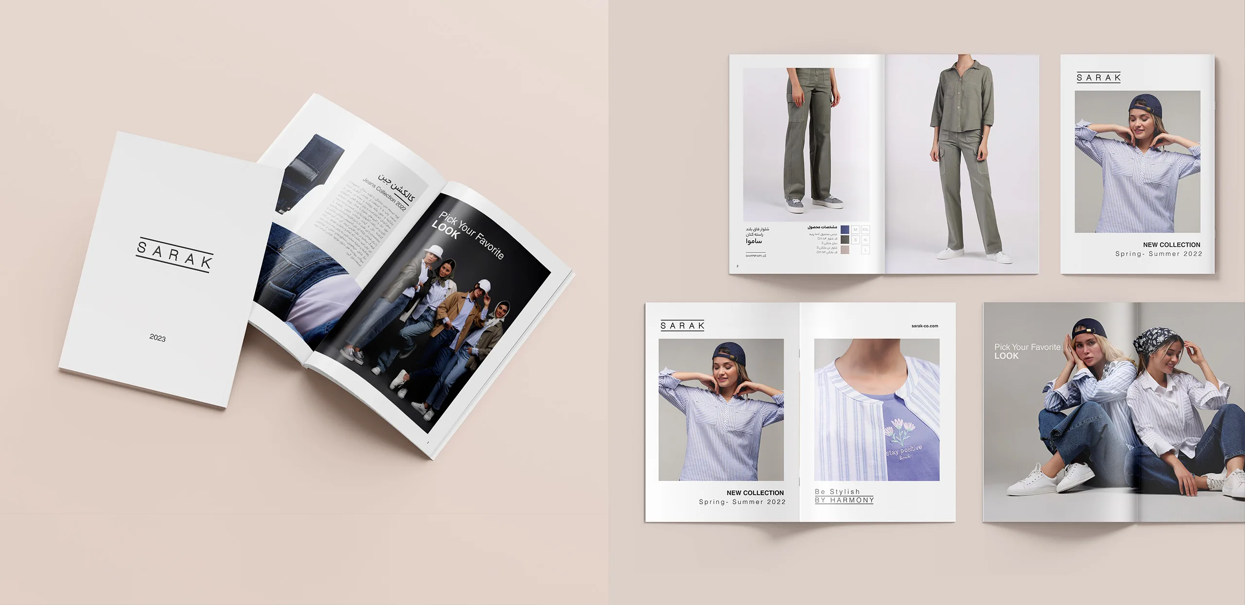
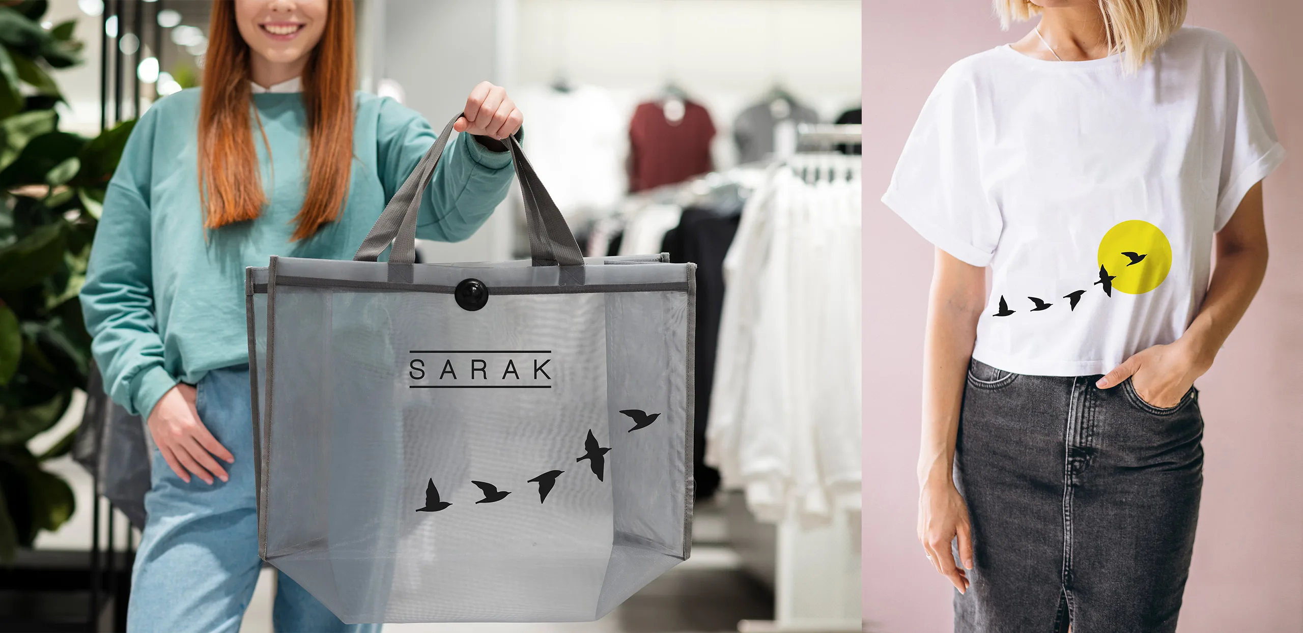
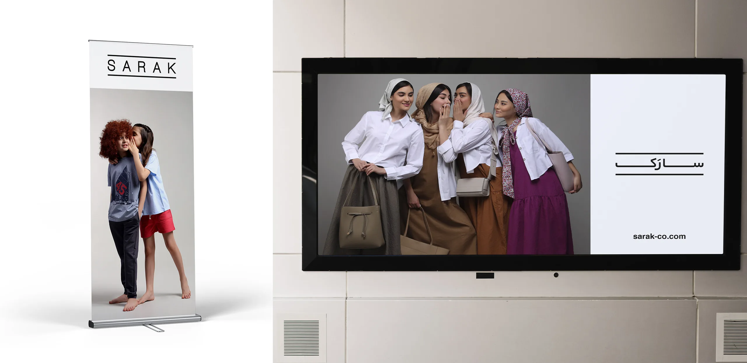
The SAARC design project began by solving the challenge of keeping the SAARC logotype in its previous format, but with standardization, it could be seen in an integrated and structured way at all touch points. Given the abundance of brand touch points such as header boards, shopping bags, website, etc., the SAARC logo had to be seen everywhere in the same way and with the same appearance.
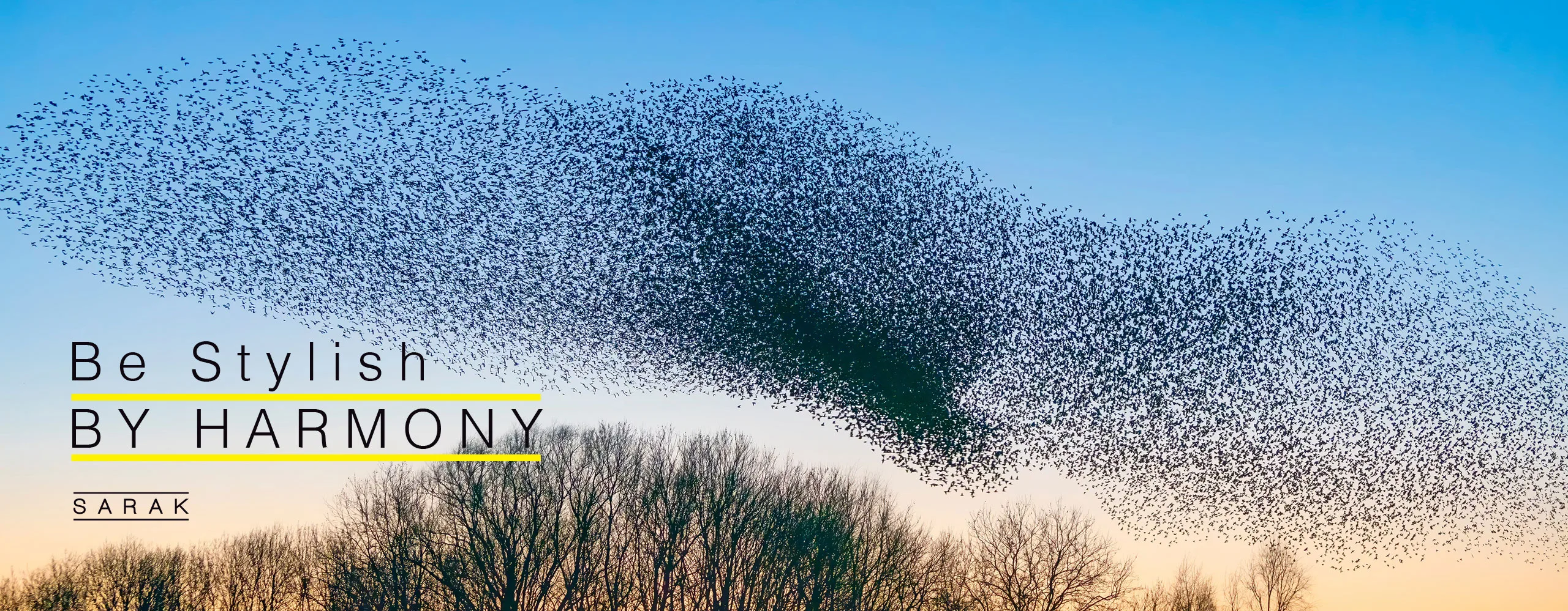
Also, by strengthening the secondary color yellow, an attempt was made to increase the audience’s attention to the brand’s appearance by adding this color.
In the brand designs, an attempt was also made to form a better association of the brand’s visual identity in the audience’s mind by using two lines above and below the logo.
Brand Pattern
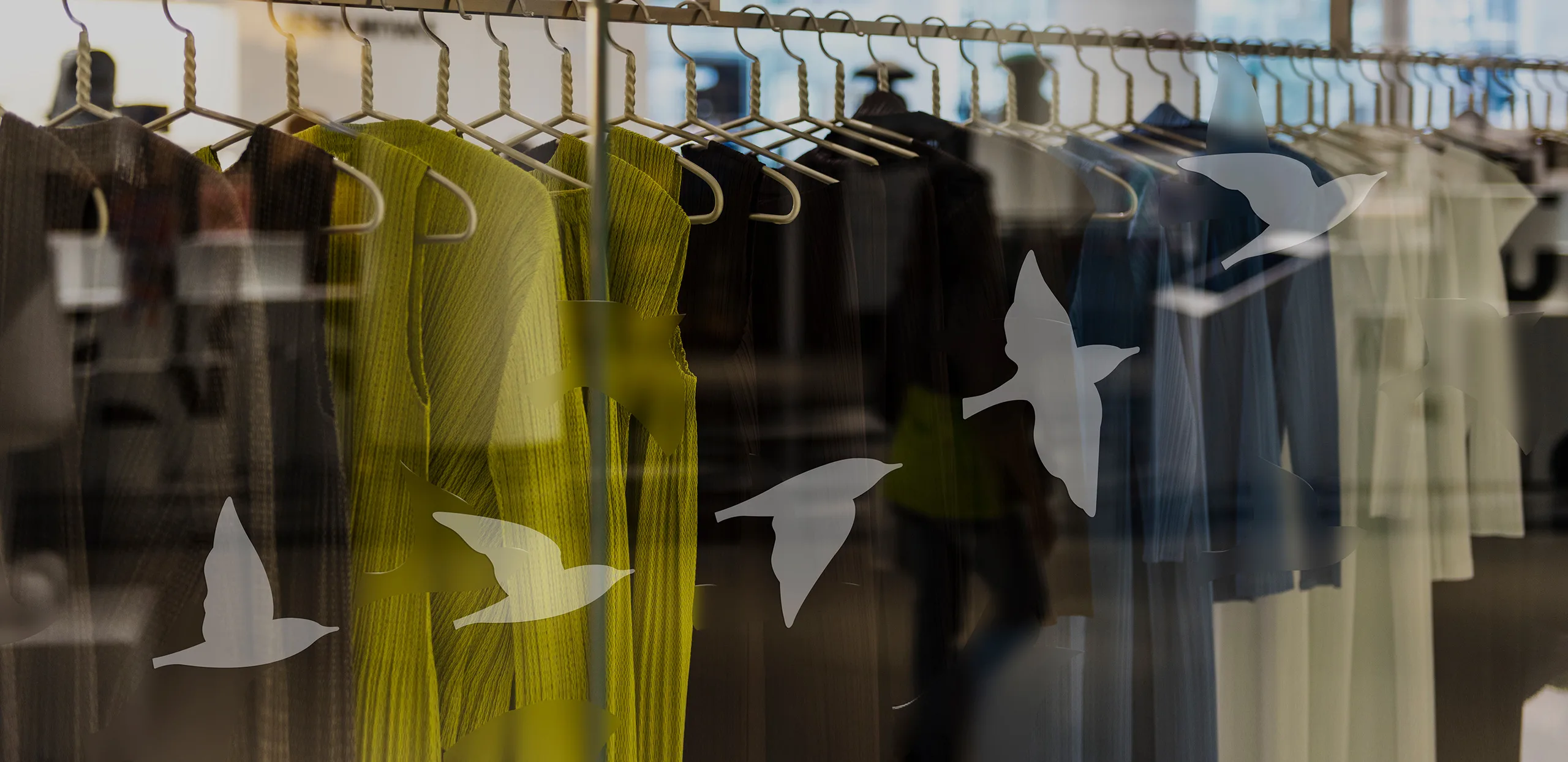
To create a stronger mental image of the SAARC brand, it was necessary to connect with the audience with a new visual element beyond the brand logo. The star was present in the brand name, which was fully consistent with the SAARC brand strategy that planned to create harmony in the style of the clothing for the audience. For this reason, the flight of starlings was used for the brand pattern design, which was used in the design of brand items and also videos, the flight of starlings and the harmony and coordination they create for the viewer when flying.