The “Nili To” brand started producing sweets and chocolate in 1400 using the most modern technologies of the day and over time expanded its product portfolio in all fields such as cotton candy, chocolate, toffee, wafer, petit four, layer cake, etc. Entering the highly competitive market of sweets and chocolate, in which our country has good competitive advantages even at the international level, can be considered the main challenge of the “Nili To” brand. Also, the ease of modeling and copying foreign brands had caused good ideas to be easily copied by competitors and there was practically no opportunity to present new products in the market.
Experience gained
Conducting various researches on consumer groups using different methods such as in-depth interviews, focus groups, etc. showed that despite the activities of many brands in the field of sweets and chocolate, several main concerns of customers are still not being answered well. First, most of the audience stated that they do not feel the main flavors such as chocolate, coffee, etc. when consuming these brands, and in fact, the originality in the taste is not as desired, and secondly, most of the brands on the market are similar to each other and are ultimately an incomplete copy of Turkish or sometimes European brands. Based on the research, it was decided to work on Nilitu from two directions. On the one hand, a fundamental change should be made in the product area and the purity of the main ingredients should be determined in such a way that the audience can easily feel the main flavor when using it, and on the other hand, the brand identity was determined in such a way that the brand is creative and produces its own products, and if it intends to benchmark foreign brands, this benchmarking should be in such a way that the product structure is maintained but is aligned with Nilitu’s identity. In addition, communication and production programs were developed in accordance with the brand identity.
Brand Visual Solutions
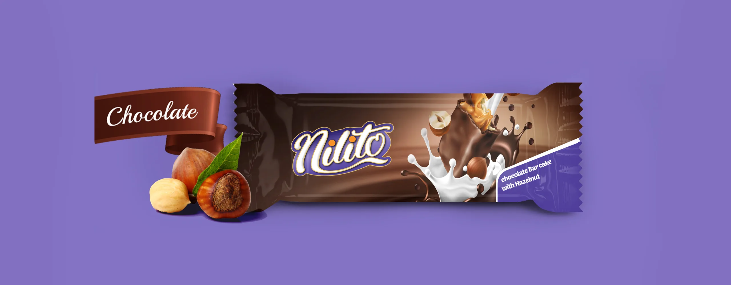
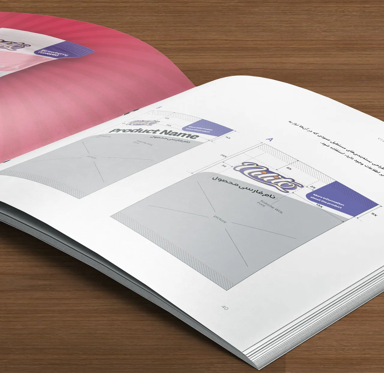
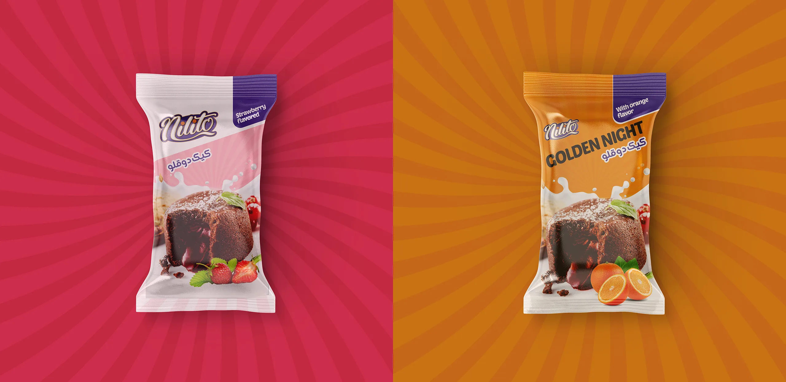
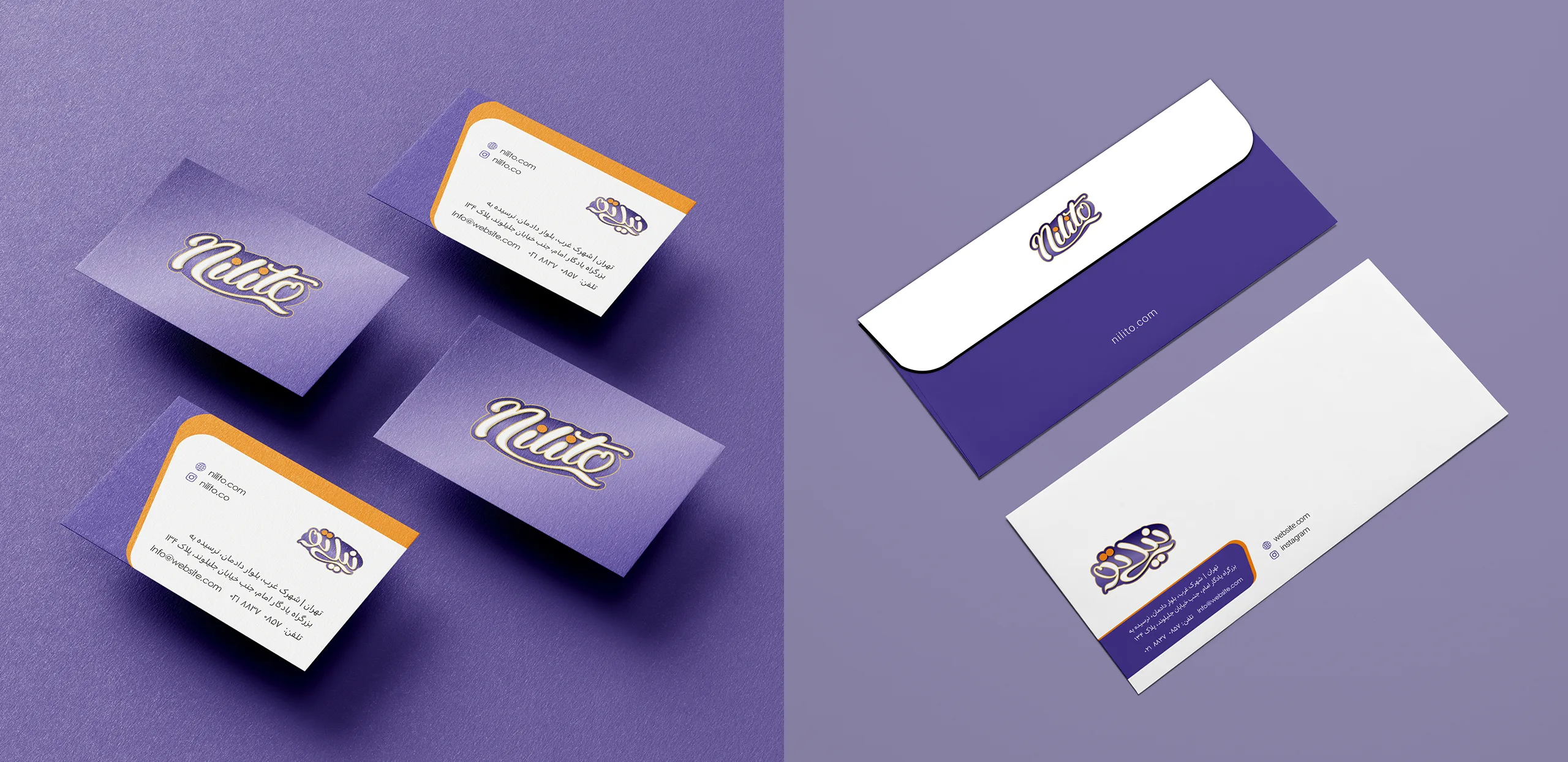
In the design of the visual identity items of the Nilito brand, an attempt was made to create visual harmony between the designs of this brand by using a curved form that evoked the angle of rotation of the logo.
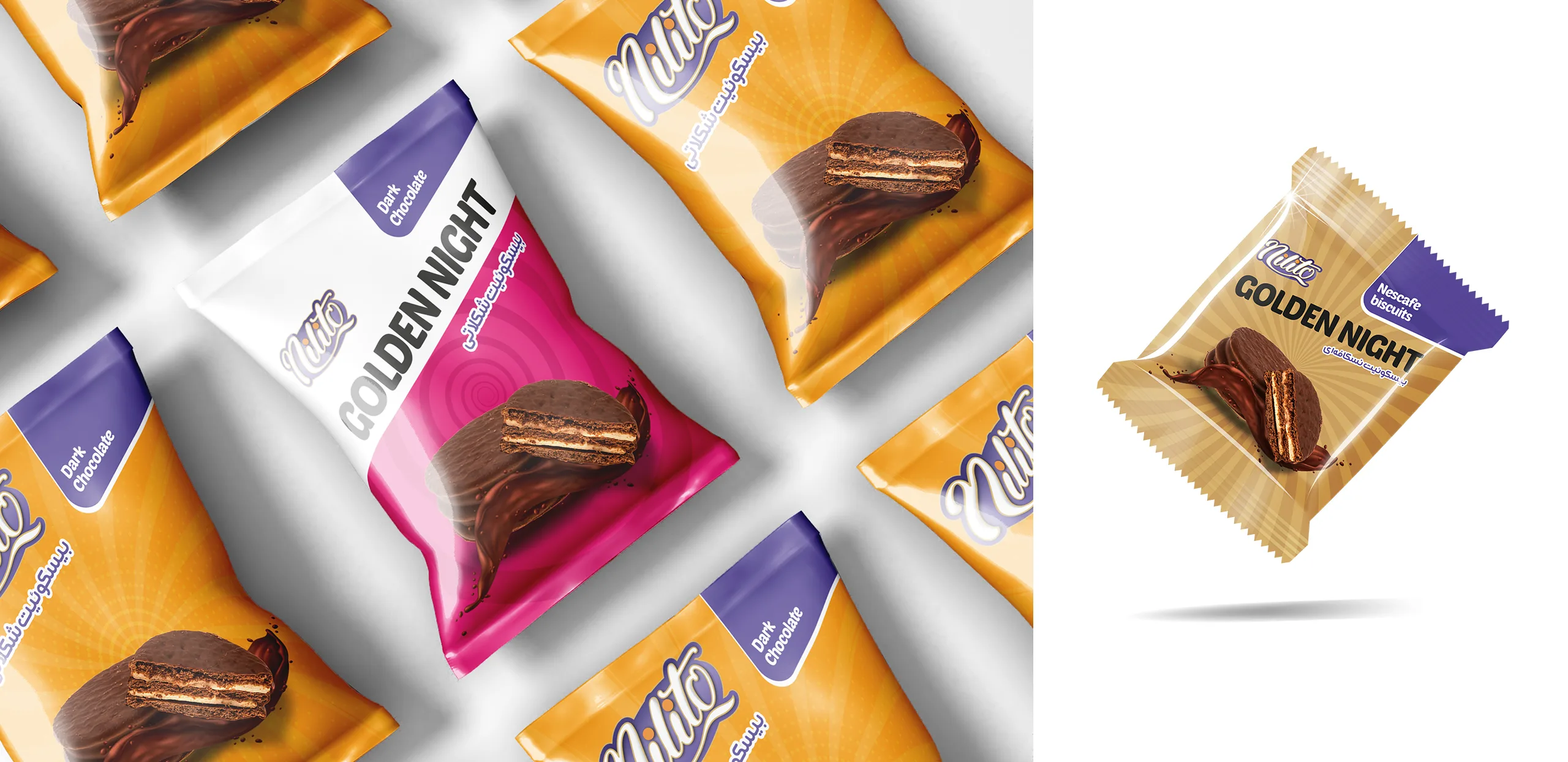
This form was used in all packaging formats that were the main contact point for Nilito. Also, in the design of the store entrances, a proportionate design was made with the same structure to maintain the visual integrity of the brand as much as possible.
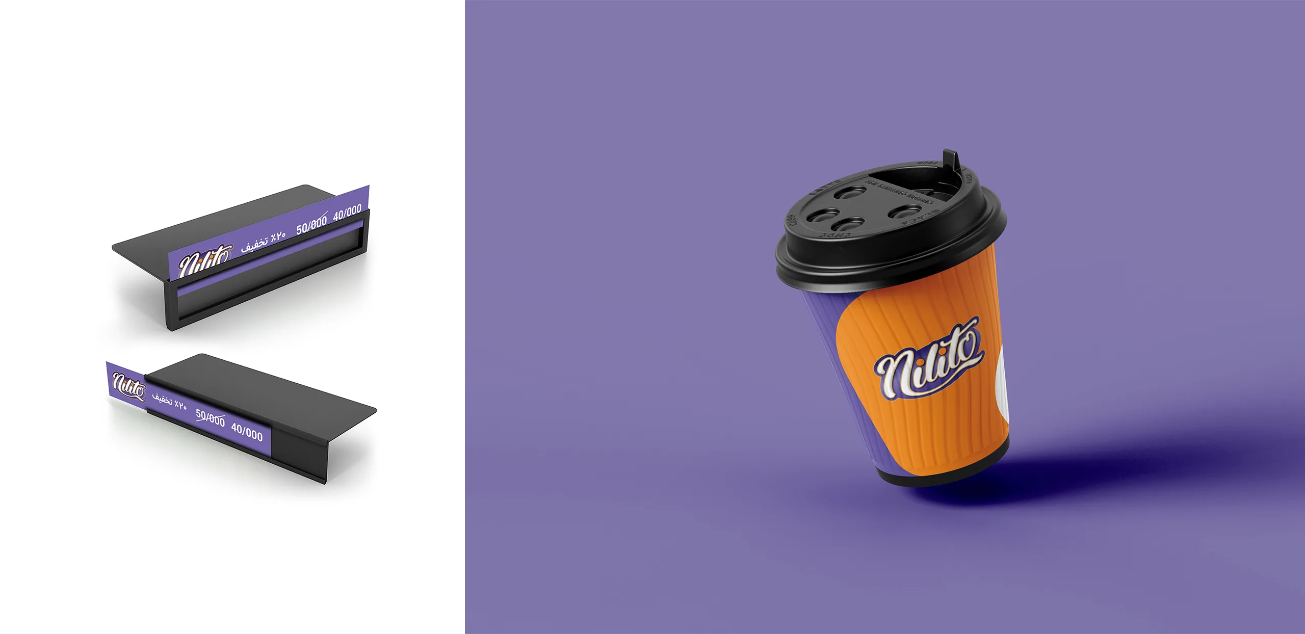
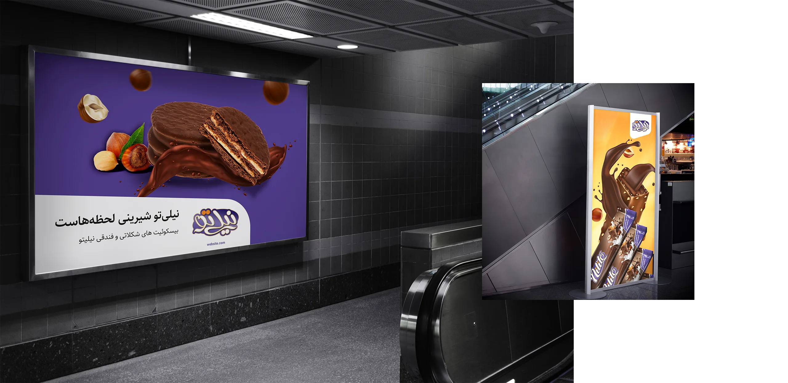
The design of the structure of various packaging types, outdoor advertising, product catalogs and brochures, digital brand space, etc. was carried out in the direction of creating a focused association for the Nilito brand.