Taifeh Food Industries Company started offering quality products in the field of rice and pulses in 2019. Finding a distinctive position in a market with numerous and powerful brands that are very difficult to differentiate between was perhaps the main challenge and concern of the Taifeh brand. On the other hand, the organization’s resources were not sufficient to find a place among the market competitors with a high-pressure advertising and communication campaign. For this reason, a large part of Taifeh’s profit margin was provided to the distribution channel, and there was not much power left to establish direct communication with the consumer and gain a distinctive position.
Experience gained
After holding several focus groups on rice consumers and also examining the behavior of competitors and the distribution channel, it was concluded that most of the brands active in this field were not focused only on rice and actually had a larger product portfolio. Since the increase in the scope of brand products and services causes brand dilution, the first Achilles heel of competitors was found. On the other hand, there was almost no strong brand in the market that had worked specifically on rice and products specific to this product and had positioned itself in the minds of the audience. For this reason, the “Taifeh” product portfolio was adjusted in such a way that in the first phase of branding, it would work only on rice and its products and in the second phase it would move towards brand extension. The focus of the first phase was on Amber-scented rice because, firstly, competitors had maneuvered less on it and secondly, it was completely aligned with the geographical origin of the brand, i.e. southern Iran. Subsequently, it was decided to create a personality called “Master Plo” and start providing specialized information about rice. Of course, this personality was not formed for organizational reasons.
Brand Visual Solutions
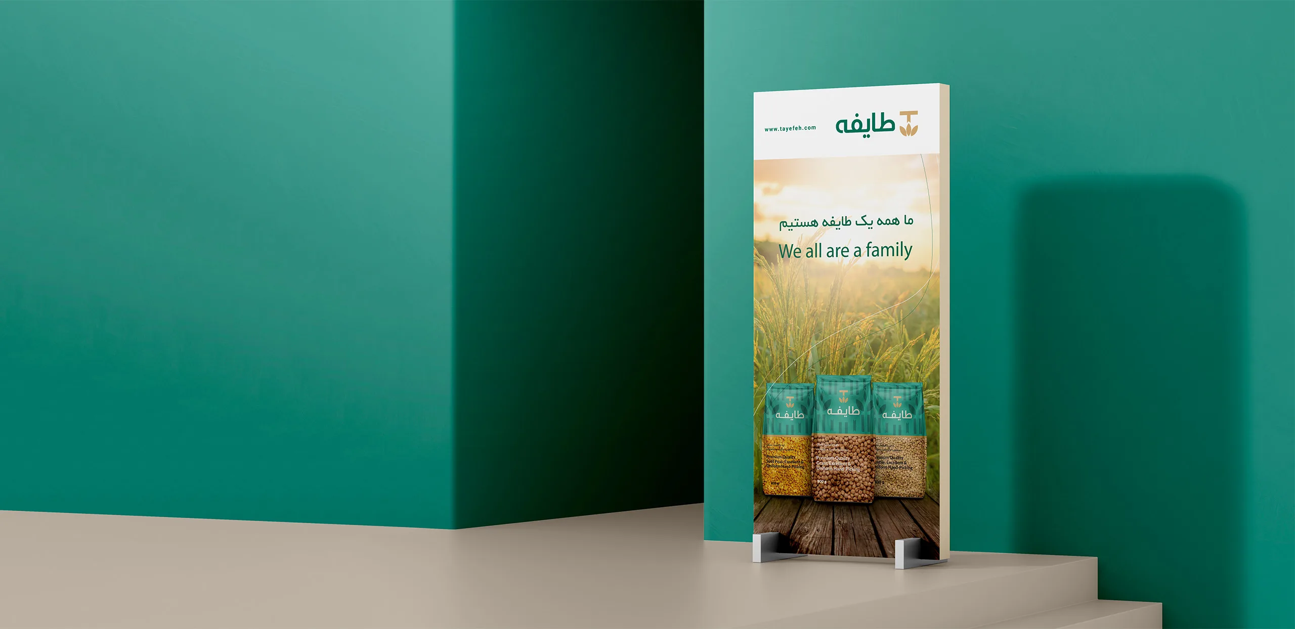
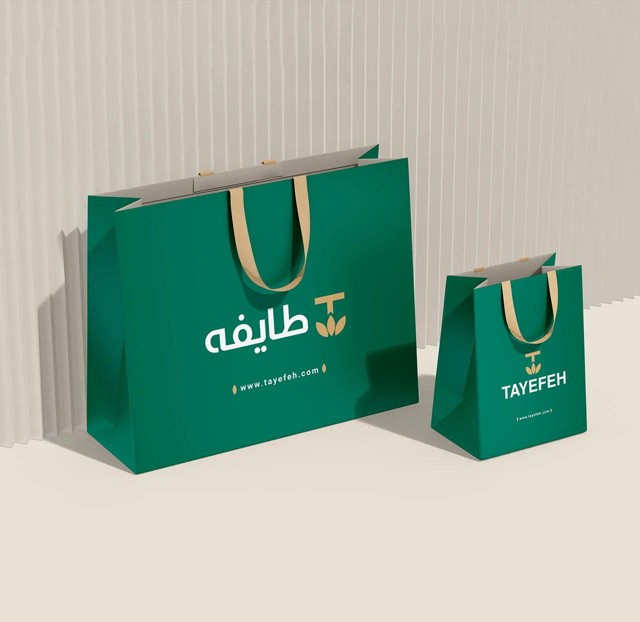
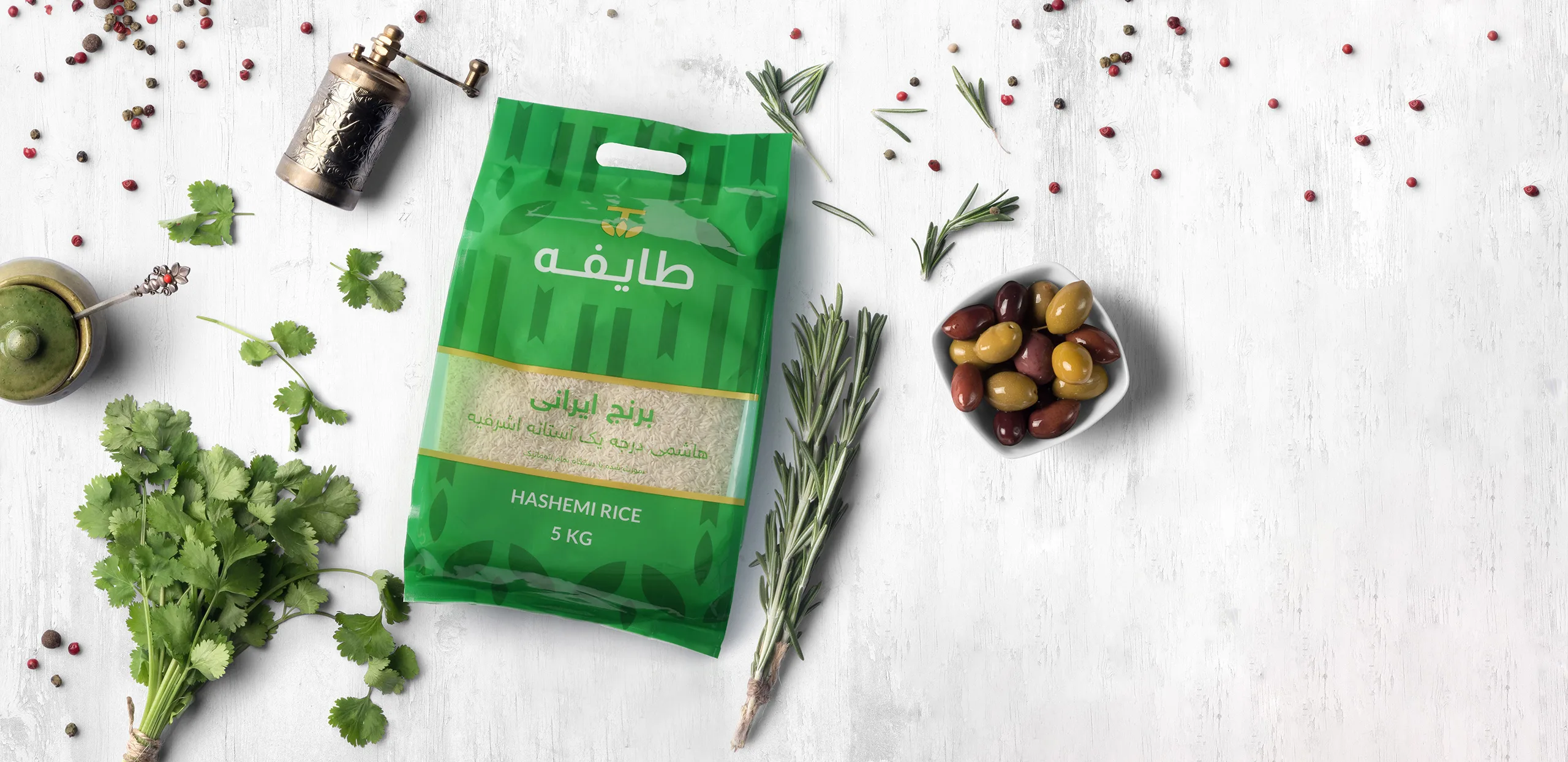
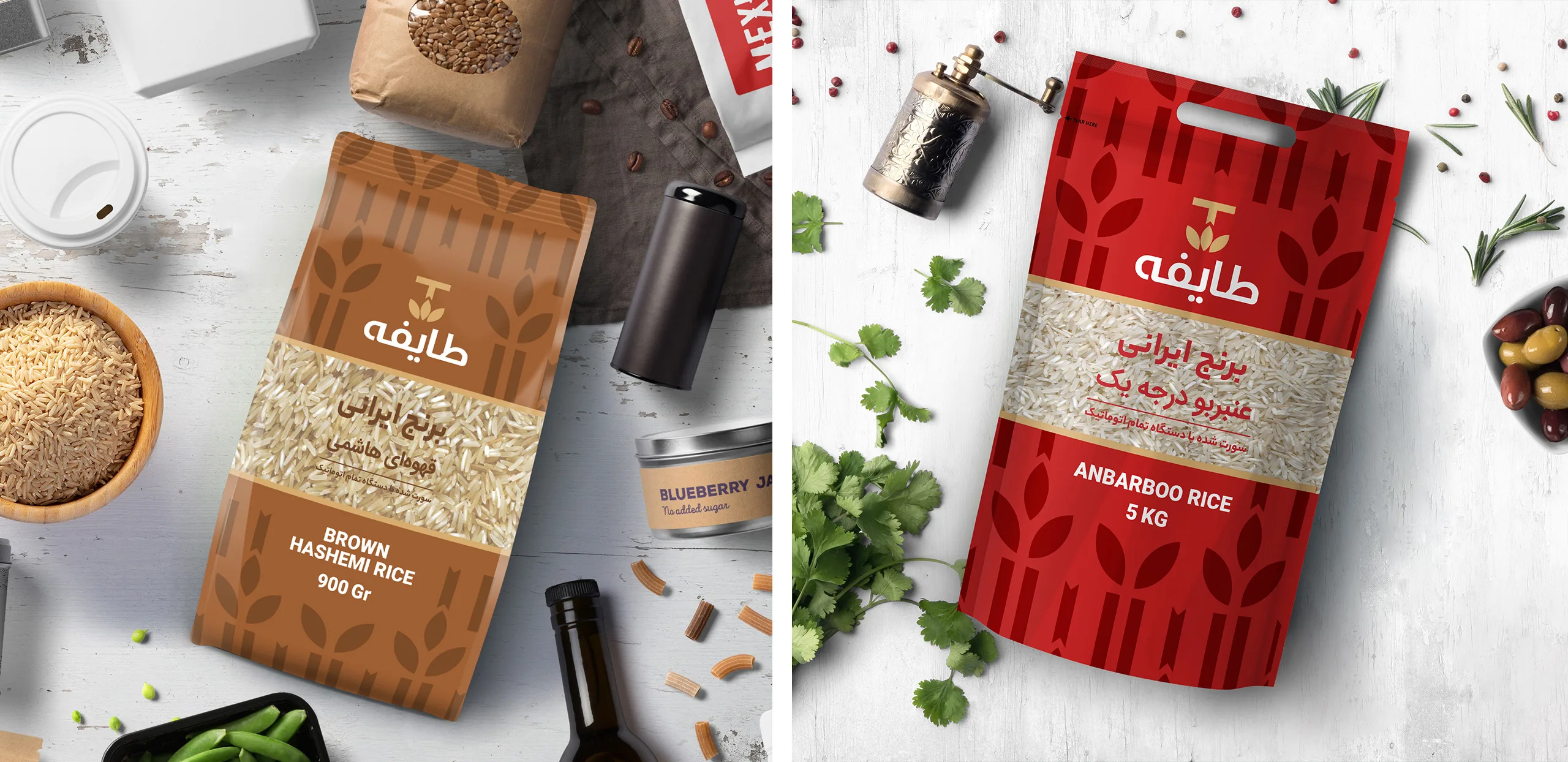
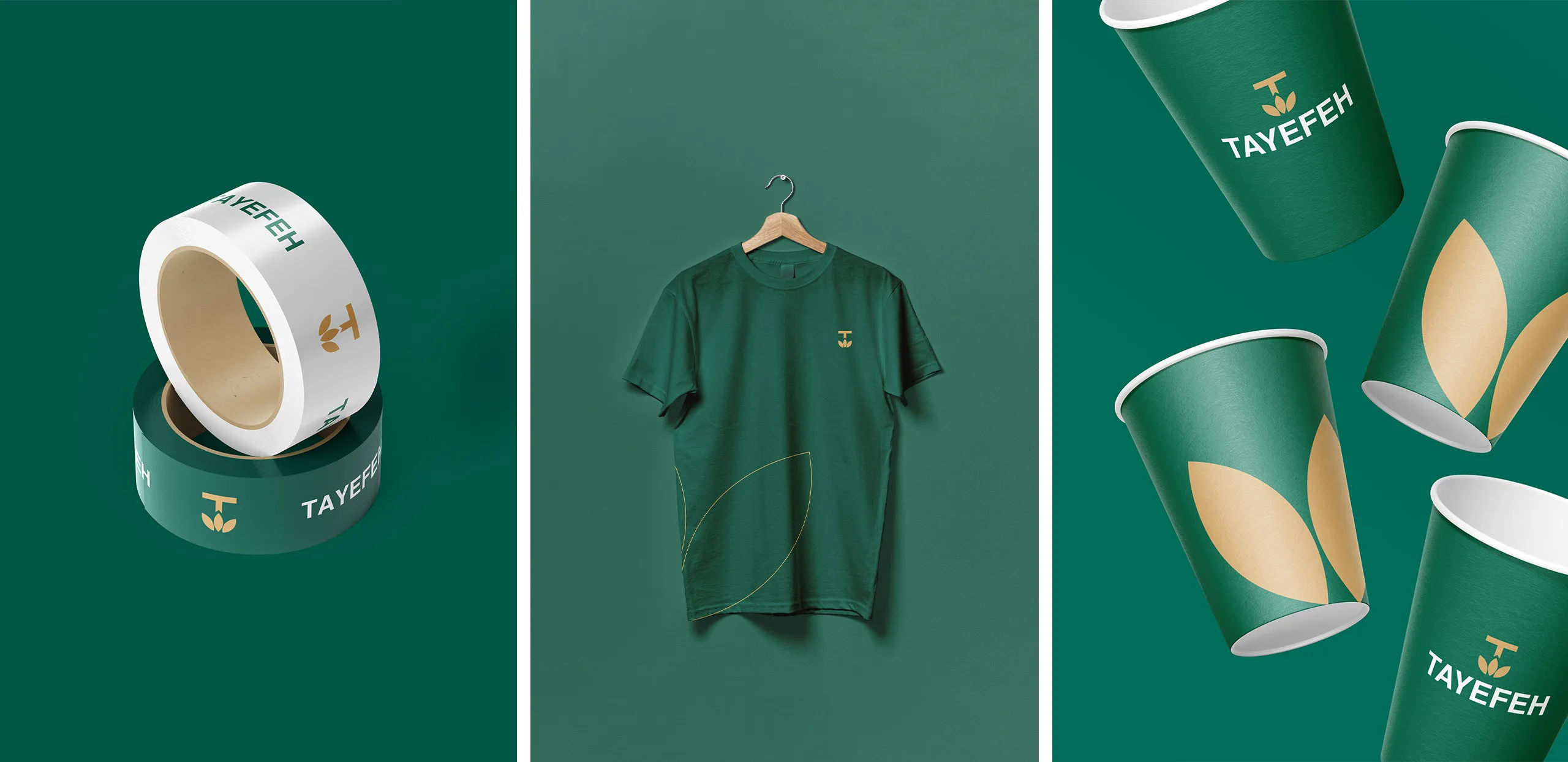
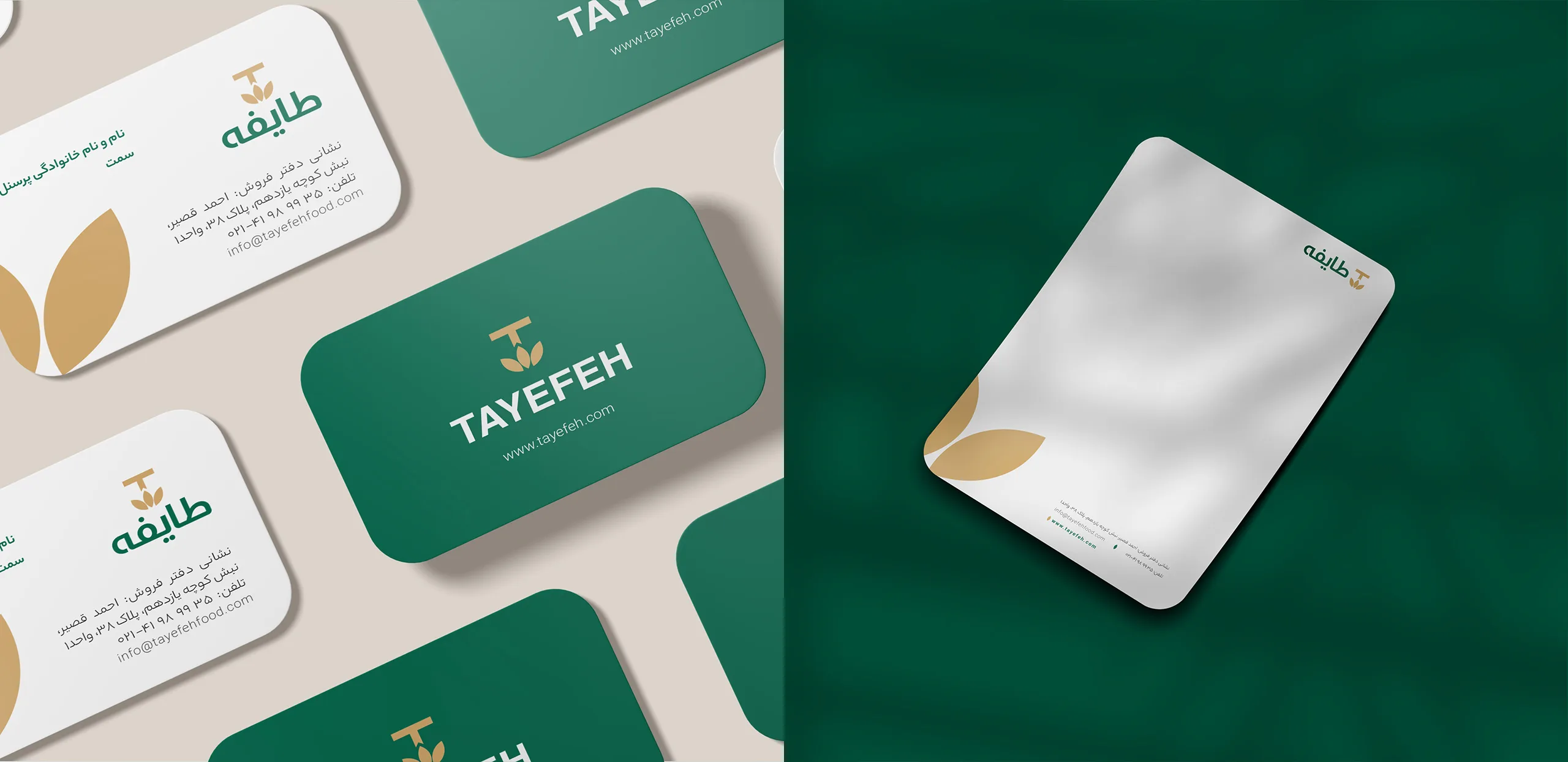
Taifeh’s brand visual identity began with a strategy brief to create a unified structure to clearly associate the appearance of the brand’s products. The Taifeh brand was associated with its audience with the green color, logo, and pattern used in the design of its product packaging.
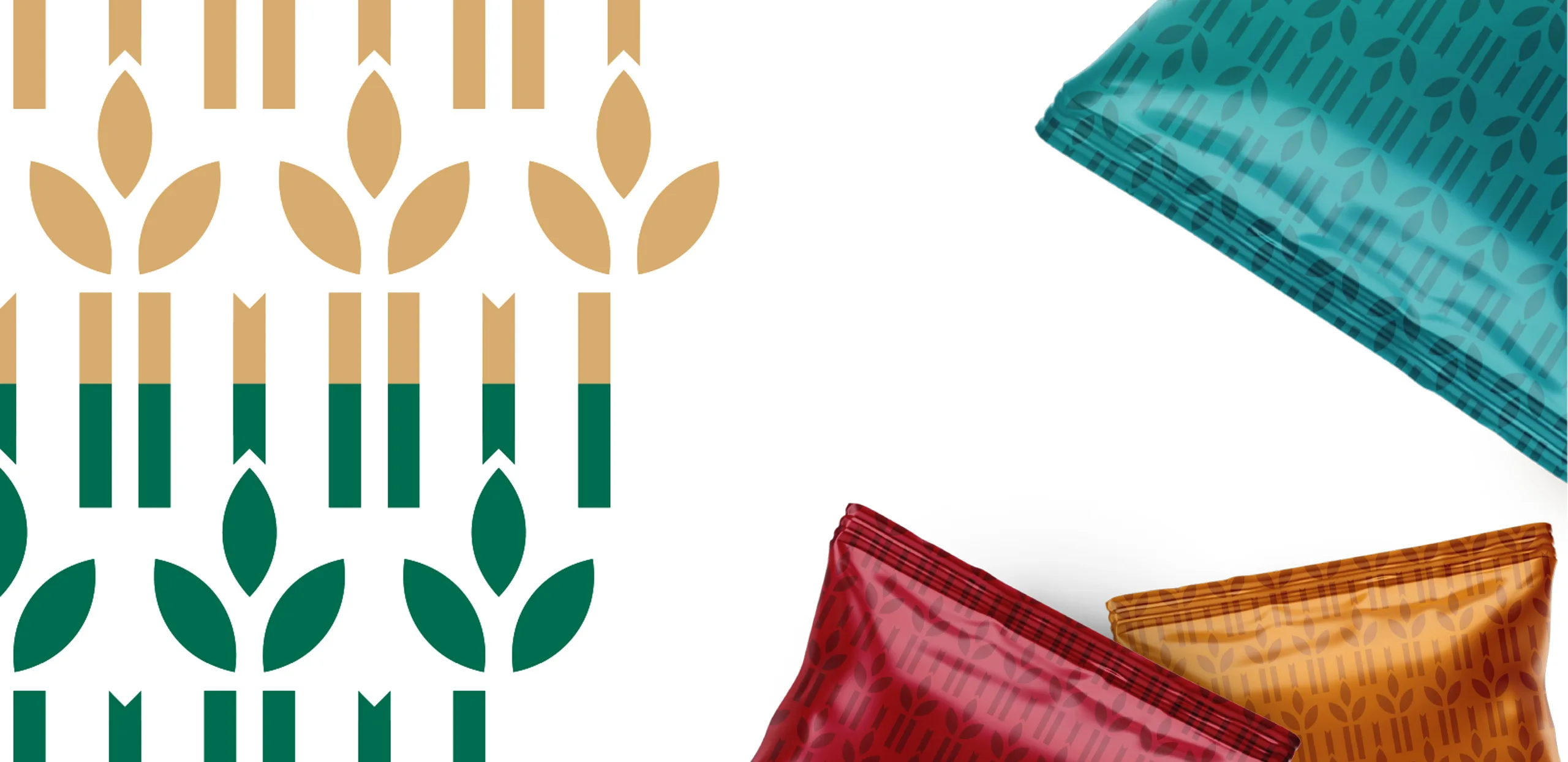
In this regard, minor modifications were made to the Persian logotype and a related and scalable pattern was designed for it to create unity between the different product packages through these elements.